Words and Wildflowers Creative Prompts – Issue 53
We LOVE research and learning as a way to get inspired and boost ideas and creativity!! So, Kenzie and I are going to be sharing the inspiration that we collect here in our second newsletter…. once a week!!!
Here’s how it works:
We provide the inspiration. You interpret it however you wish… any medium, any size. It is meant to inspire lettering and floral art combined together. But, you can:
- Just do the florals, just do the lettering, or combine them together.
- Use the provided quote for your piece or select your own.
- Use colors from one of the inspiration images or select your own favorites
- Create the floral art… as a still life in a vase, a single flower, a border, a pattern, a bouquet
Hope you will create with us and post your work at #wordsandwildflowers2024 and tag @lorisiebert.studio and @snippetsofwhimsy
Quote of the week…
“Maybe we can release the birds from our chests and chase them straight into the lives we’ve always held inside us anyway.”
— Victoria Erickson
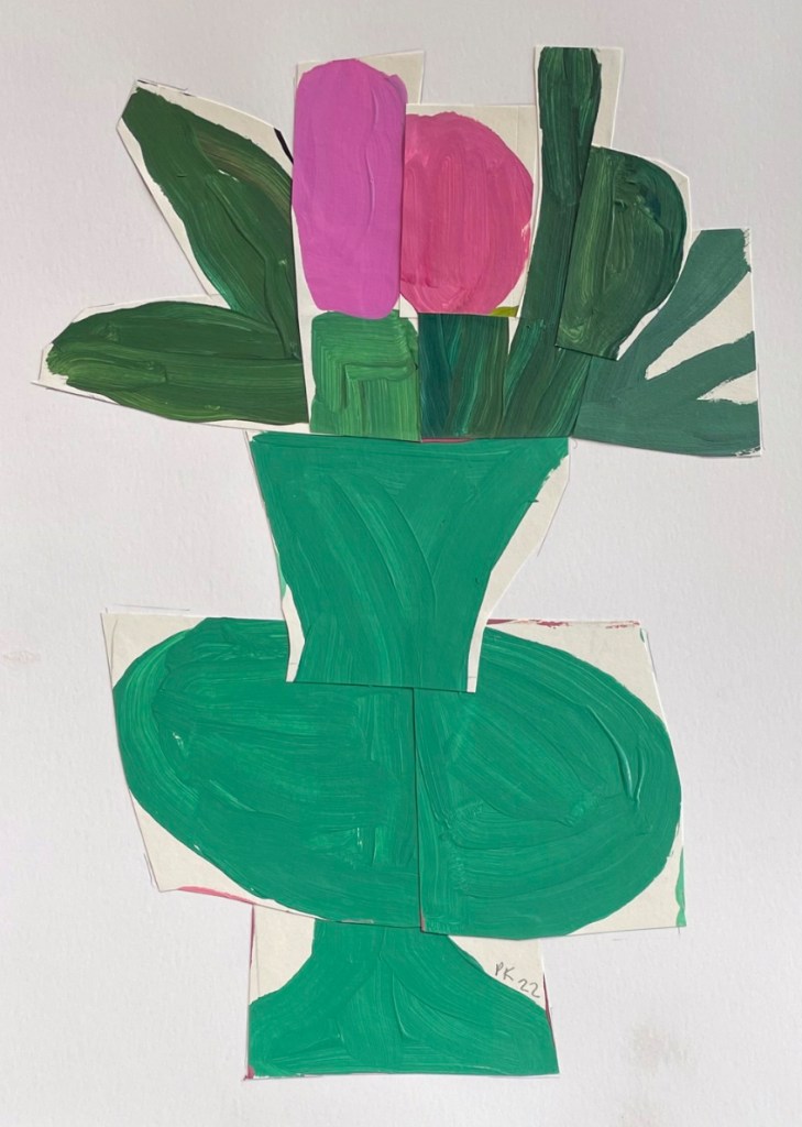
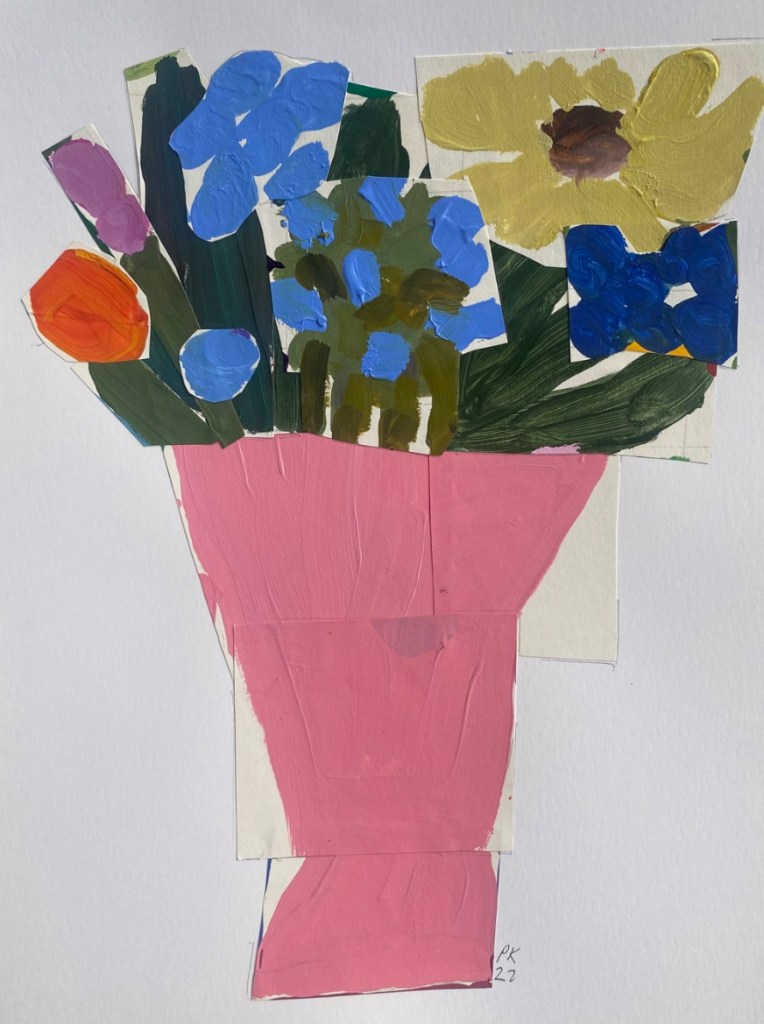
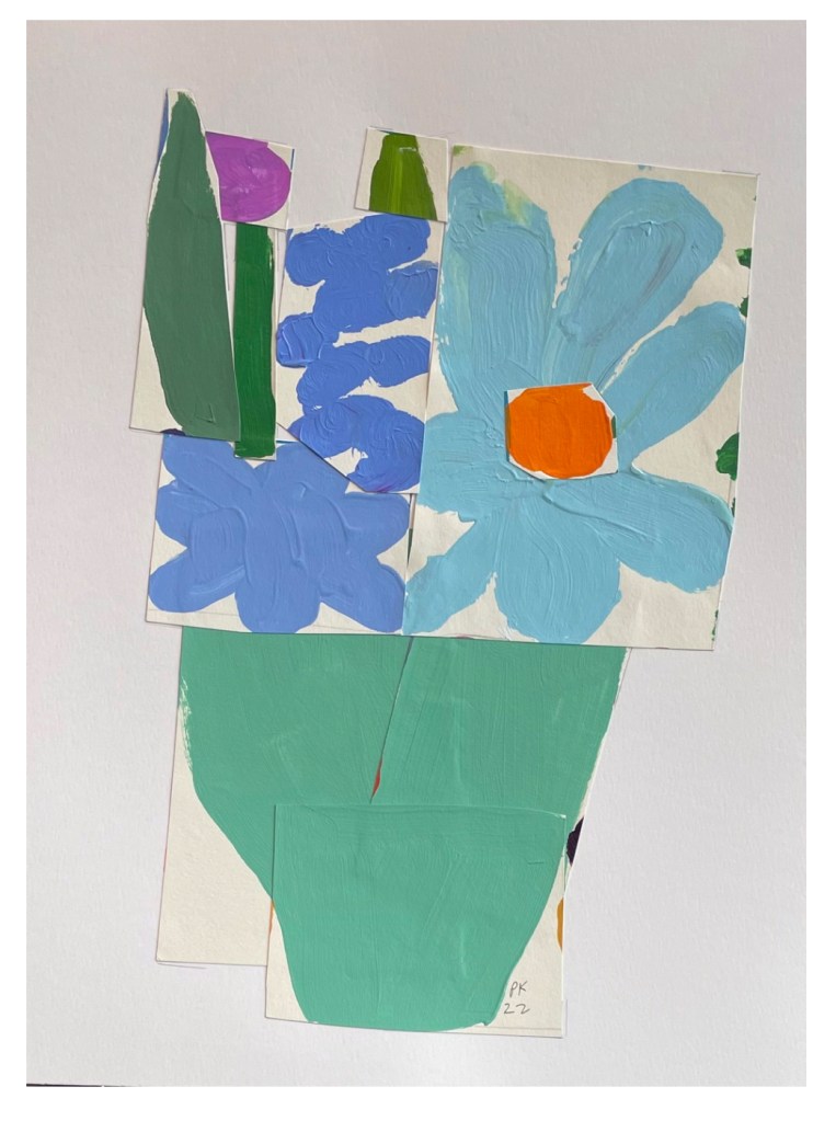
Inspirational Artist of the week: Peggi Kroll-Roberts
Award-winning artist Peggi Kroll-Roberts was trained at Arizona State University and the Art Center College of Design in Pasadena, CA.
Peggi worked as a fashion and advertising illustrator before transitioning to fine art. Her artworks are featured in the Laguna Beach Art Museum and the Pasadena Historical Museum.
Using intense color and value to accentuate her subject, she moved into fine art with a bold palette, a love for small paintings and a very loose style that achieves a lot with a few very energetic brush strokes. She prefers to suggest reality rather than render it.
Peggi paints animated figures, and breaks away from conventional still life with playful paintings of everyday scenes: cosmetics, the occasional coffee cup or slab of butter. Peggi’s work gives us a new appreciation of daily life.
Peggi’s realist impressionist and expressionist styles are striking, and she has won multiple fine art and plein air awards in addition to the Blackwell prize in painting.

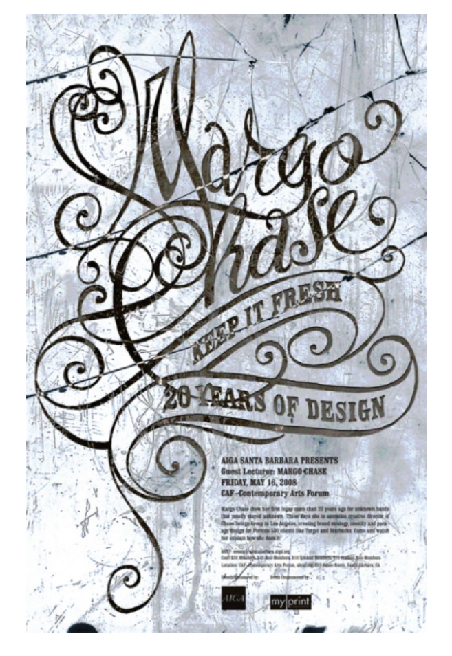
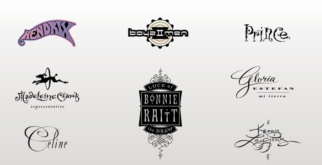
Hand lettering inspiration of the week: Margo Chase…
who I once hung out with for a day YEARS AGO…and when researching her… found out that she died in a plane crash while piloting at age 59. SO sad to hear this.
Margo Chase (February 20, 1958 – July 22, 2017) was an American graphic designer known for her eclectic and experimental design style. Chase was prolific – with a career bridging the graphic design field’s transition from the analog to the digital era, working with clients ranging from Selena and Prince to Mattel and Procter & Gamble.
With a portfolio of medical illustrations, Chase found work at a small advertising firm in Long Beach, designing packaging for the Ralph’s grocery store chain. She was soon hired away by Rosebud Books to design a series of tourist guidebooks. During this time, Chase met Laura LaPuma, who would go on to give her her first album cover design job at Warner Brothers Records. As she accumulated more design work, Chase set up an office in her Silverlake home, hiring Nancy Ogami and studio manager Robert Short to assist in servicing clients such as Geffen Records, Virgin Records, and others.
Chase designed logos for Prince’s Lovesexy, as well as his Paisley Park production company. Attracting enough positive attention, she was asked to design the logo – and eventually the packaging – for Madonna’s 1989 album Like a Prayer. This opened the door for other high-profile projects such as Cher’s Love Hurts, the poster campaign for 1992’s Bram Stoker’s Dracula, and others.
Chase’s work from this period of her career was quite distinct, taking inspiration from a wide variety of sources – calligraphy, illuminated manuscripts, and medieval architecture – leading publications to refer to her as the “Queen of Goth.” Wary of being aesthetically pigeonholed, she took on work for linen manufacturer Matteo. What initially began as a logo and stationary design project morphed into full-blown textile and product design. During this time, Chase expanded her studio – hiring designer Terry Stone to help her launch into motion picture titles, as well as market her typographic work as a separate venture called “Gravy Fonts.” After working with clients across the entertainment industry, Chase decided that she was a print designer at heart and turned her attention to packaging design, stating, “What I like about designing print or packaging is that when the job is finished there is something physical to show for it – it’s timeless. With the broadcast work, once it’s been seen, it’s already old.”