Words and Wildflowers Creative Prompts – Issue 118
Posted on October 12, 2026
We LOVE research and learning as a way to get inspired and boost ideas and creativity!! So, Kenzie and I are going to be sharing the inspiration that we collect here in our second newsletter…. once a week!!!
Here’s how it works:
We provide the inspiration. You interpret it however you wish… any medium, any size. It is meant to inspire lettering and floral art combined together. But, you can:
- Just do the florals, just do the lettering, or combine them together.
- Use the provided quote for your piece or select your own.
- Use colors from one of the inspiration images or select your own favorites
- Create the floral art… as a still life in a vase, a single flower, a border, a pattern, a bouquet
Hope you will create with us and post your work at #wordsandwildflowers2026 and tag @lorisiebert.studio and @snippetsofwhimsy
Quote of the week…
“Creativity is not the possession of some special talent. It’s about the willingness to play.”
— John Cleese
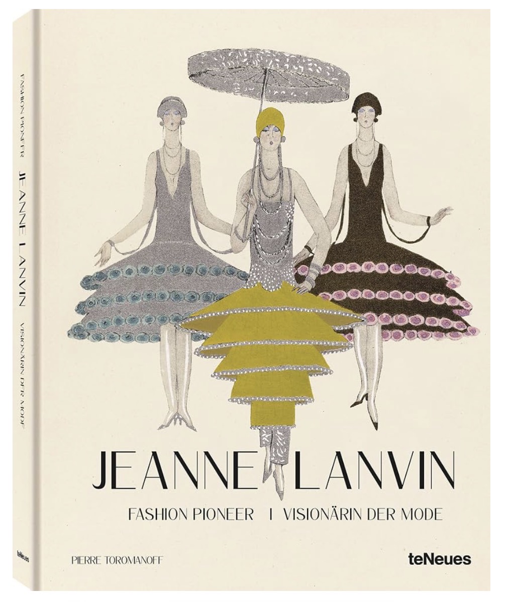
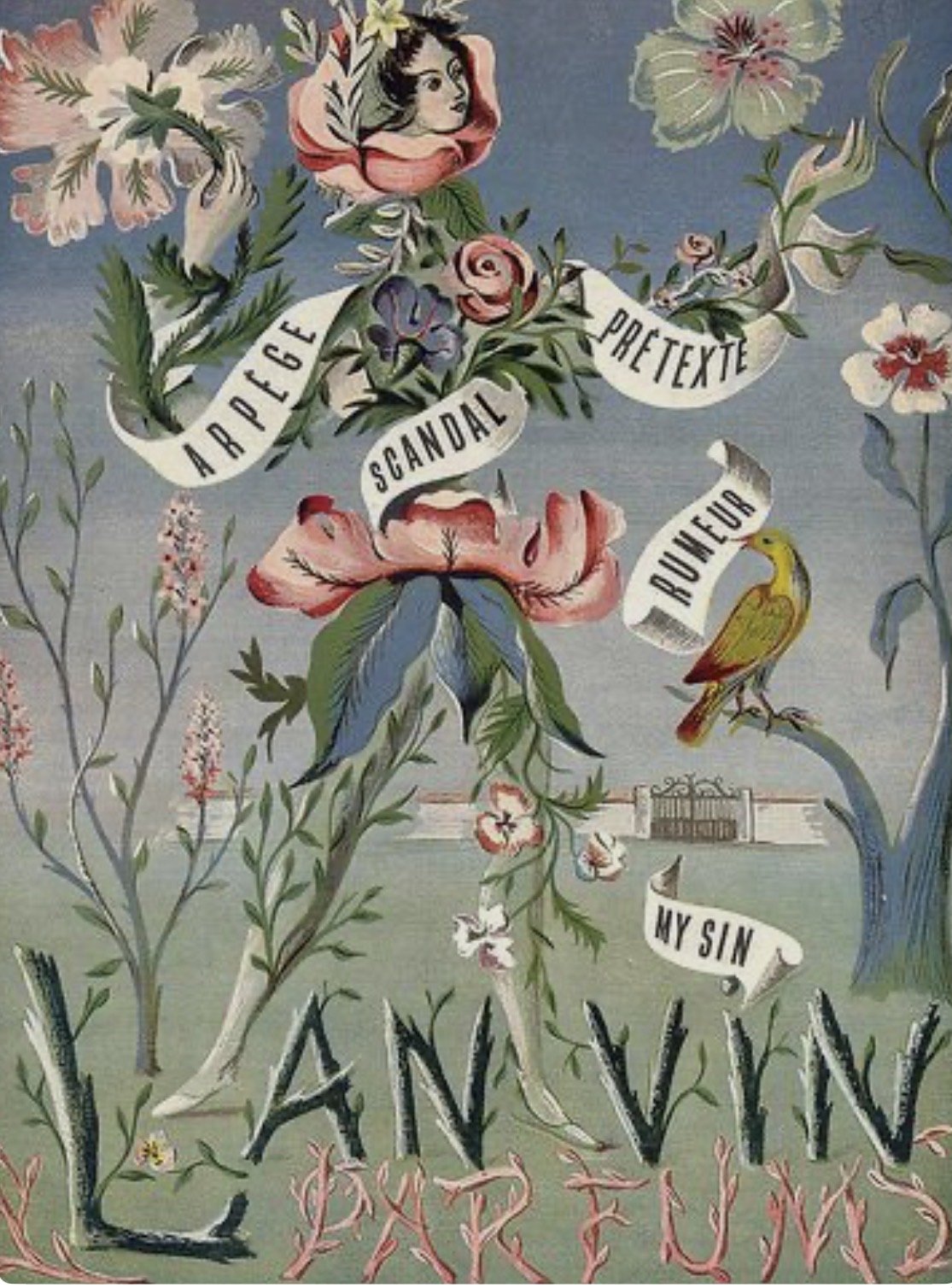
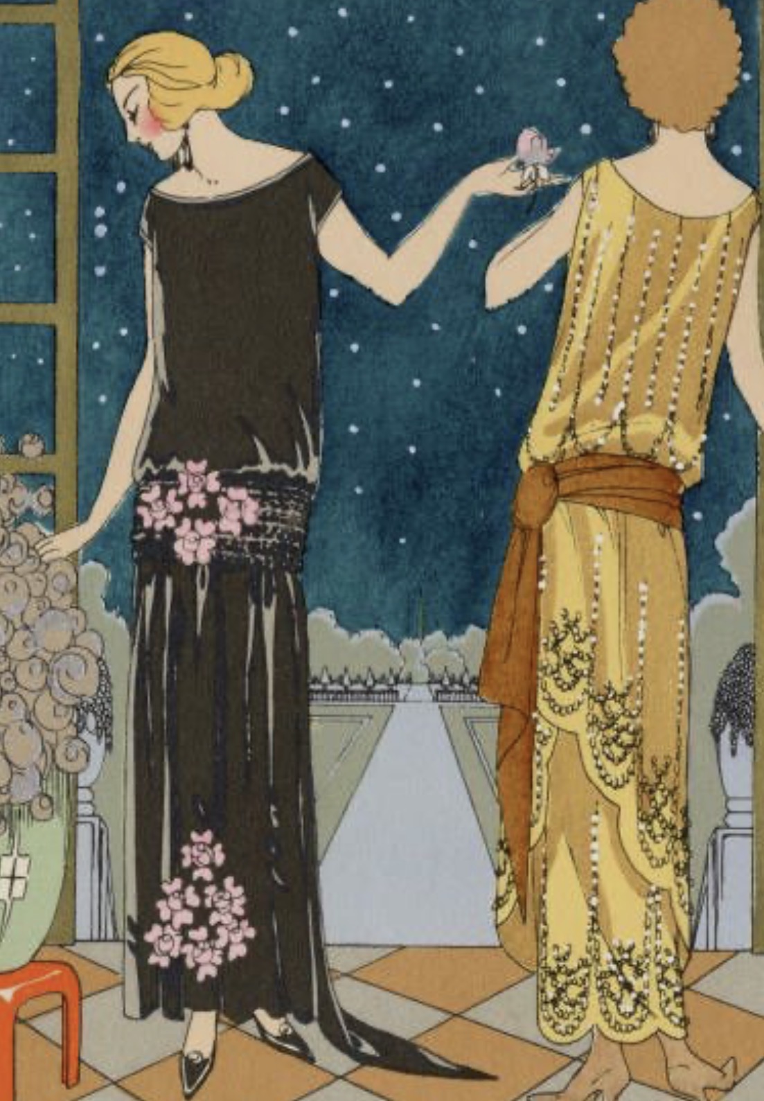
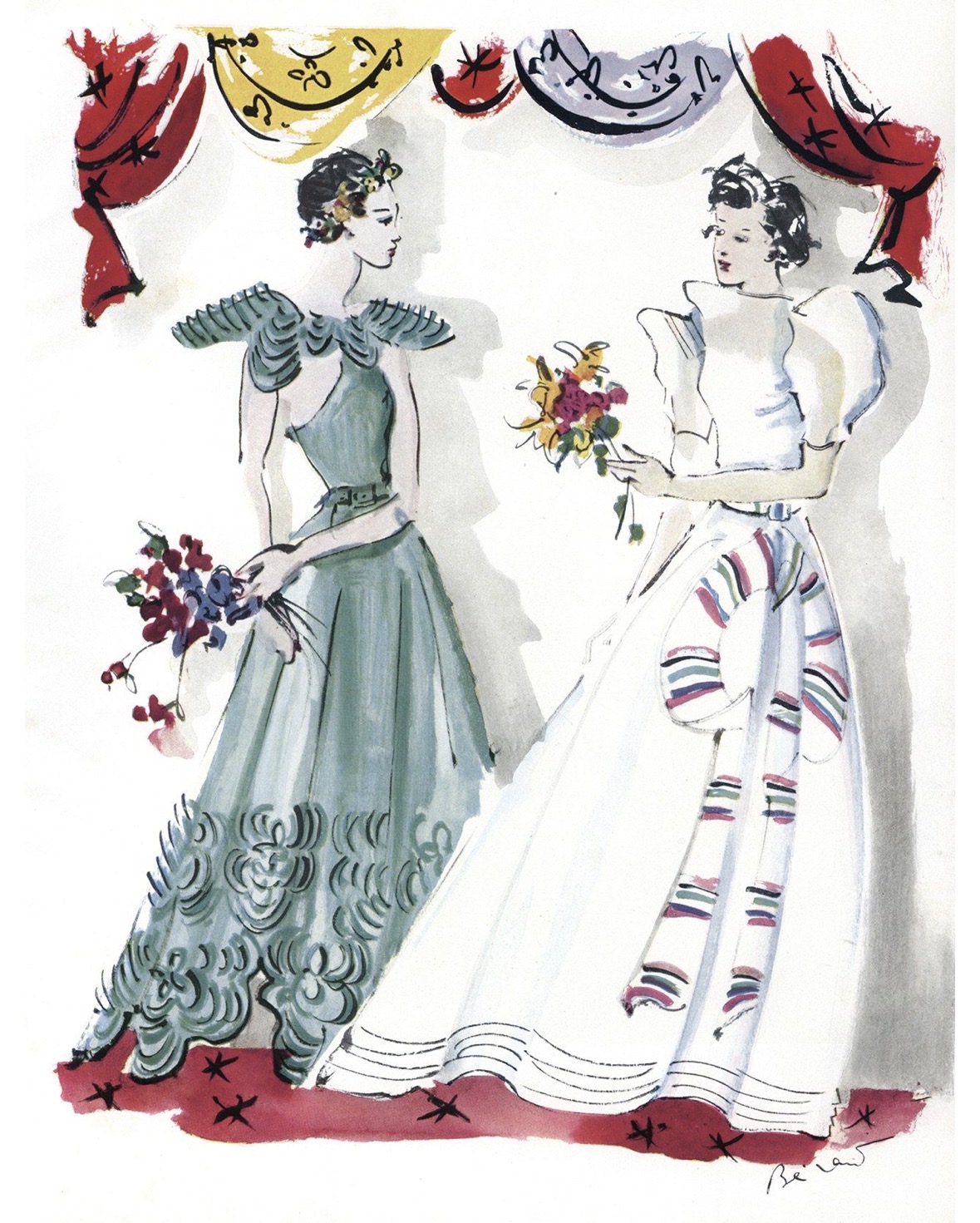
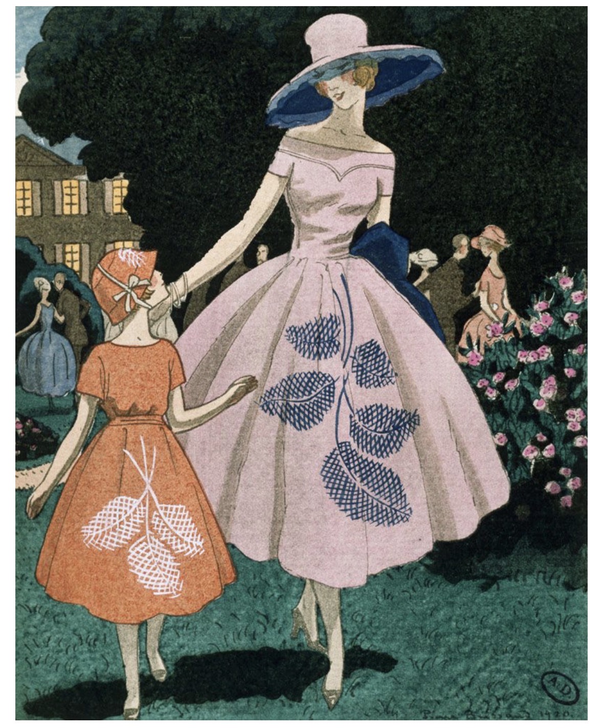
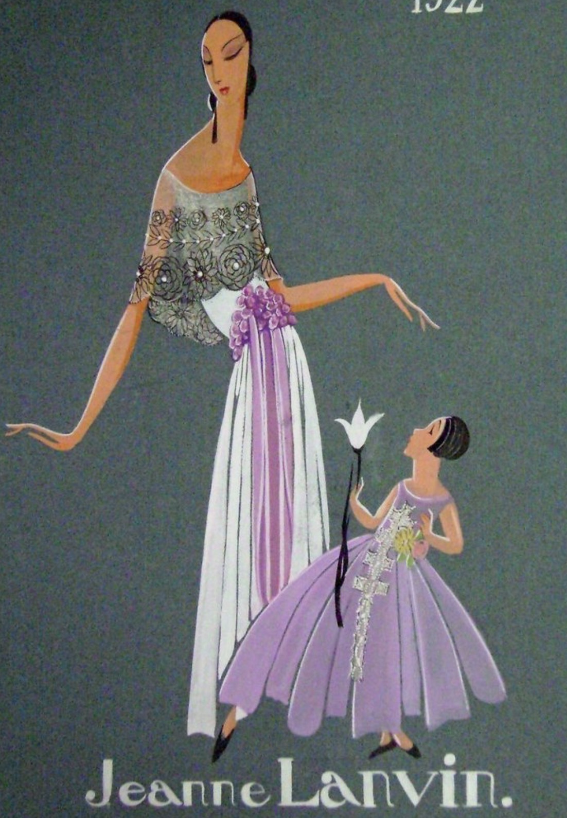
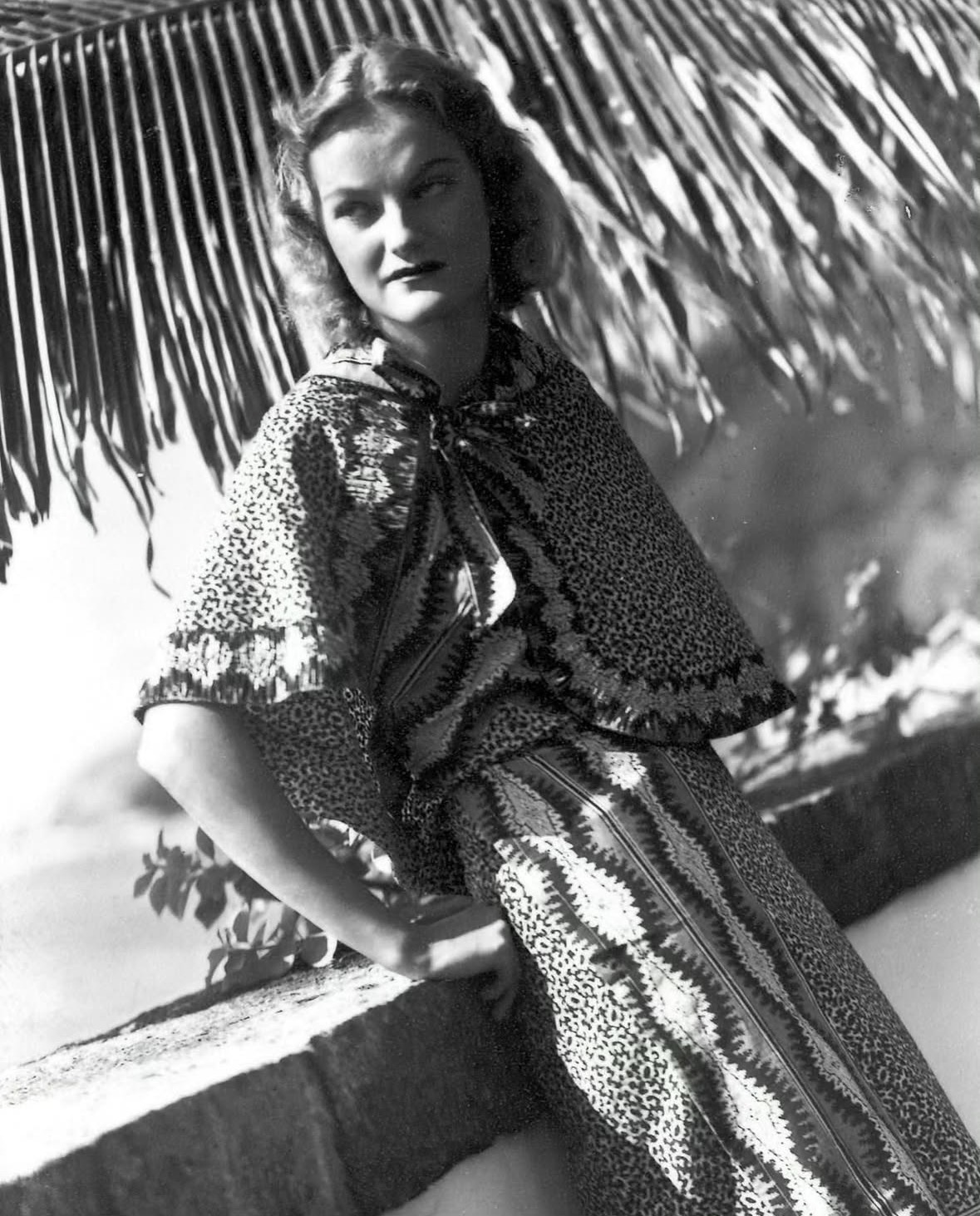
Inspiration of the week: Jeanne Lanvin
Jeanne-Marie Lanvin 1 January 1867 – 6 July 1946) was a French haute couturefashion designer. She founded the Lanvin fashion house and the beautyand perfume company Lanvin Parfums.
In 1909, Lanvin joined the Syndicat de la Couture (fr), which marked her formal status as a couturière. The clothing Lanvin made for her daughter began to attract the attention of a number of wealthy people who requested copies for their own children. Soon, Lanvin was making dresses for their mothers, and some of the most famous names in Europe were included in the clientele of her new boutique on the rue du Faubourg Saint-Honoré in Paris. One of her models Maria Minard was the grandmother of future French actor Alain Delon.
In the 1920s, Lanvin opened shops devoted to home décor, menswear, furs and lingerie. Starting in 1923, the Lanvin empire included a dye factory in Nanterre. Her most significant endeavour was the creation of Lanvin Parfums SA in 1924. Her signature fragrance, Arpège, introduced in 1927, was inspired by the sound of her daughter Marguerite practicing her scales on the piano. (Arpège is French for arpeggio.)
In 1921, Lanvin created Lanvin Décoration with celebrated architect Armand Albert Rateau. Their first design project was the Theatre Daunou in Paris, owned at the time by actress Jane Renouardt, a friend and client of Lanvin. In 1922, Lanvin collaborated with Rateau in redesigning her apartment, her homes and her businesses. The living room, boudoir and bathroom of the apartment was reassembled in 1985 in the Musée des Arts Décoratifs, Paris. For this home, Rateau designed some remarkable 1920–22 furniture in bronze.
The pair developed a friendship. Rateau came aboard Lanvin’s empire as manager of Lanvin-Sport, designing the Lanvin spherical La Boule perfume flacon for Arpège, originally produced by the Manufacture Nationale de Sèvres. To this day, Arpège perfume globe, designed by Rateau, are imprinted with Paul Iribe’s gold image (rendered in 1907) of Lanvin and her daughter Marguerite. Rateau also managed Lanvin-Décoration, an interior-design department established in 1920, in the main store on the rue du Faubourg Saint-Honoré.
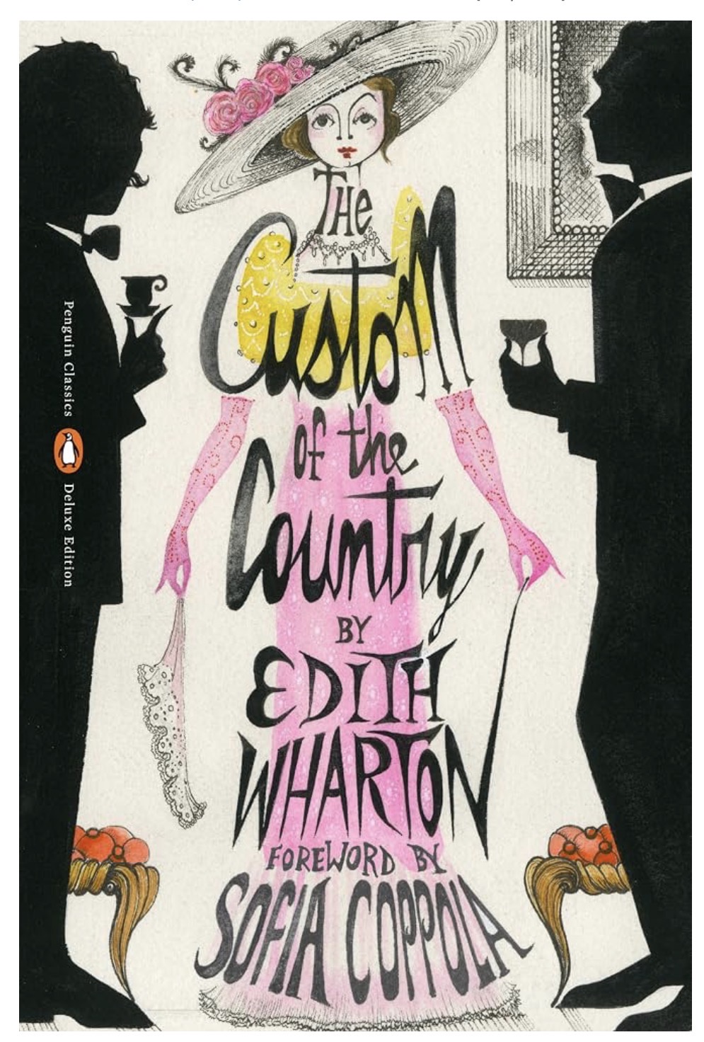
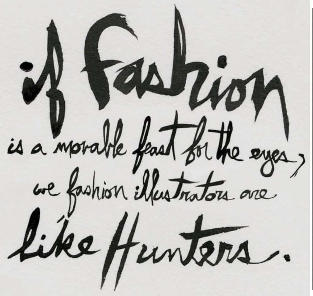
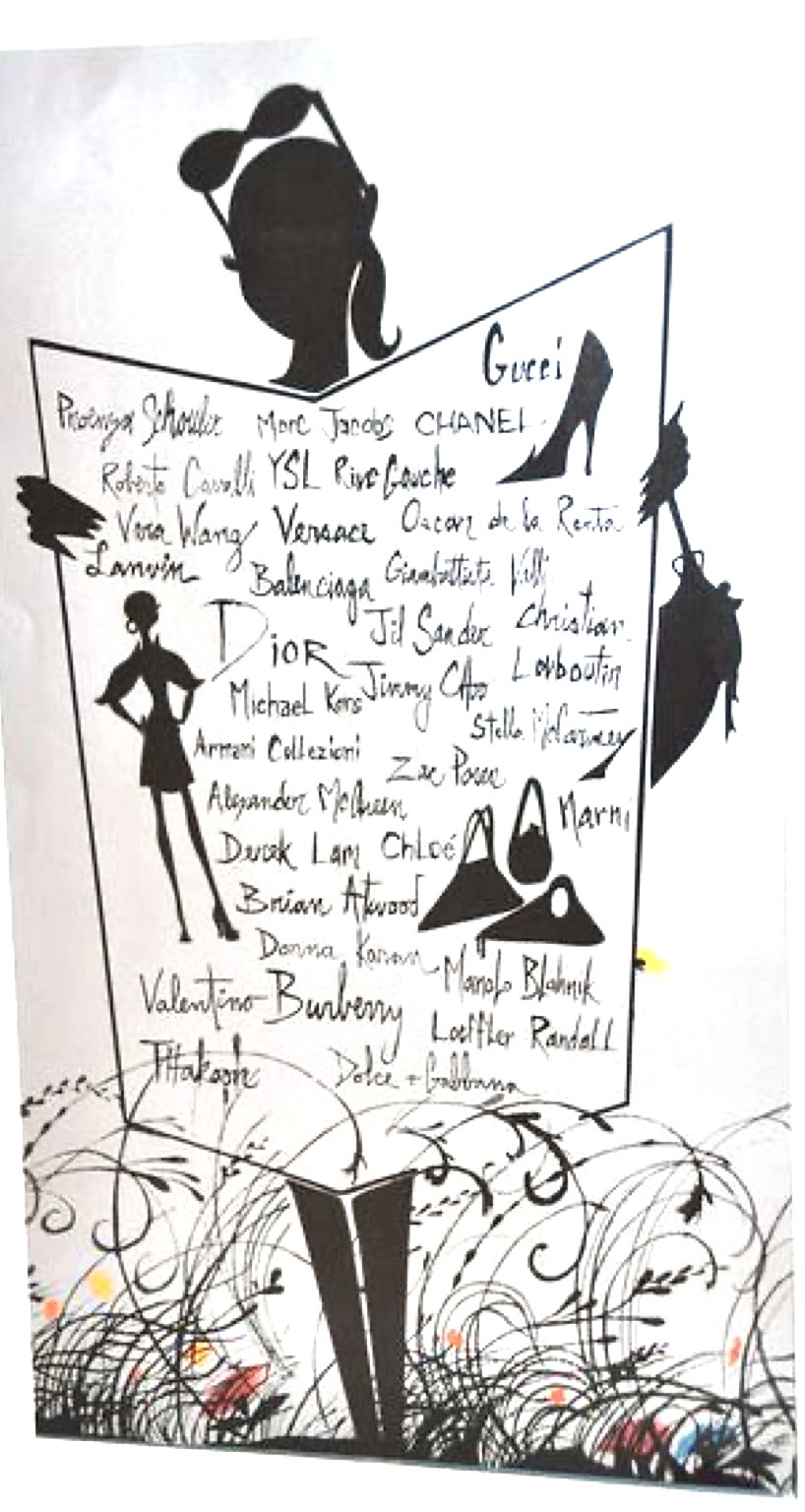
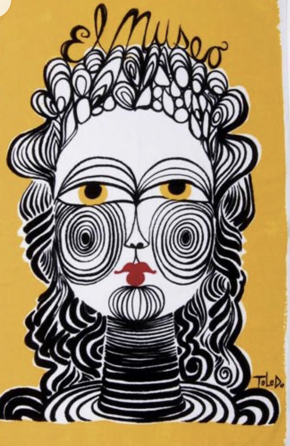
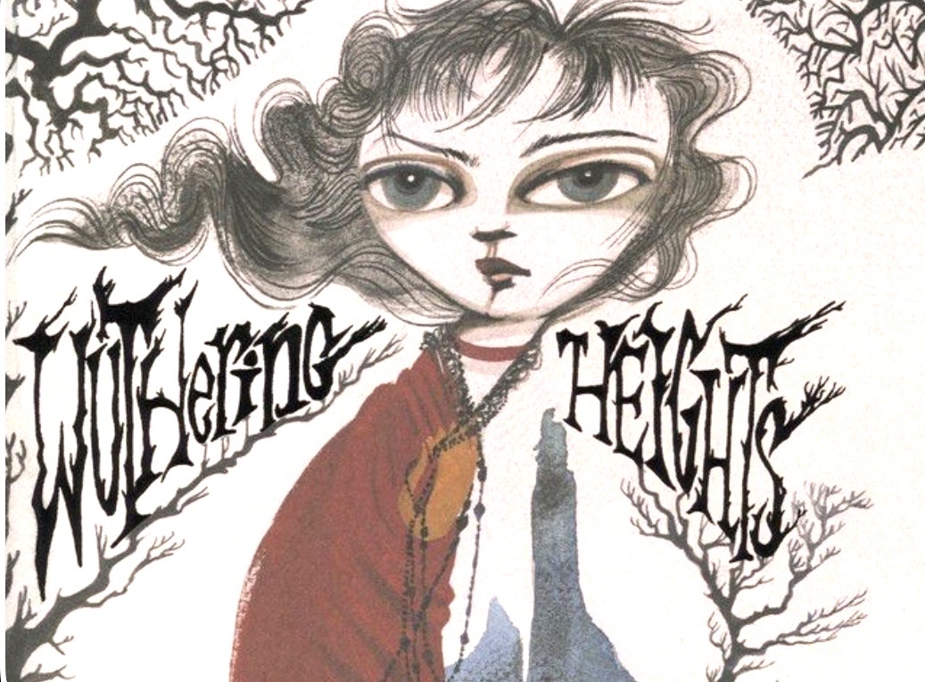
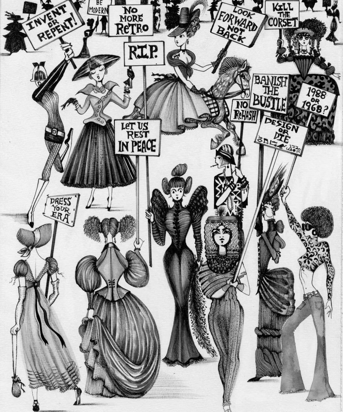
Hand lettering inspiration of the week: Ruben Toledo
Born in Cuba, Ruben Toledo immigrated to New York as a child, where he would later meet Isabel Toledo in an art class at the age of thirteen. Their shared background as Cuban-born immigrants and a mutual passion for art forged a bond that would define their lives and careers. Early in his artistic journey, Toledo collaborated with Elio Fiorucci, showcasing his art and connecting with influential figures like Andy Warhol, who encouraged the young artist’s endeavors. This formative period laid the groundwork for his future in the art and fashion worlds, eventually leading to his marriage to Isabel in 1984.
Ruben and Isabel Toledo cultivated a unique and inseparable creative partnership, each serving as the other’s lifelong muse. He often sketched her designs, and her architectural garments were frequently inspired by his gestural brushstrokes. Their collaborative efforts quickly gained traction, culminating in their brand’s debut at New York Fashion Week in 1985 and subsequent representation in prominent retailers globally. Their studios, located in significant downtown Manhattan spaces including Times Square and the former atelier of Art Kane, were central to the city’s vibrant art scene, fostering a continuous flow of creative exchange.
Toledo’s artistic practice extends beyond fashion illustration to encompass mannequin design, painting, and sculpture, demonstrating a versatility that has characterized his career. He notably collaborated with gallerist Ralph Pucci since 1988 on mannequin projects. While initially working extensively in black and white, Isabel encouraged him to integrate more color into his palette, a development that further enriched his aesthetic. The couple’s work achieved broader public recognition when Isabel designed the iconic lemongrass inauguration ensemble for First Lady Michelle Obama in 2009. Following Isabel’s passing in 2019, Ruben has dedicated himself to preserving their shared legacy, seeing himself as the custodian of their collective body of work and a proponent for their enduring artistic narrative.
Words and Wildflowers Creative Prompts – Issue 116
Posted on October 5, 2026
We LOVE research and learning as a way to get inspired and boost ideas and creativity!! So, Kenzie and I are going to be sharing the inspiration that we collect here in our second newsletter…. once a week!!!
Here’s how it works:
We provide the inspiration. You interpret it however you wish… any medium, any size. It is meant to inspire lettering and floral art combined together. But, you can:
- Just do the florals, just do the lettering, or combine them together.
- Use the provided quote for your piece or select your own.
- Use colors from one of the inspiration images or select your own favorites
- Create the floral art… as a still life in a vase, a single flower, a border, a pattern, a bouquet
Hope you will create with us and post your work at #wordsandwildflowers2026 and tag @lorisiebert.studio and @snippetsofwhimsy
Quote of the week…
“When one door closes, sometimes we need to turn the knob to open another…”
— J.A. Tran
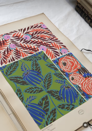
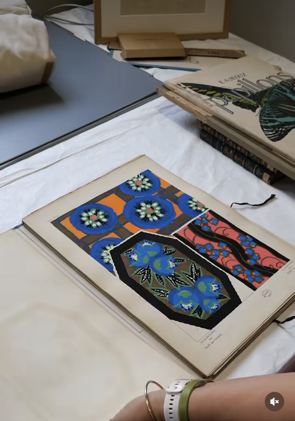
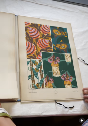
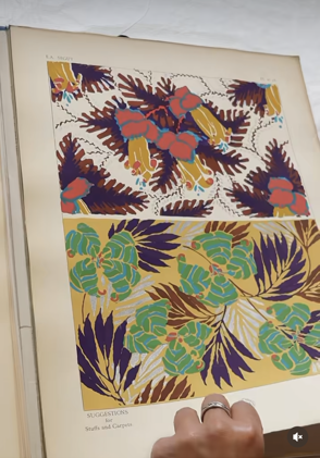
Inspiration of the week: Émile-Alain Séguy
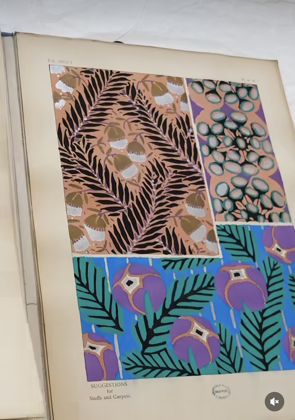
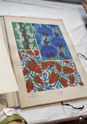
Émile-Allain Séguy (1877–1951) was one of the leading designers of decorative motifs of the Art Deco period. In 1902, after graduating from the École des Arts Décoratifs, he specialized in decorative portfolios. He created motifs for publishers of textiles and wallpaper.
The portfolio, published in 1925, was limited to only 300 copies. The copy preserved at the National Museum of Ceramics has retained all the intensity of the original colors.
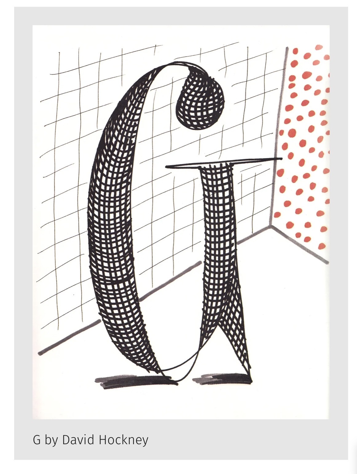
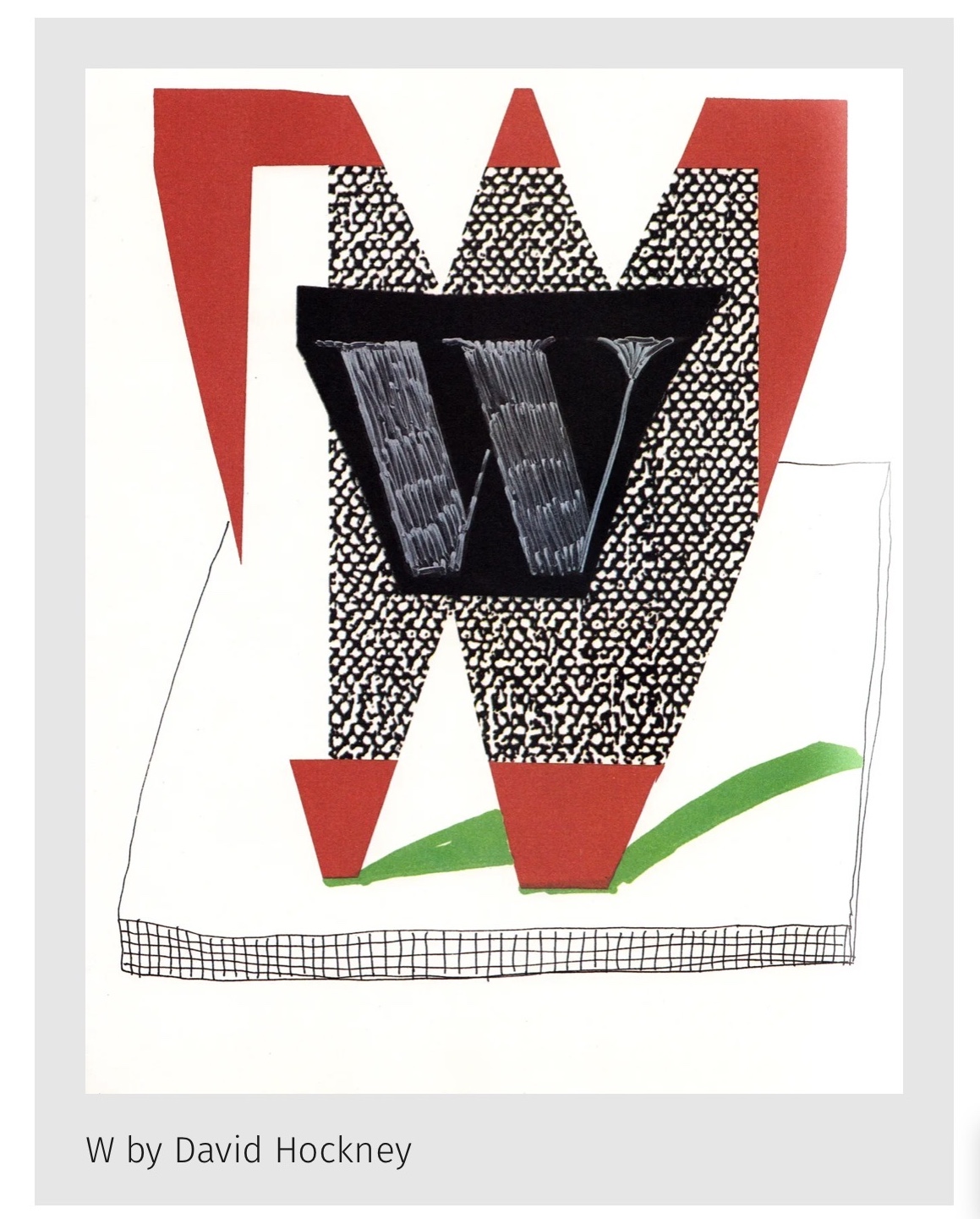
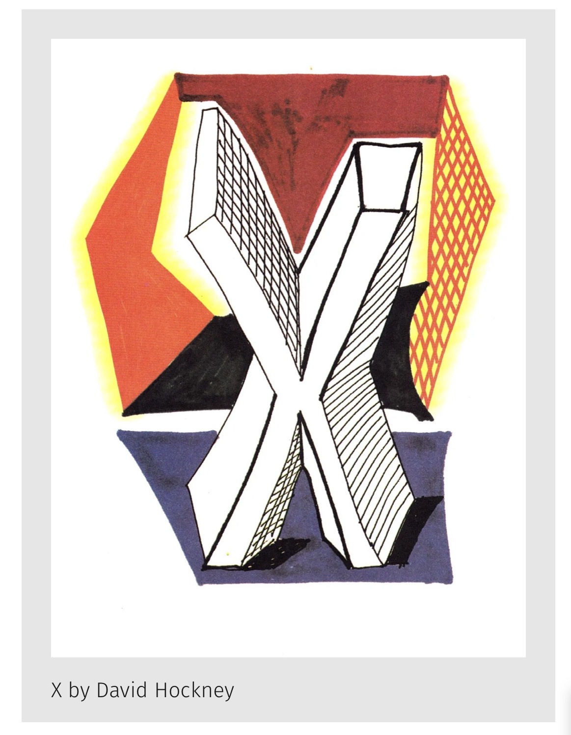
Hand lettering inspiration of the week: David Hockney
David Hockney (9 July 1937 – 11 June 2026) was a British painter, stage designer and photographer. As an important contributor to the pop art movement of the 1960s, he is considered one of the most influential British artists of the 20th and 21st centuries. He was known for his vivid, stylized realism and championed figurative work, often in a bold style, during a period when abstract art predominated.
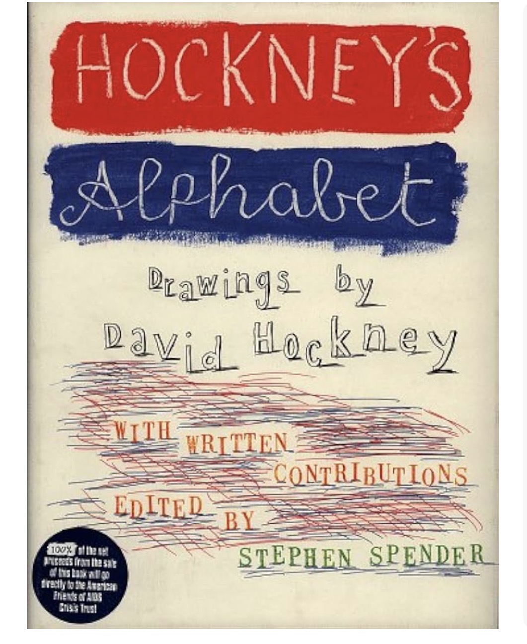
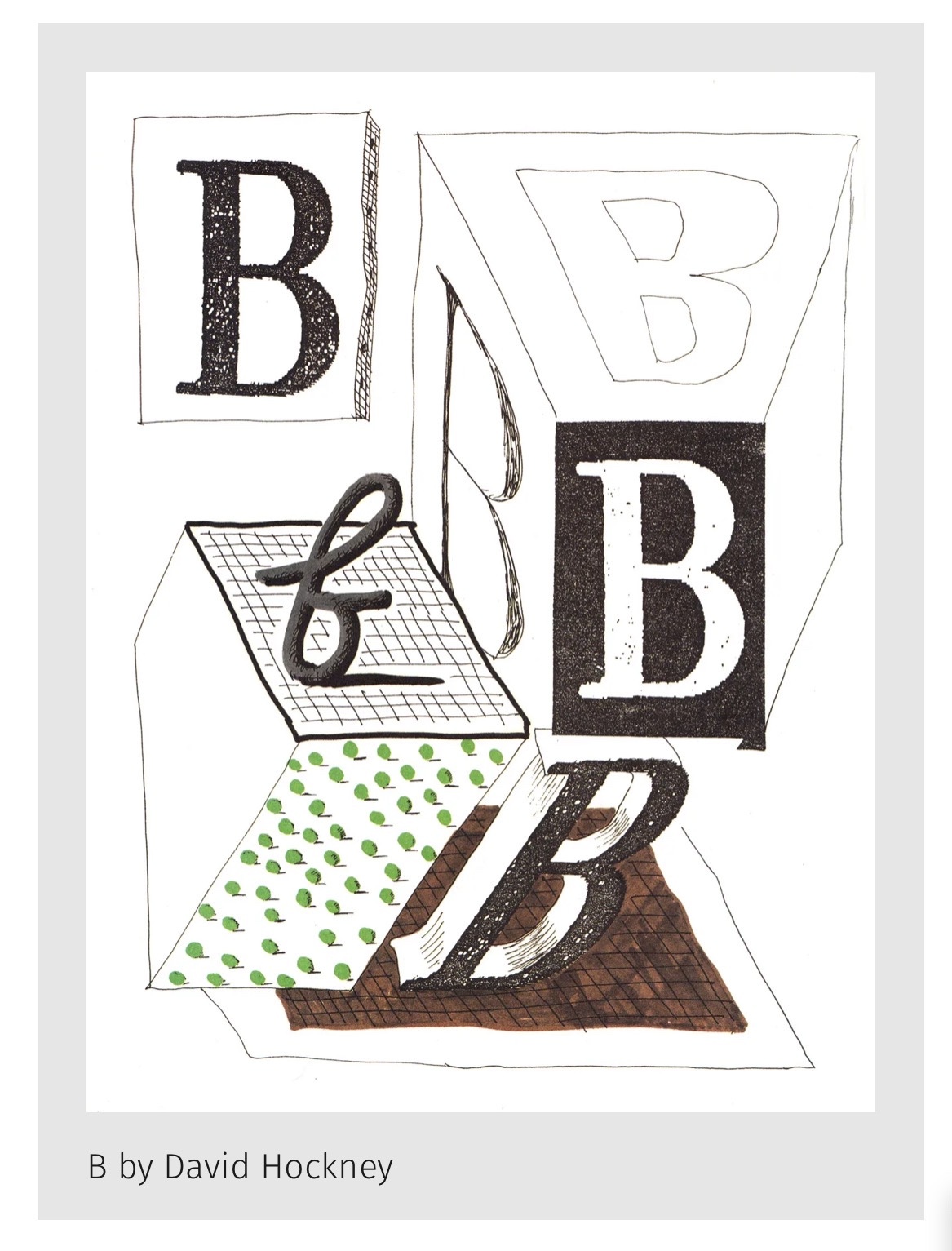
Hockney’s Alphabet is a diverse portfolio of works that draws together Hockney’s literary influence with his experiments in mark-making.
Words and Wildflowers Creative Prompts – Issue 115
Posted on September 28, 2026
We LOVE research and learning as a way to get inspired and boost ideas and creativity!! So, Kenzie and I are going to be sharing the inspiration that we collect here in our second newsletter…. once a week!!!
Here’s how it works:
We provide the inspiration. You interpret it however you wish… any medium, any size. It is meant to inspire lettering and floral art combined together. But, you can:
- Just do the florals, just do the lettering, or combine them together.
- Use the provided quote for your piece or select your own.
- Use colors from one of the inspiration images or select your own favorites
- Create the floral art… as a still life in a vase, a single flower, a border, a pattern, a bouquet
Hope you will create with us and post your work at #wordsandwildflowers2026 and tag @lorisiebert.studio and @snippetsofwhimsy
Quote of the week…
“Strive to reach the highest.”
— This is the motto of Queen Kapiʻolani.
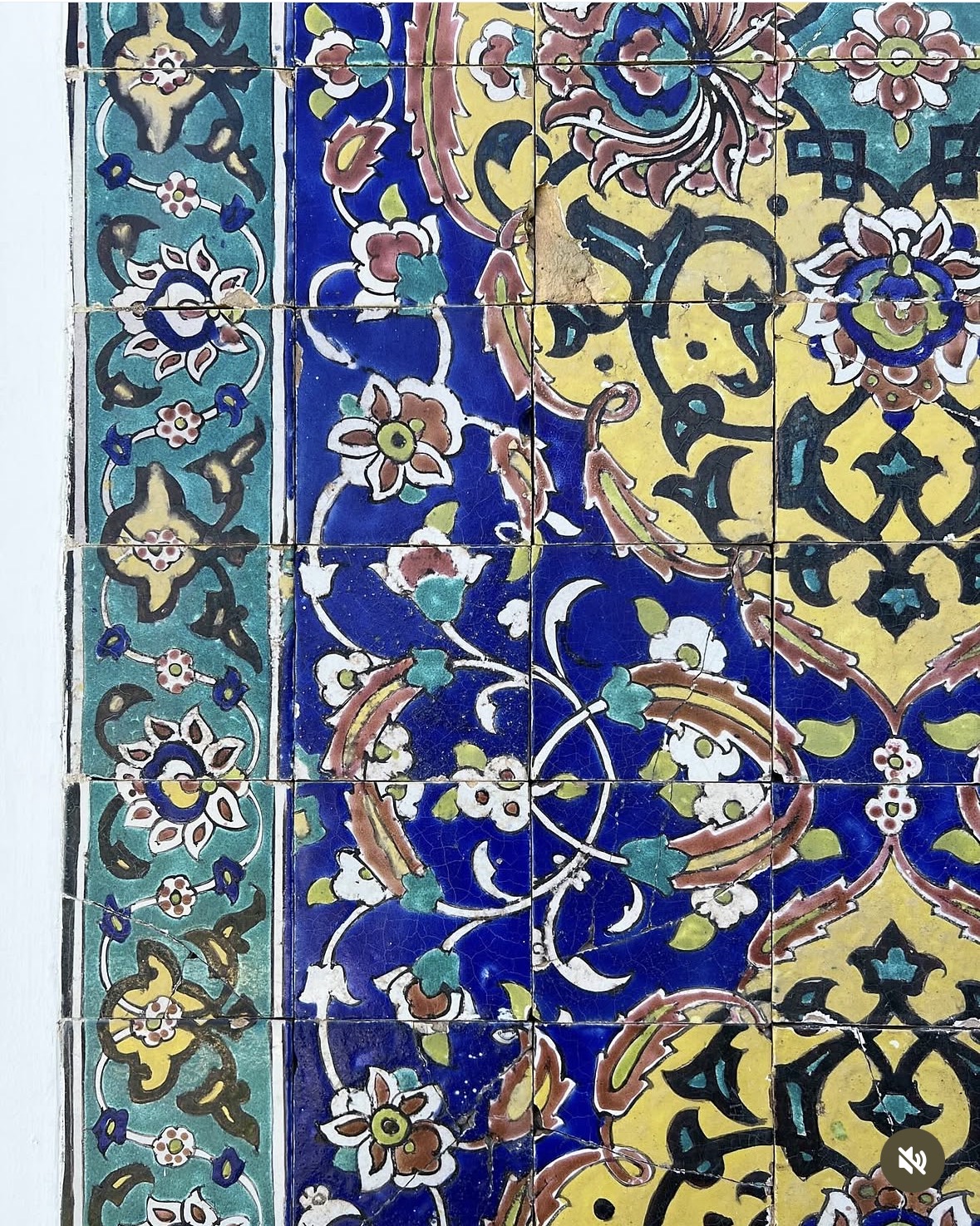
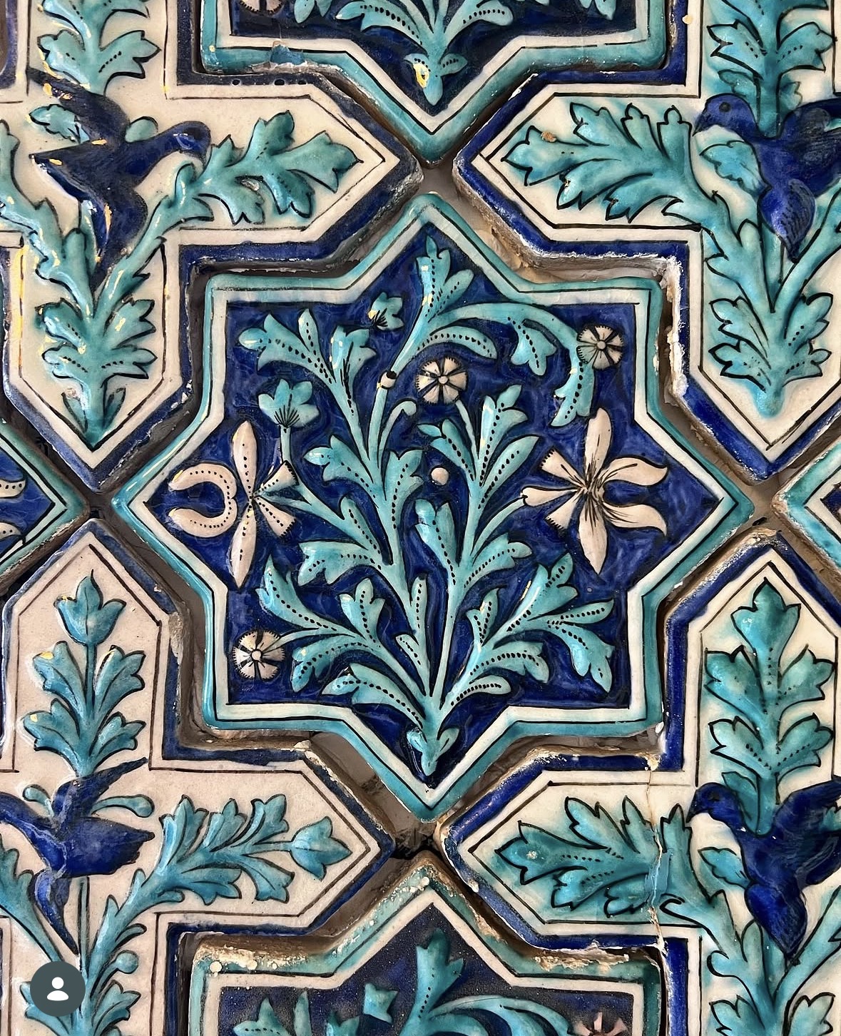
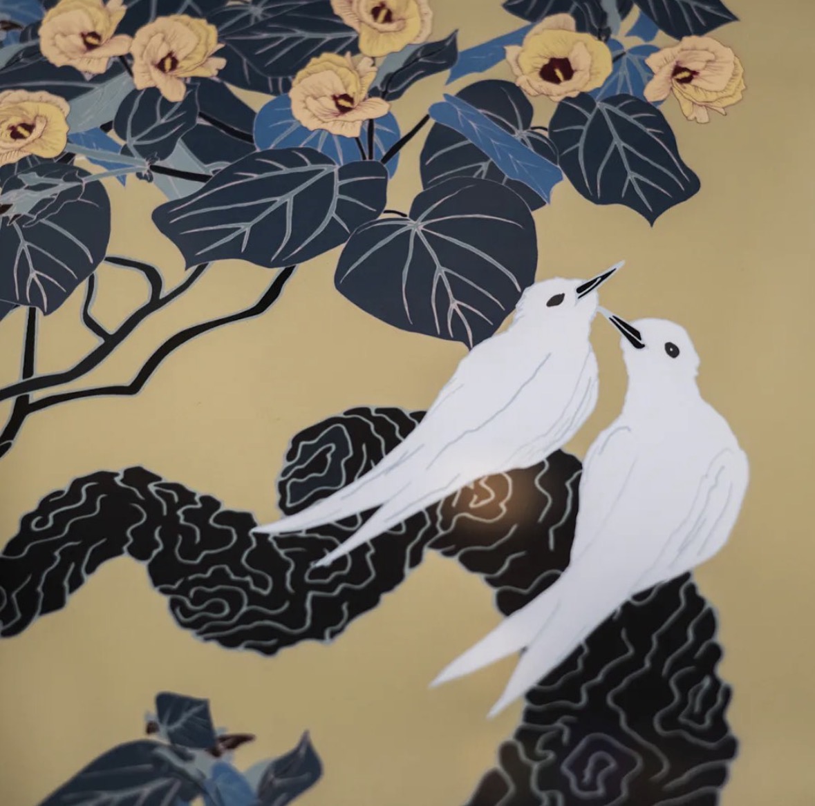
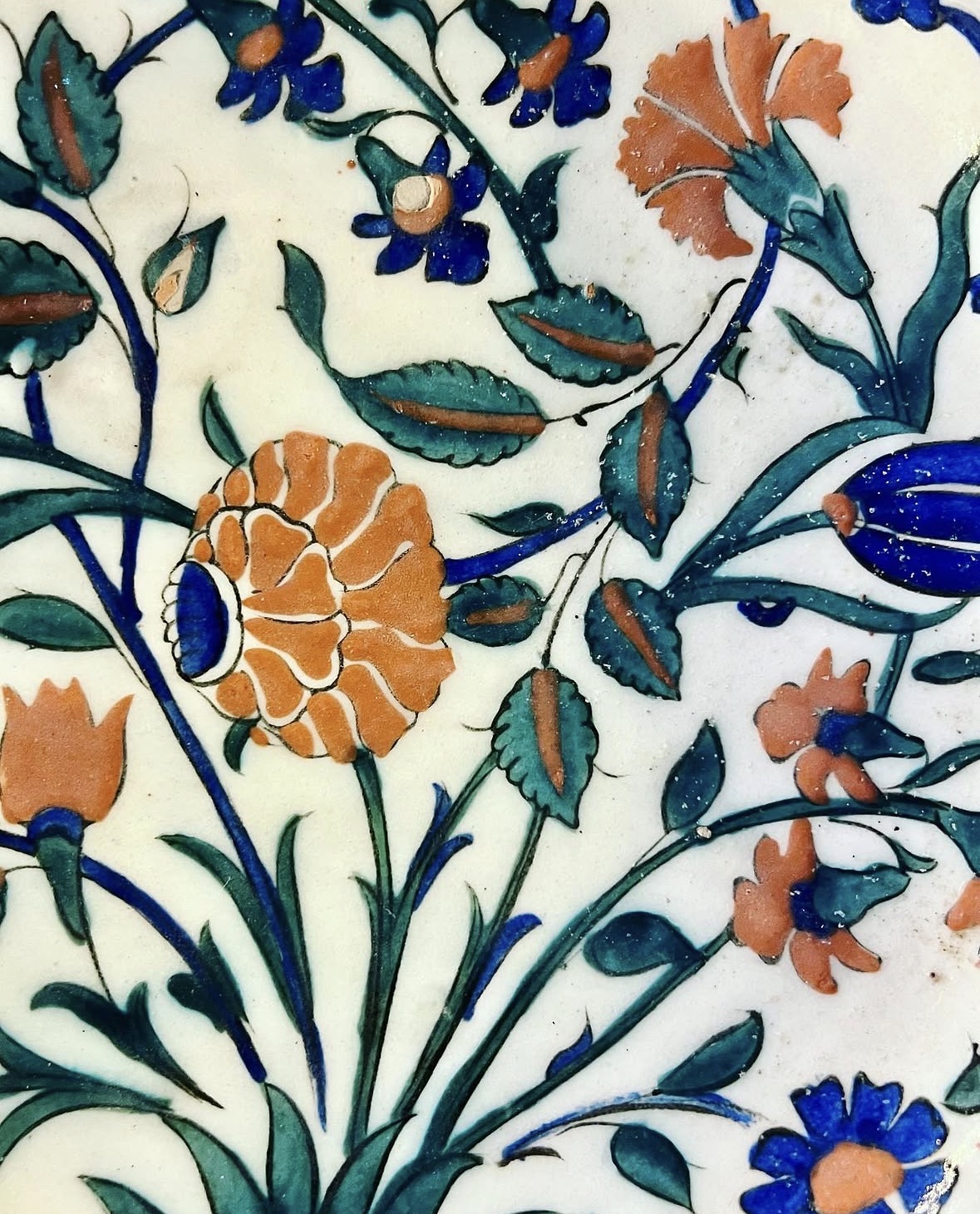
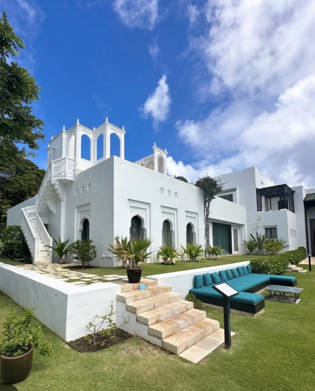
Inspiration of the week: Shangri La Museum
The Shangri La Museum of Islamic Art, Culture & Design is housed in the former home of Doris Duke near Diamond Head in Honolulu, Hawaii.
Shangri La was built between 1936 and 1938 after Duke’s honeymoon, which took her through the Islamic world. Her travels in Egypt, India, and the Middle East inspired her to design a home that reflected the beauty, diversity, and craftsmanship of Islamic art and architecture. Her experiences in North Africa and South and Southeast Asia also shaped her vision of combining Islamic design with the natural landscape of Hawaiʻi.
For nearly 60 years, Duke commissioned and collected artworks for the space, eventually forming a collection of over 4,000 objects. The structure was designed by Marion Sims Wyeth, and Duke personally collaborated with artisans to incorporate Moroccan ceilings, Persian tilework, and Mughal-style gardens into the home’s design. Over time, she expanded her collection to nearly 4,500 works, especially ceramics, wood, glass, and textiles from 1600 to 1940.
In 2002, the building opened to the public as the Shangri La Museum for Islamic Art, Design & Culture.It remains the only US museum dedicated exclusively to Islamic art, and fulfills Duke’s wish that Shangri La be open to students, scholars, and others interested in the appreciation and study of Islamic art.
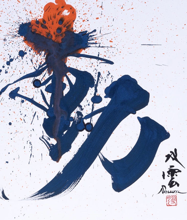
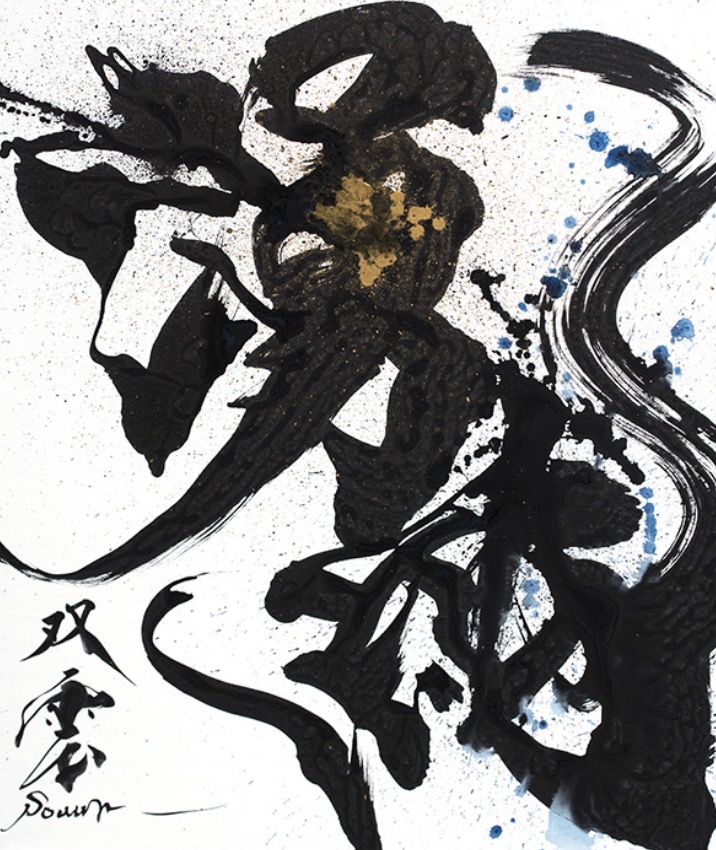
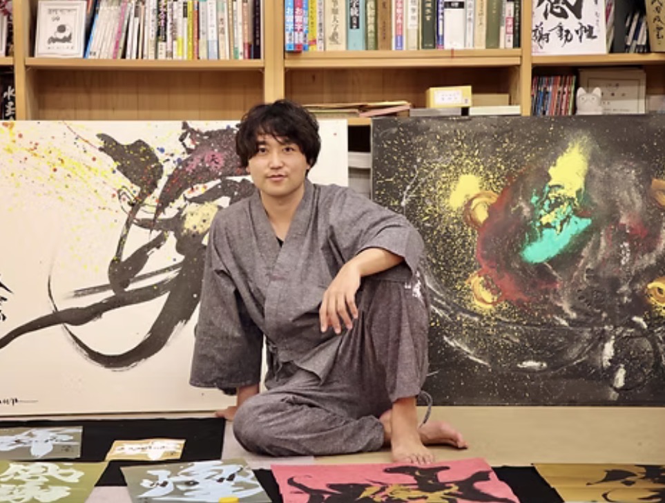
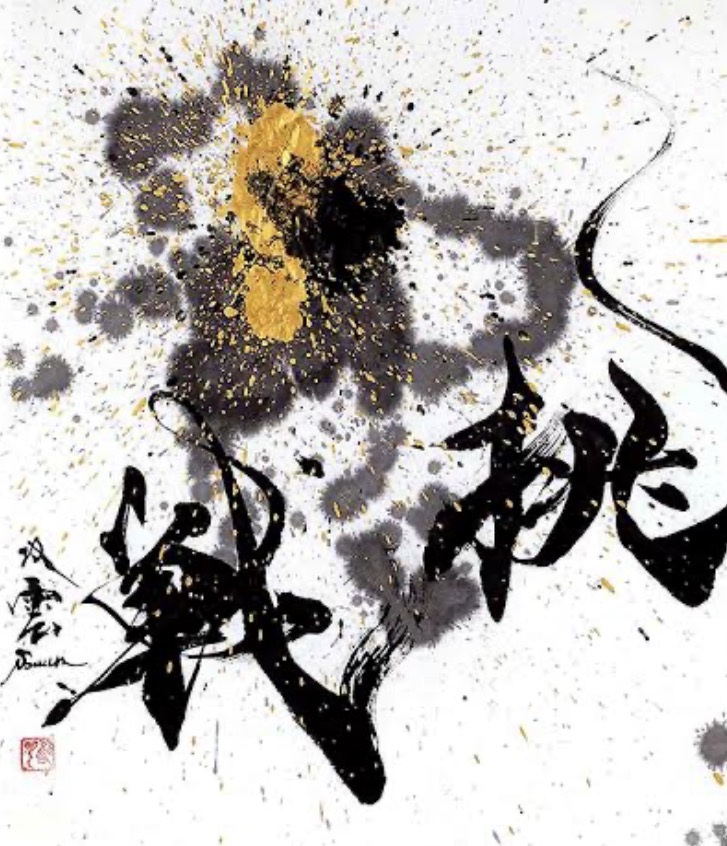
Hand lettering inspiration of the week: Souun Takeda
Souun Takeda was born in 1975 in Kumamoto Prefecture, and he trained under his mother and professional calligrapher, Souyou Takeda. After graduating from Tokyo University of Science, he joined NTT where he worked for three years before turning to the path of the calligrapher. Since then, he has worked on numerous projects, including the title lettering and logos of many films and TV programmes. In recent years, he has been expanding the range of his activities overseas.
Since his mother is a professional calligrapher, Souun Takeda first took up calligraphy at the age of three. He was brimming with lively curiosity as a child, always wondering why the strokes of a character are written in a fixed order, or what sets apart “bad” calligraphy from “good.” He often played around with calligraphy, loosening up the strokes or writing faintly on purpose.
Takeda studied engineering at university; even now, his mind is full of thoughts of atoms and equations, and he has a wealth of knowledge on the sciences. When it comes to calligraphy, it’s not as if he feels a compulsion to write. Rather, what he holds on to is his gratitude for and curiosity towards his existence in the present, a point in the long galactic time.
Words and Wildflowers Creative Prompts – Issue 114
Posted on September 21, 2026
We LOVE research and learning as a way to get inspired and boost ideas and creativity!! So, Kenzie and I are going to be sharing the inspiration that we collect here in our second newsletter…. once a week!!!
Here’s how it works:
We provide the inspiration. You interpret it however you wish… any medium, any size. It is meant to inspire lettering and floral art combined together. But, you can:
- Just do the florals, just do the lettering, or combine them together.
- Use the provided quote for your piece or select your own.
- Use colors from one of the inspiration images or select your own favorites
- Create the floral art… as a still life in a vase, a single flower, a border, a pattern, a bouquet
Hope you will create with us and post your work at #wordsandwildflowers2026 and tag @lorisiebert.studio and @snippetsofwhimsy
Quote of the week…
“Everything you’ve ever wanted is on the other side of fear.”
— George Addair
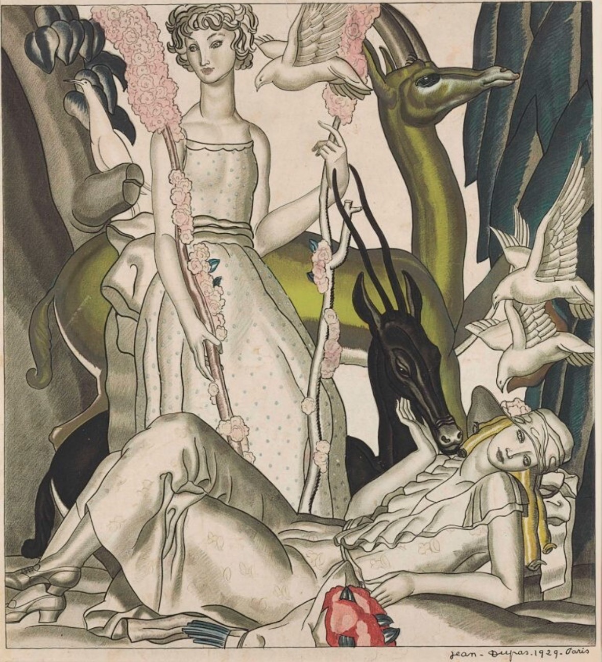
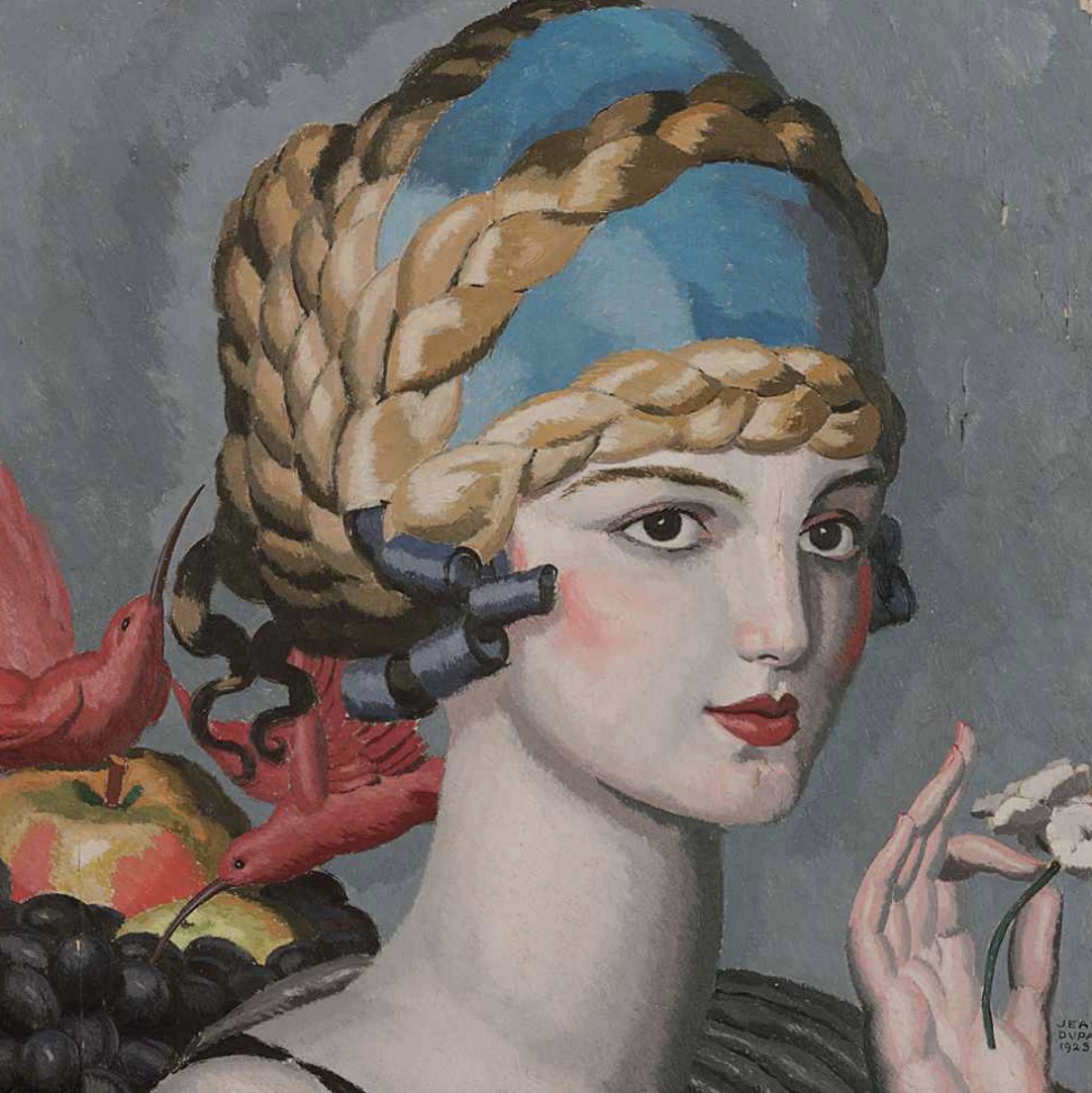
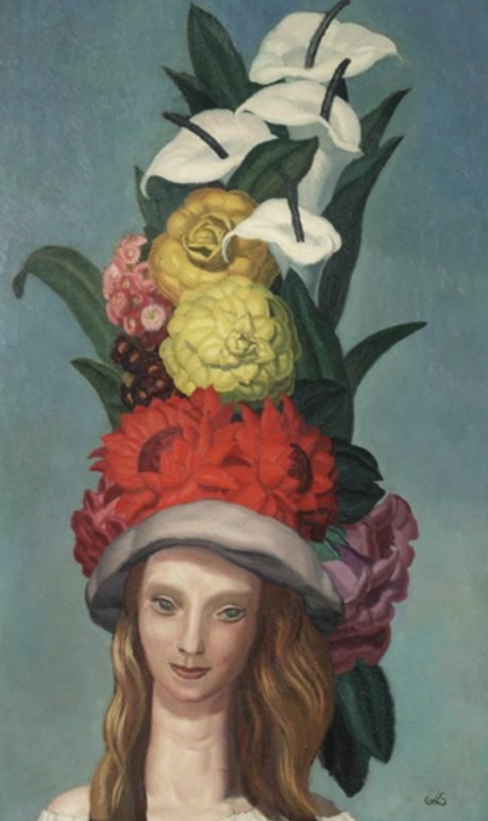
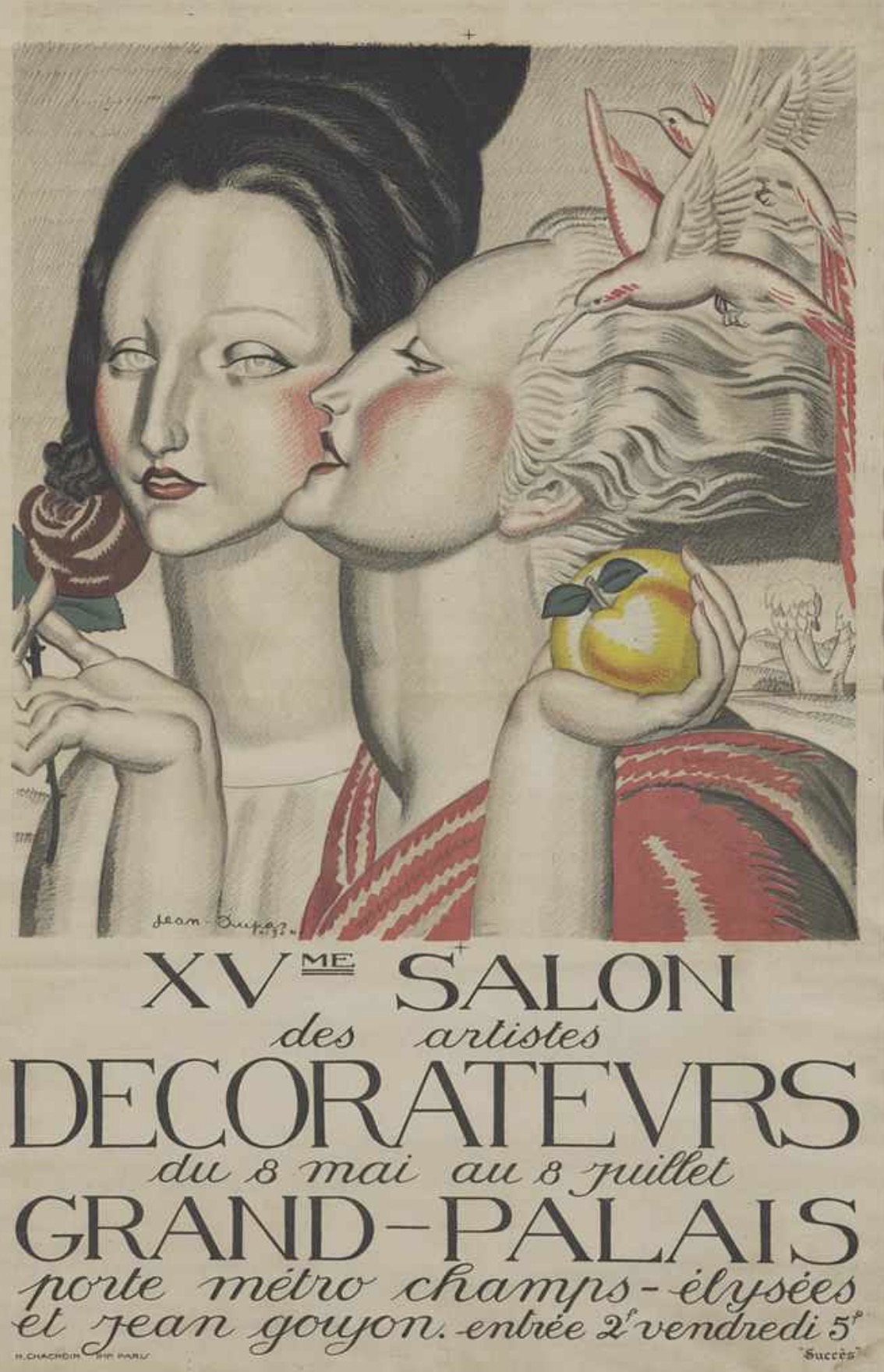
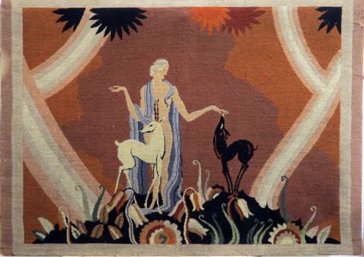
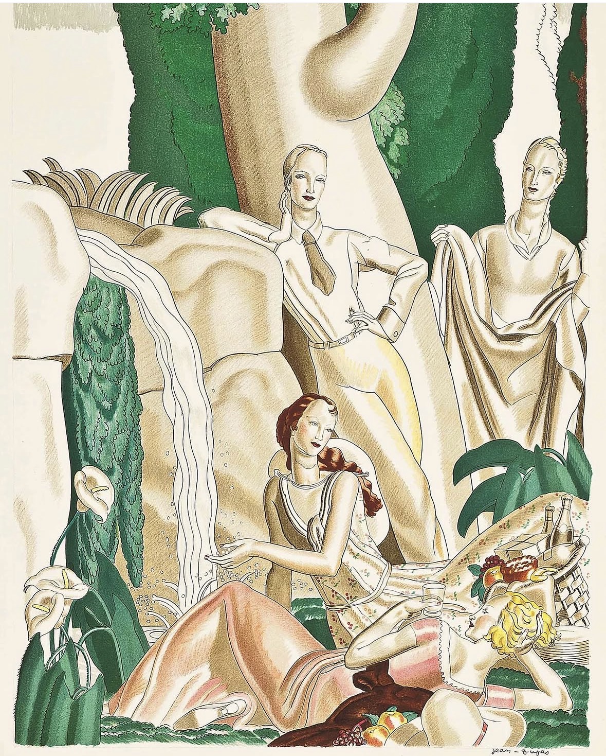
Inspiration of the week: Jean Dupas
Born in Bordeaux in 1882, and initially trained as an academic painter, from the 1920s onwards Jean Dupas worked as a creative painter-decorator, producing diverse works ranging from grand scale murals and panels, to posters and other commercial designs.
Despite his varied artistic interests, Dupas’ style remained distinct and immediately recognisable throughout his career, his work characterised by unique scenes set in dreamscape surroundings and figures always statuesque and elegant in appearance, with gracefully elongated necks and fashionably stylised looks.
Jean Dupas created two decorative poster panels for the London Underground in 1930; Thence to Hyde Park and Where is this Bower Beside the Silver Thames. Arguably some of his best graphic work, the panels promoted the charms of London life, and specifically the leisure destinations that the Underground brought into easy reach.
Jean Dupas is today considered among the greatest artists of the Art Deco movement.
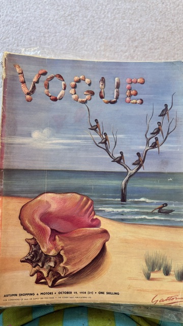
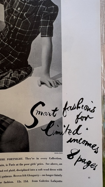
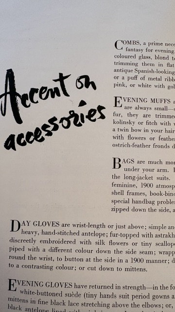
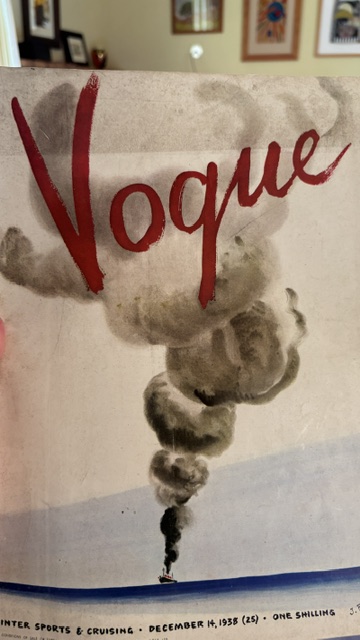
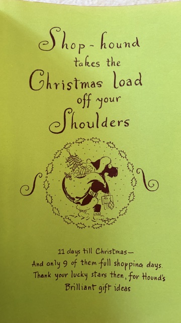
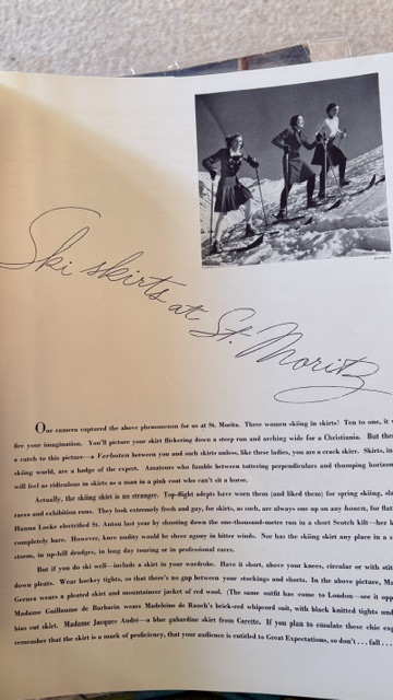
Hand lettering inspiration of the week: Vintage Vogue Magazines
With had the opportunity to look through a stack of Vogue magazines from the 1930’s. The illustrations and lettering …SO INSPIRING!!
Words and Wildflowers Creative Prompts – Issue 113
Posted on September 14, 2026
We LOVE research and learning as a way to get inspired and boost ideas and creativity!! So, Kenzie and I are going to be sharing the inspiration that we collect here in our second newsletter…. once a week!!!
Here’s how it works:
We provide the inspiration. You interpret it however you wish… any medium, any size. It is meant to inspire lettering and floral art combined together. But, you can:
- Just do the florals, just do the lettering, or combine them together.
- Use the provided quote for your piece or select your own.
- Use colors from one of the inspiration images or select your own favorites
- Create the floral art… as a still life in a vase, a single flower, a border, a pattern, a bouquet
Hope you will create with us and post your work at #wordsandwildflowers2026 and tag @lorisiebert.studio and @snippetsofwhimsy
Quote of the week…
“I want to paint the way a bird sings.”
— Claude Monet
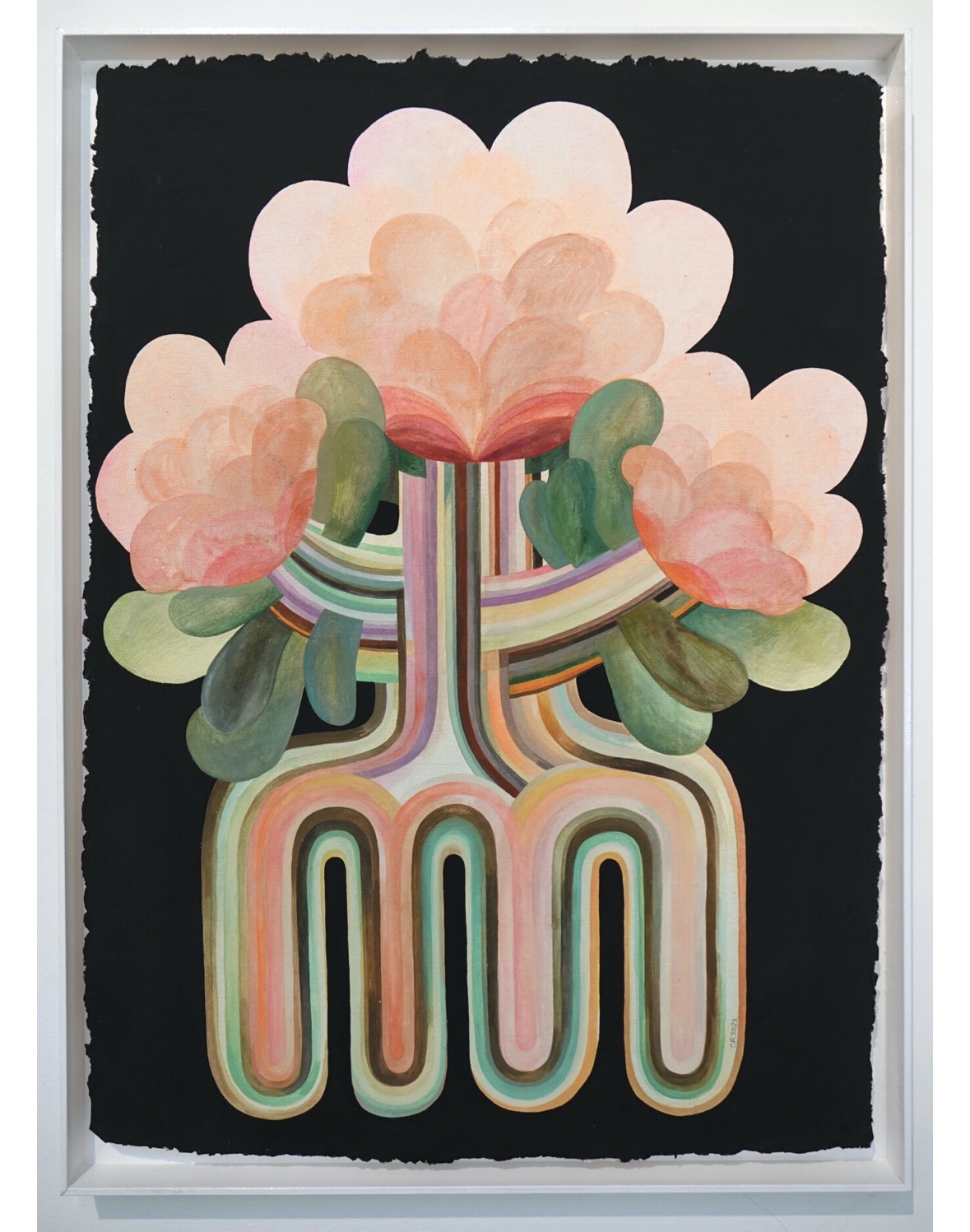
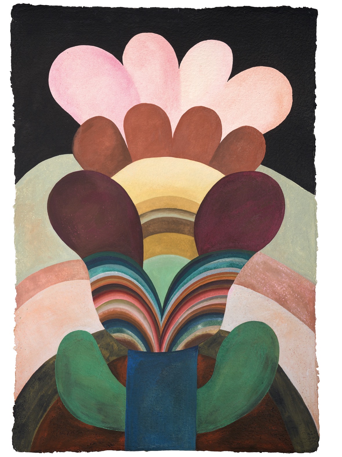
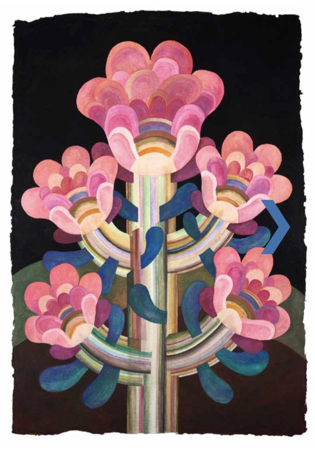
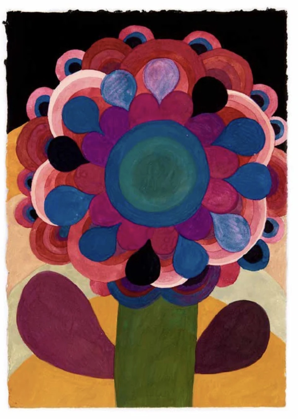
Inspiration of the week: Caroline Rennequin
Caroline Rennequin (born 1970) is a multi-disciplinary French visual artist, painter, and set designer who lives and works in Paris. Her eclectic work is highly regarded for its vibrant color blocks, organic/botanical motifs, and a distinct aesthetic sensibility deeply rooted in 1970s utopias. Alongside her independent studio practice, she maintains a prominent career as an artistic director in the luxury fashion world.
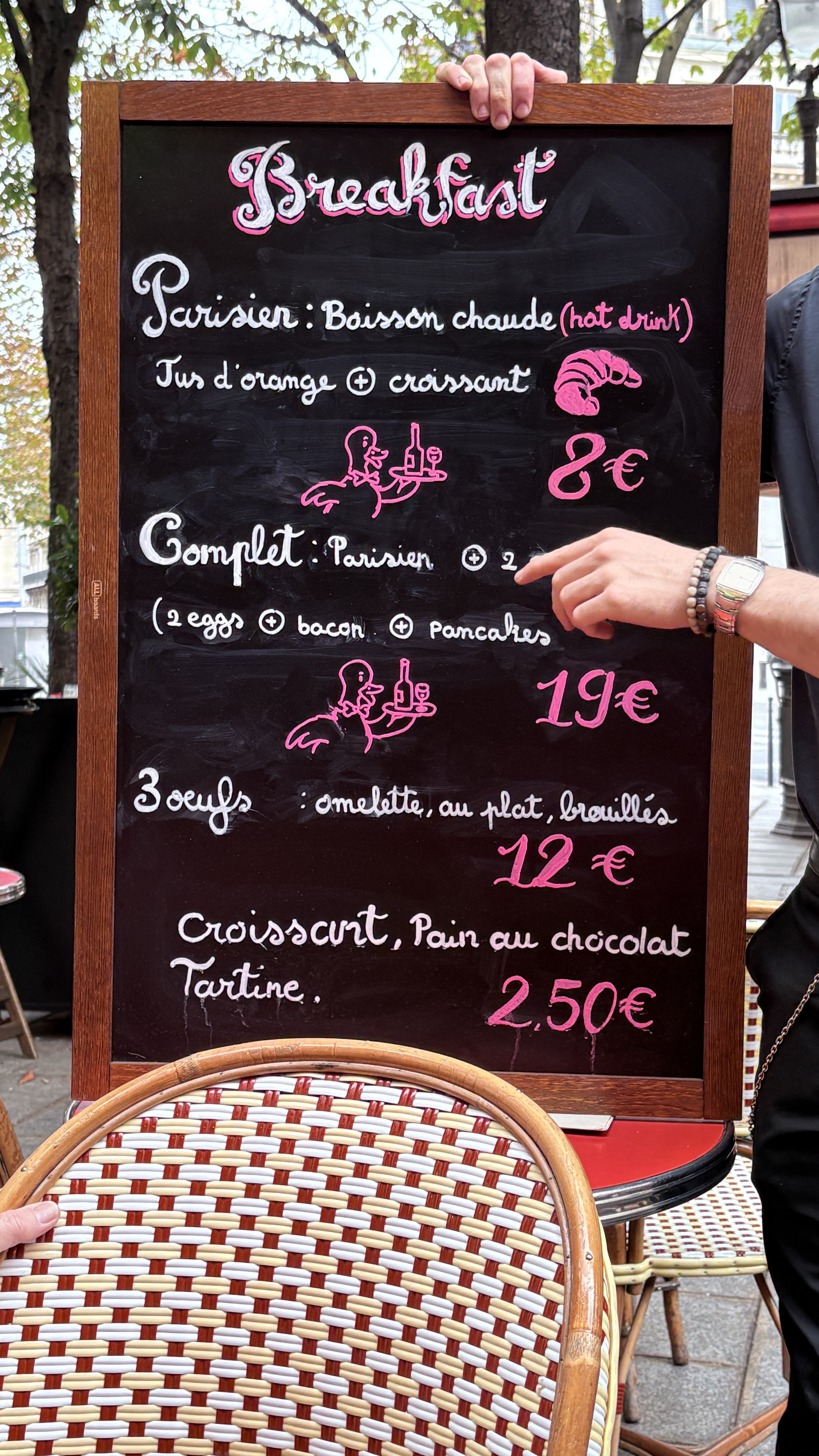
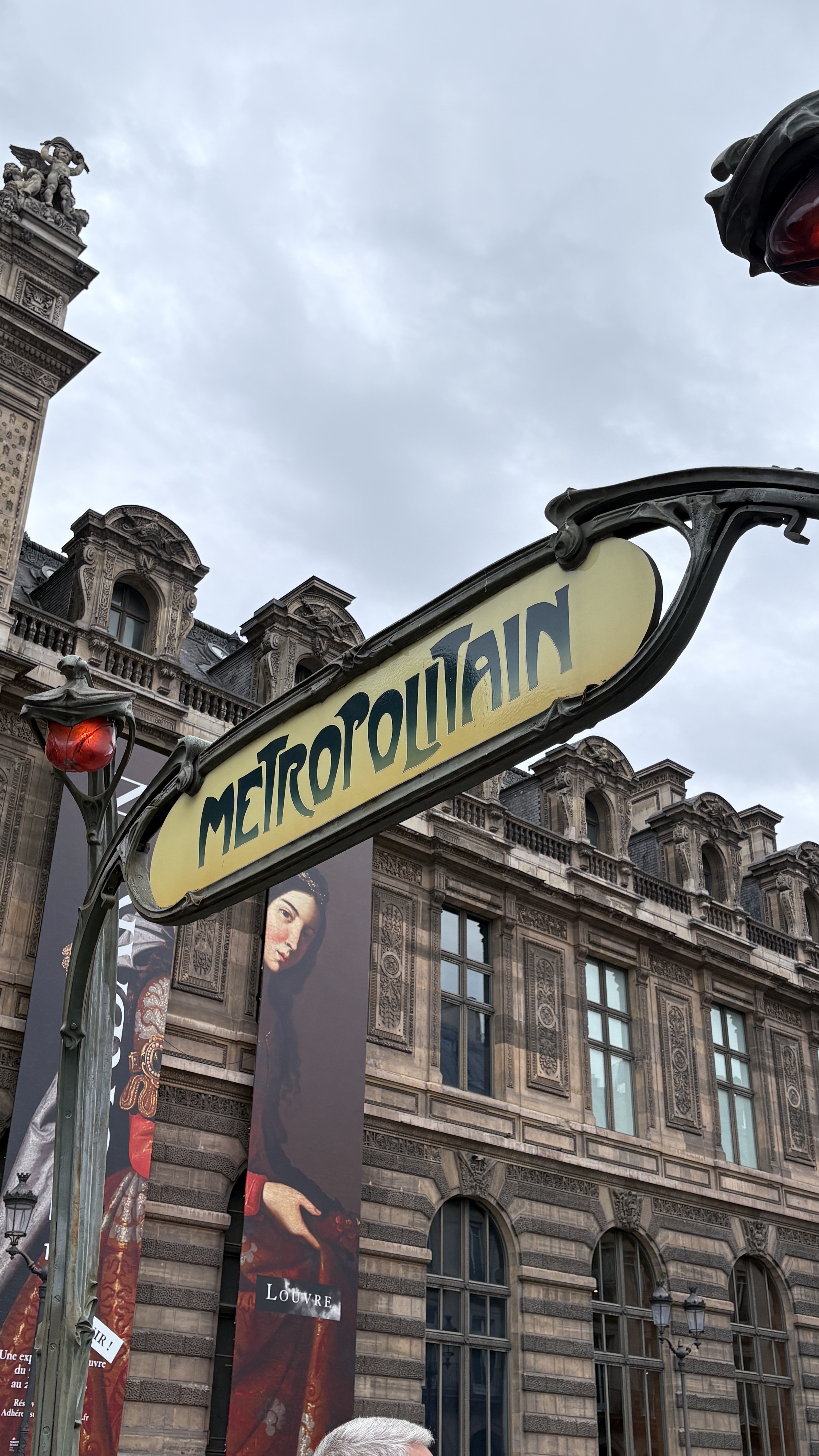
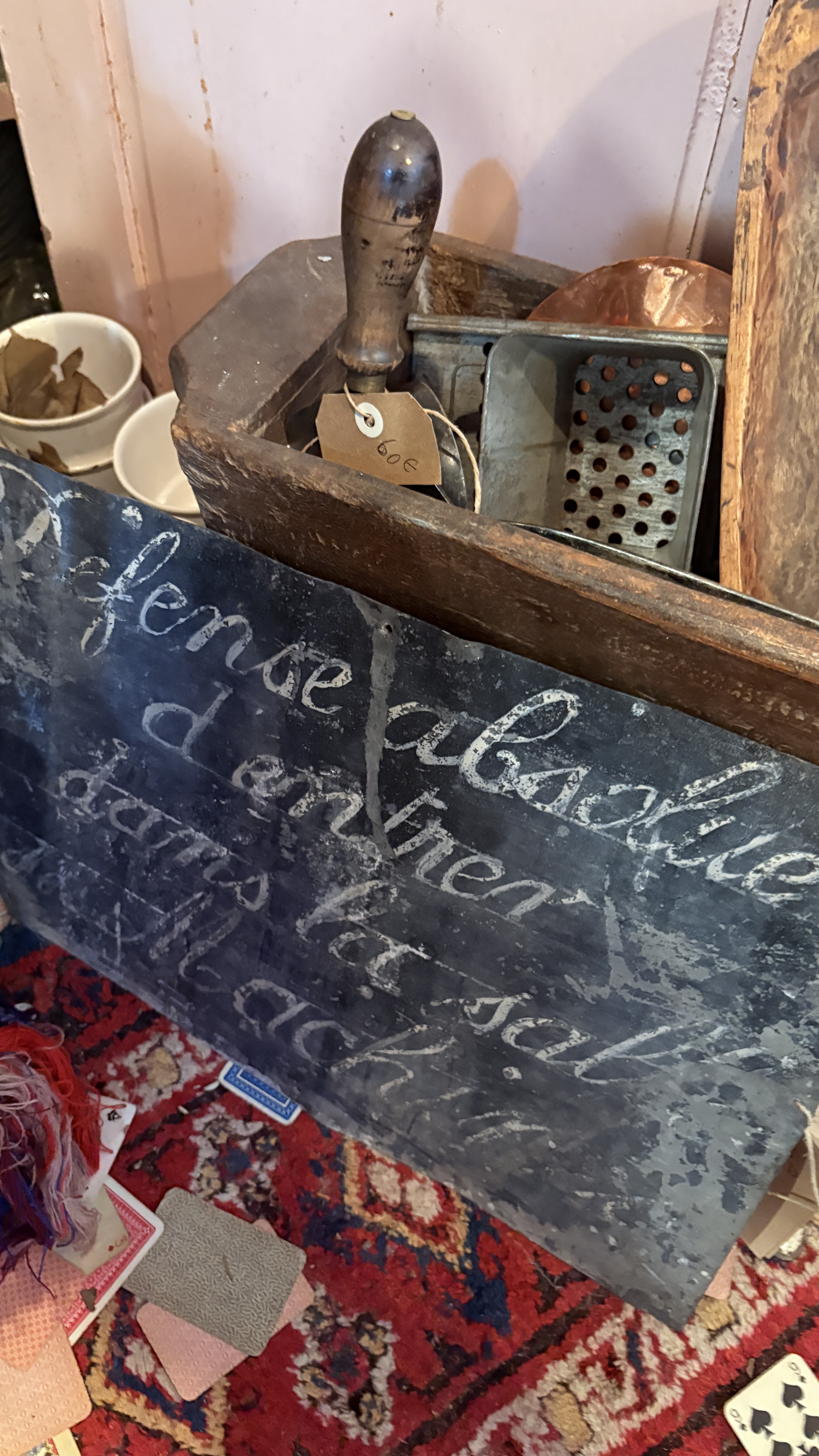
Hand lettering inspiration of the week:
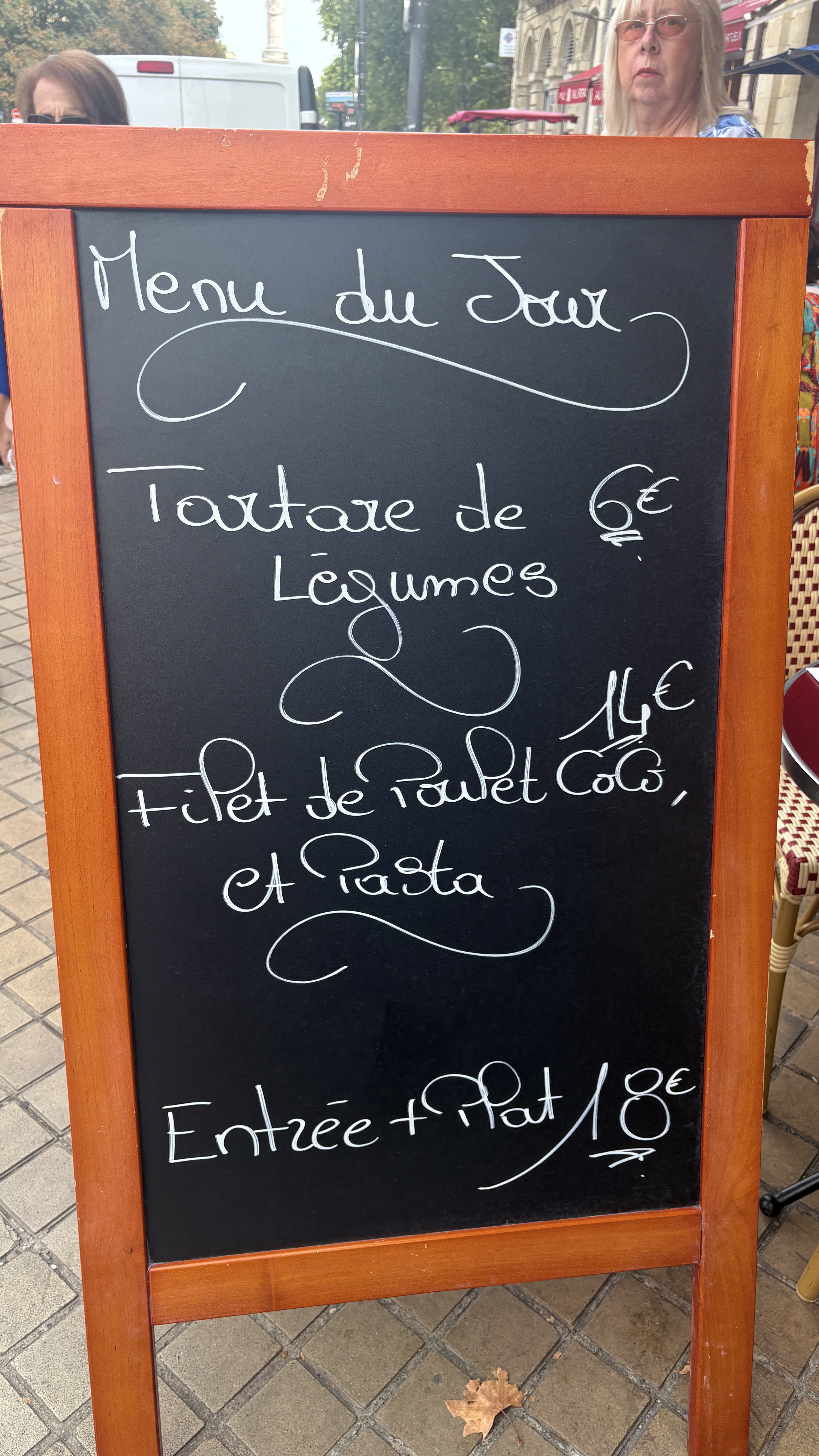
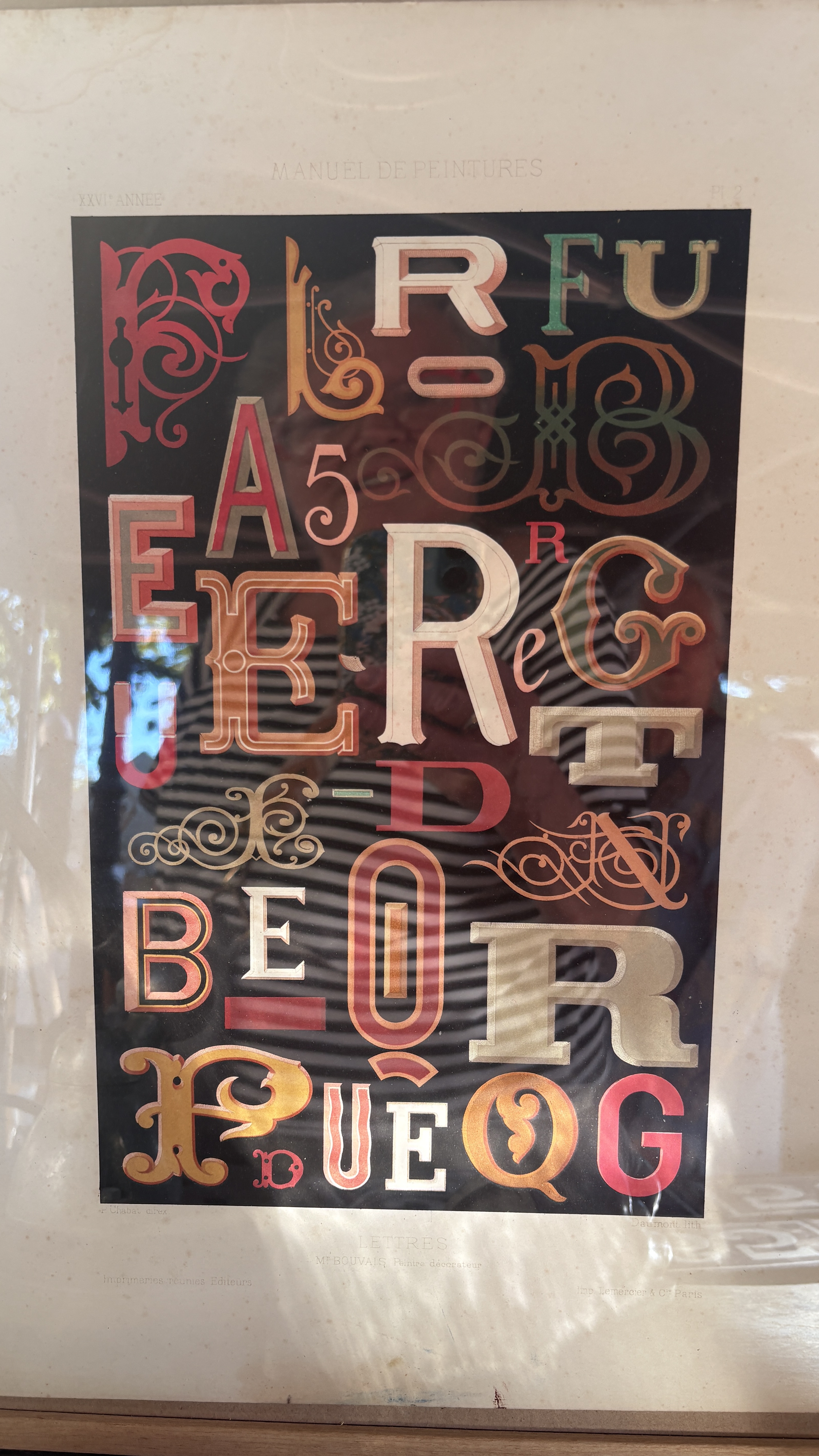
More lettering from France. I can’t help myself from taking pictures of type everywhere I go!
Words and Wildflowers Creative Prompts – Issue 112
Posted on September 8, 2026
We LOVE research and learning as a way to get inspired and boost ideas and creativity!! So, Kenzie and I are going to be sharing the inspiration that we collect here in our second newsletter…. once a week!!!
Here’s how it works:
We provide the inspiration. You interpret it however you wish… any medium, any size. It is meant to inspire lettering and floral art combined together. But, you can:
- Just do the florals, just do the lettering, or combine them together.
- Use the provided quote for your piece or select your own.
- Use colors from one of the inspiration images or select your own favorites
- Create the floral art… as a still life in a vase, a single flower, a border, a pattern, a bouquet
Hope you will create with us and post your work at #wordsandwildflowers2026 and tag @lorisiebert.studio and @snippetsofwhimsy
Quote of the week…
“If you don’t like the road you’re walking, start paving another one.”
— Dolly Parton
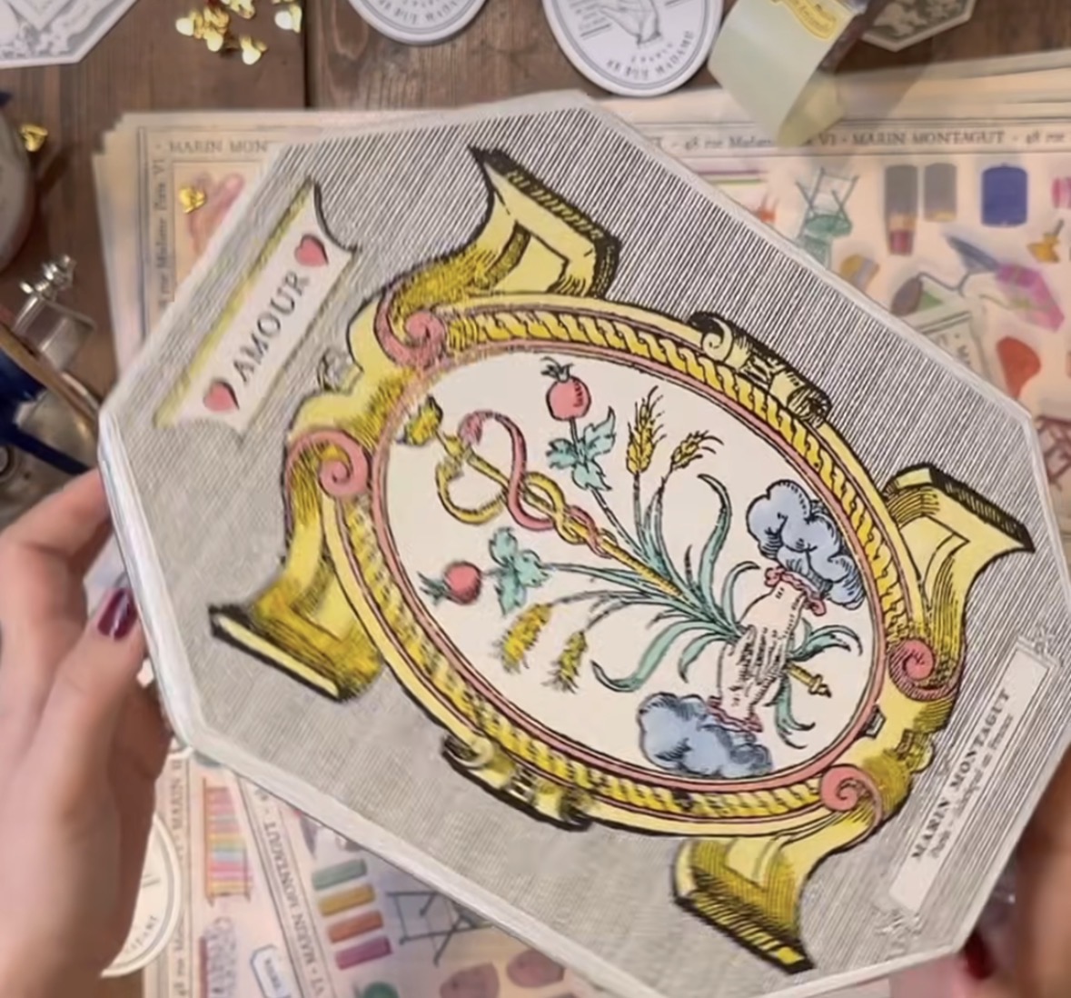
Inspiration of the week: Marin Montagut
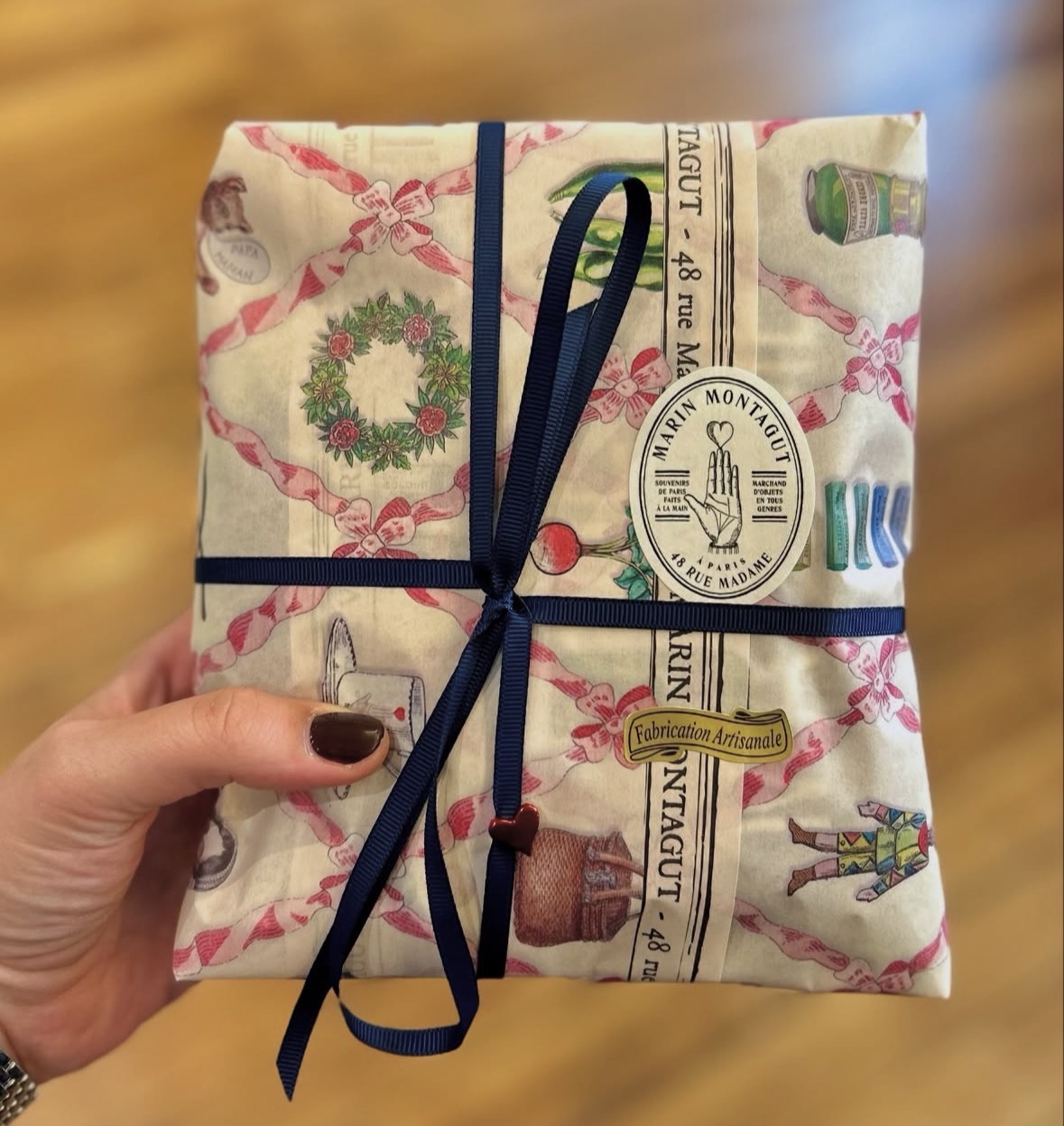
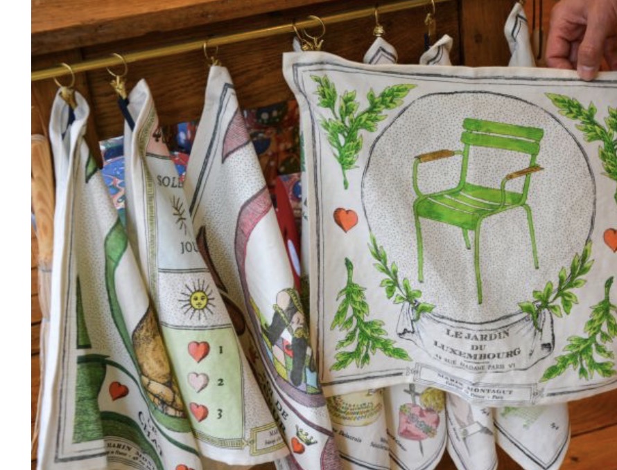
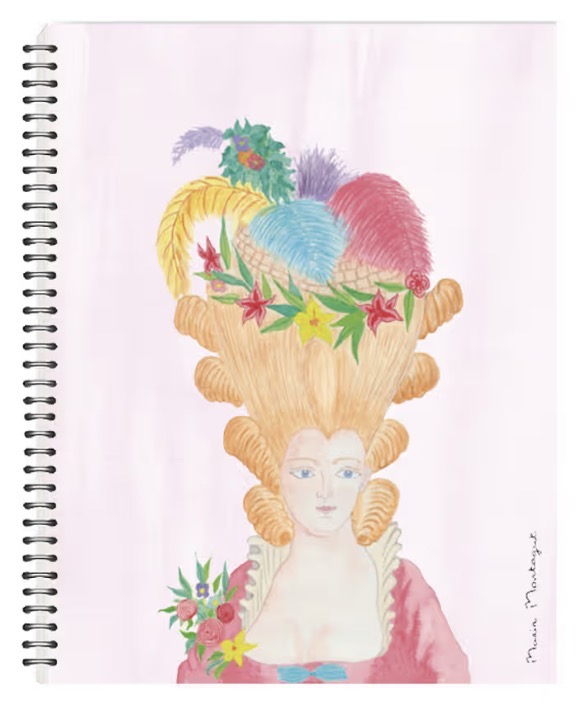
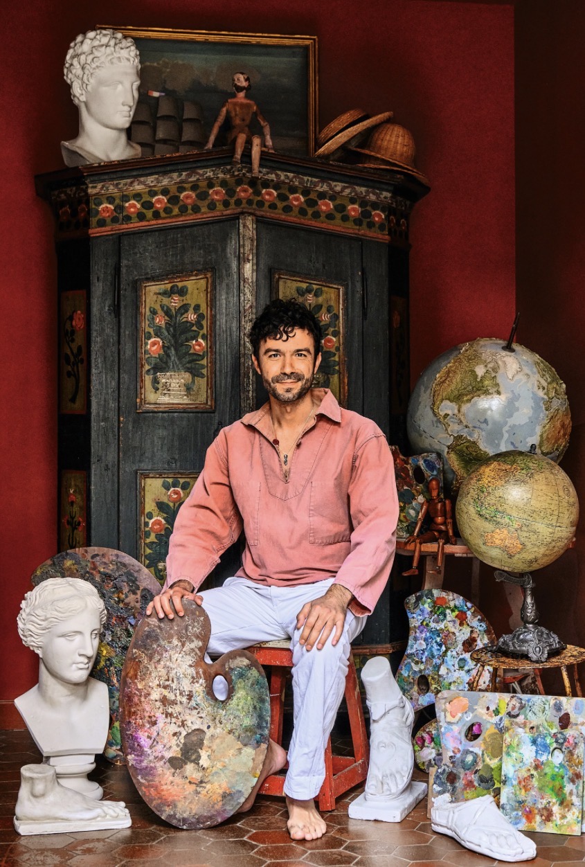
Marin Montagut is a French artist, illustrator, and designer known for his whimsical watercolors and his signature Parisian boutique.
Background and Early Life
Marin Montagut grew up surrounded by art and antiques. His grandmother was an artist, and his mother organizes antique fairs.
He studied at Saint Martins College of Art and Design in London and is now an interior and set designer, film director, producer, and illustrator.
Montagut worked for 15 years traveling the world, making documentaries, and collaborating with major luxury and design houses.
He created Bonjour City Map Guides, which are illustrated pocket guides highlighting secret spots in cities like Paris, London, and New York.
In June 2020, he opened his flagship store at 48 rue Madame in the 6th arrondissement of Paris.
Under his eponymous brand, he creates objects that celebrate the Official Marin Montagut History and “celebrate his favorite neighborhoods with elegance and accuracy.”
He splits his time between his vibrant Parisian life and a 19th-century cottage in Normandy. This rural retreat serves as his main source of inspiration and primary design studio.
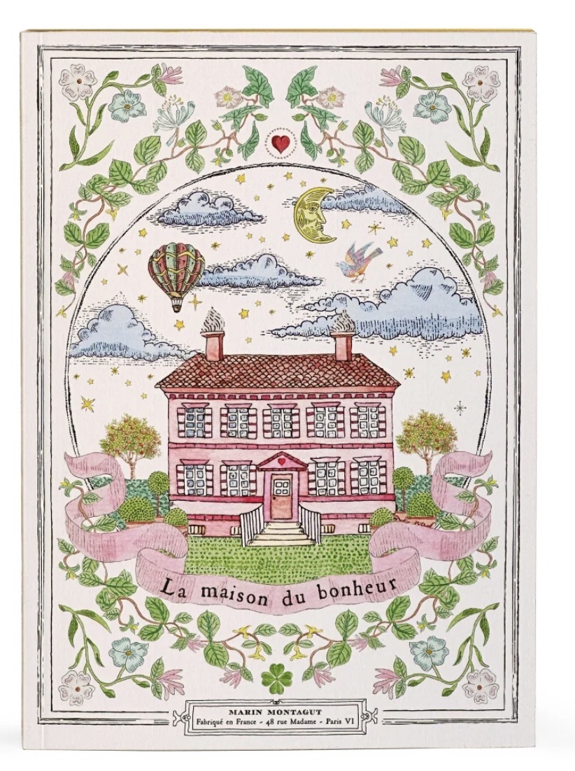
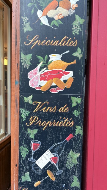
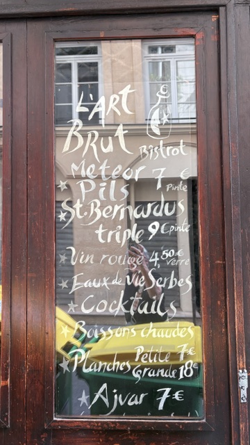
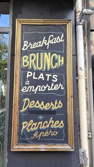
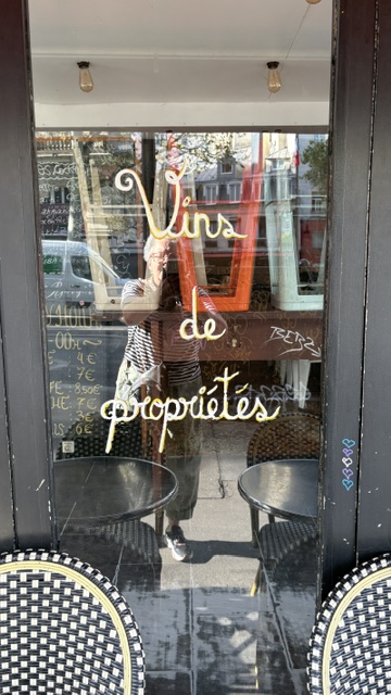
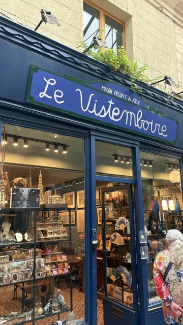
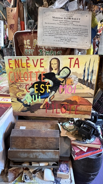
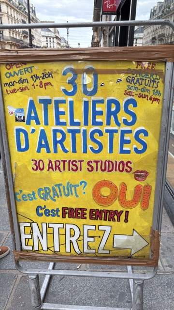
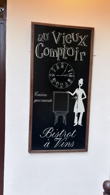
Hand lettering inspiration of the week:
I’m in France teaching a retreat. Here are a few lettering examples that grabbed my eye!
Words and Wildflowers Creative Prompts – Issue 111
Posted on August 31, 2026
We LOVE research and learning as a way to get inspired and boost ideas and creativity!! So, Kenzie and I are going to be sharing the inspiration that we collect here in our second newsletter…. once a week!!!
Here’s how it works:
We provide the inspiration. You interpret it however you wish… any medium, any size. It is meant to inspire lettering and floral art combined together. But, you can:
- Just do the florals, just do the lettering, or combine them together.
- Use the provided quote for your piece or select your own.
- Use colors from one of the inspiration images or select your own favorites
- Create the floral art… as a still life in a vase, a single flower, a border, a pattern, a bouquet
Hope you will create with us and post your work at #wordsandwildflowers2026 and tag @lorisiebert.studio and @snippetsofwhimsy
Quote of the week…
“I accept the great adventure of being me.”
— Simone de Beauvoir
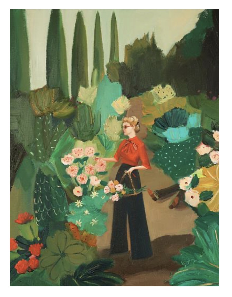
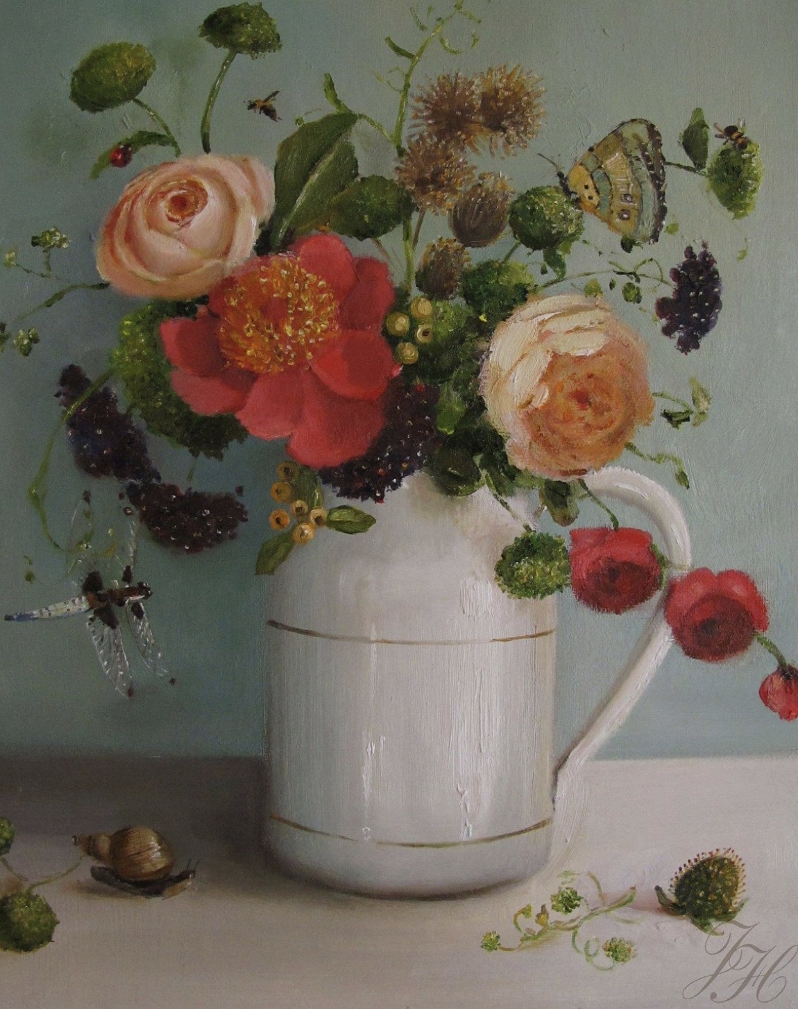
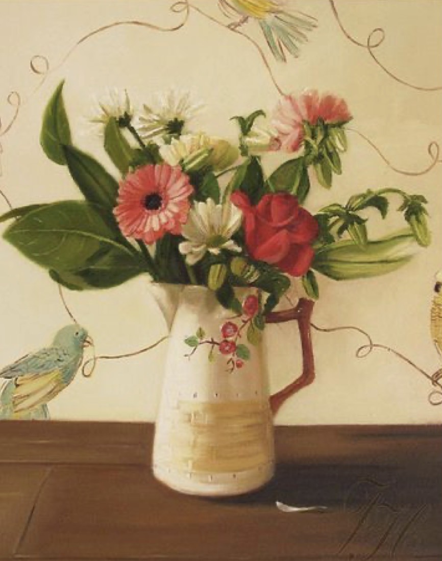
Inspiration of the week: Janet Hill
Janet Hill can do it all. As beloved as she is as a children’s author, she is also an incredibly talented, masterful painter. Her work is both elegant, yet whimsical, often with an underlying narrative that instantly captures the imagination. Her painting style evokes a sense of nostalgia, mystery, humor and comfort. She has works displayed in private collections throughout North America, Europe, Asia, and Australia, and she holds a client roster that includes the world-renowned Tiffany & Co.
Janet lives in Stratford, Ontario, where she keeps an in-house artist’s studio, along with her husband, John, an independent bookseller, and their cat and dog.
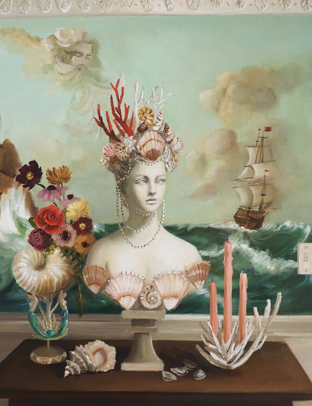
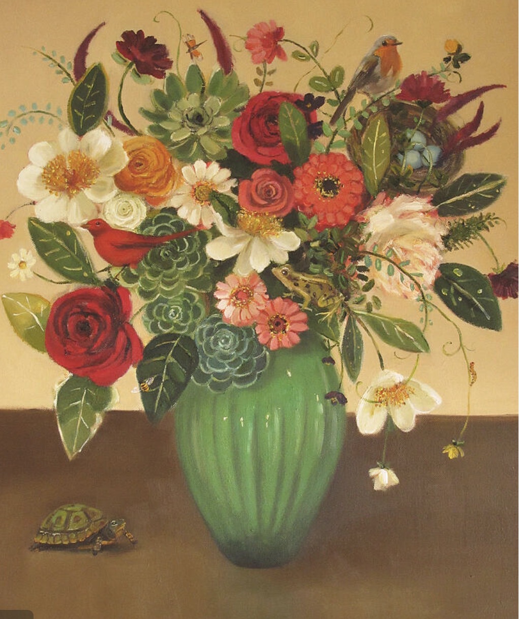
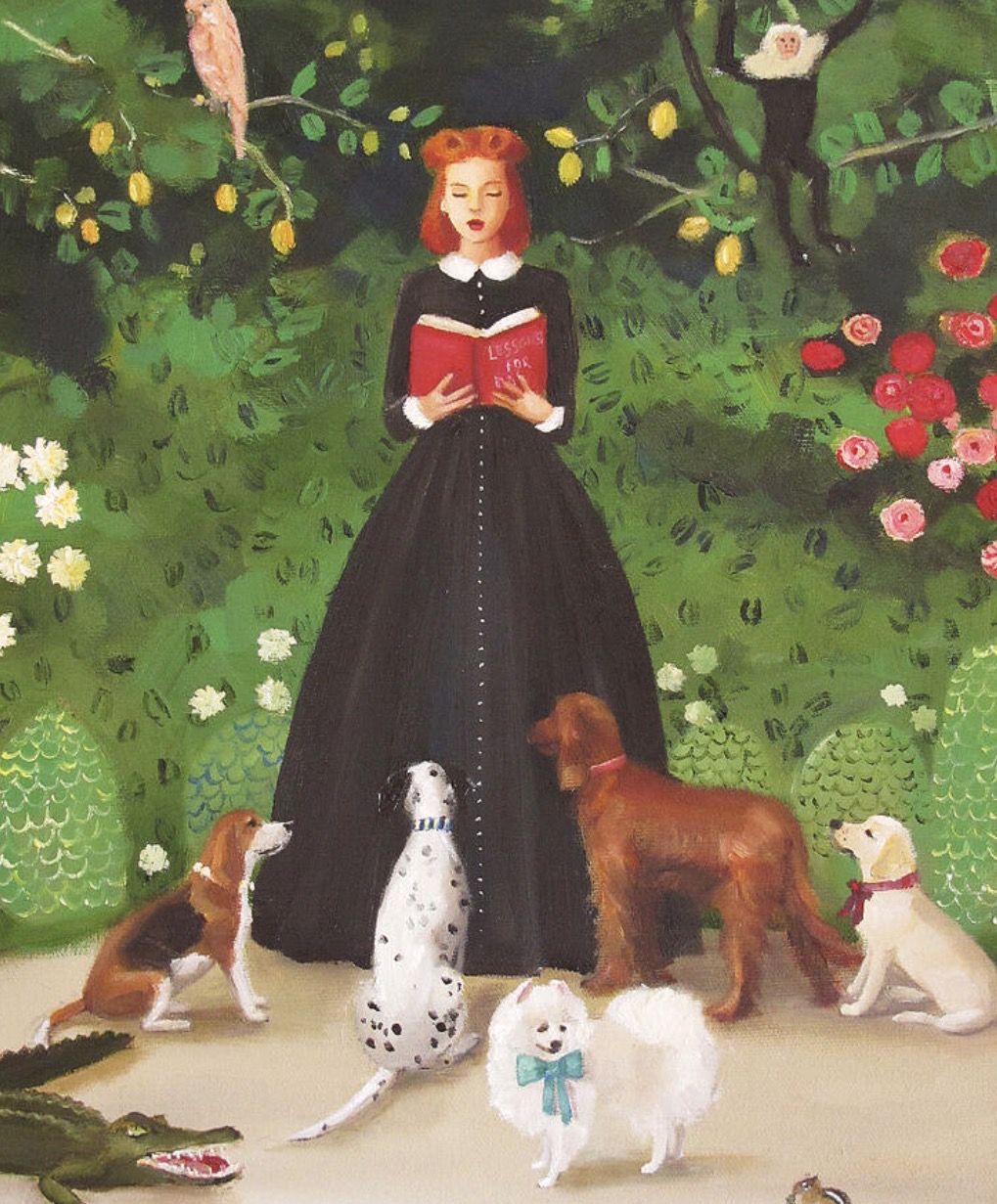
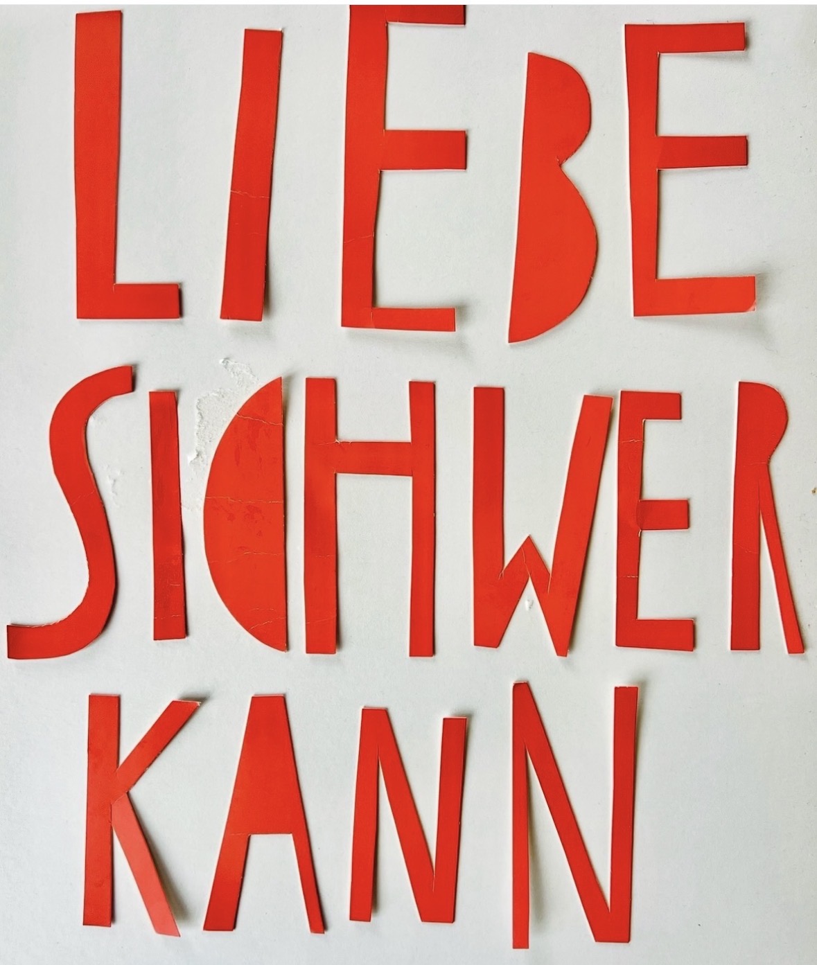
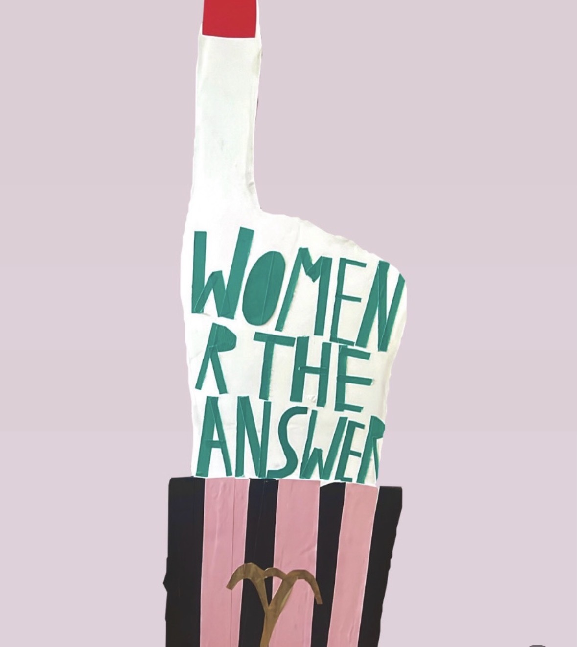
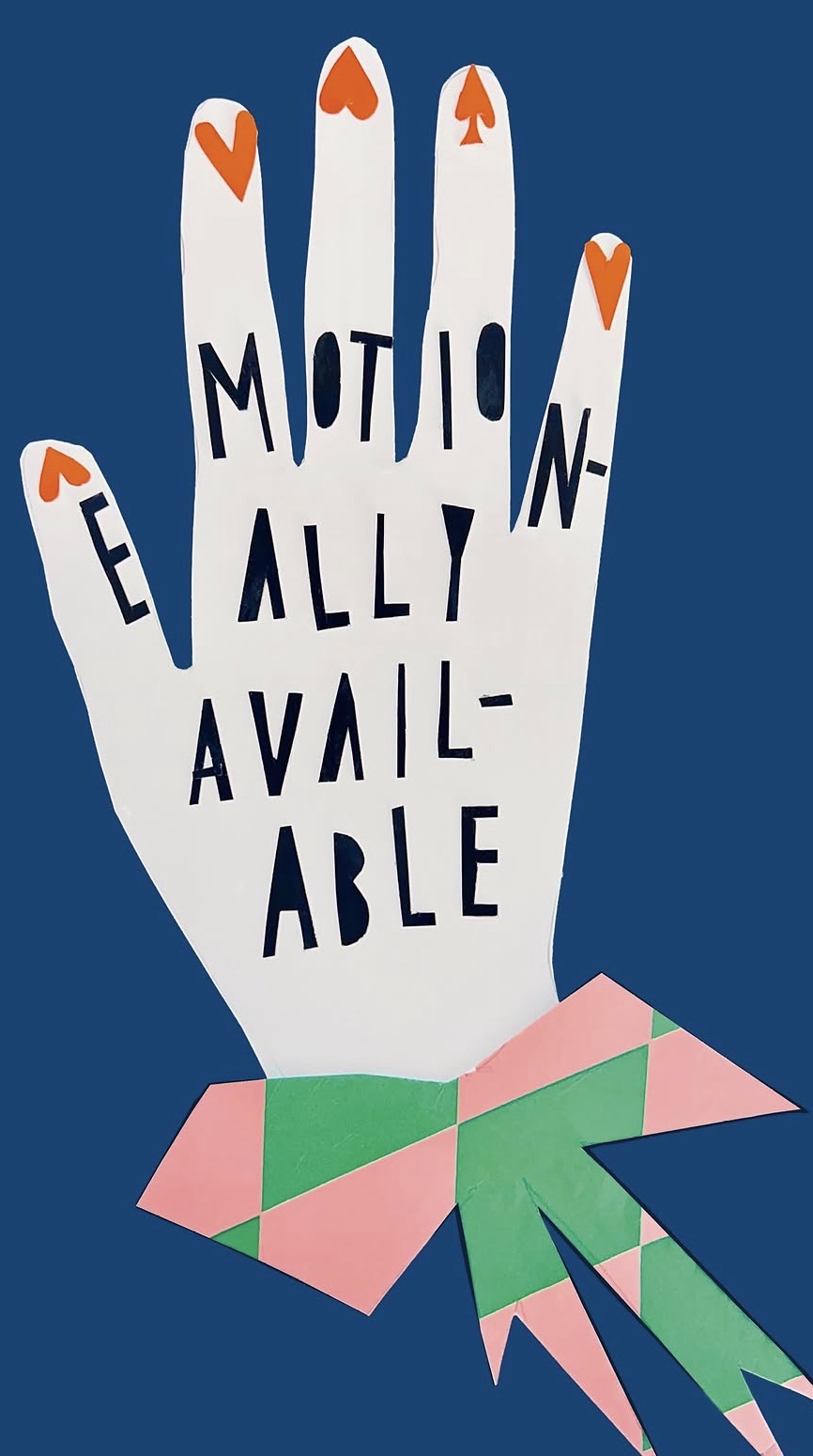
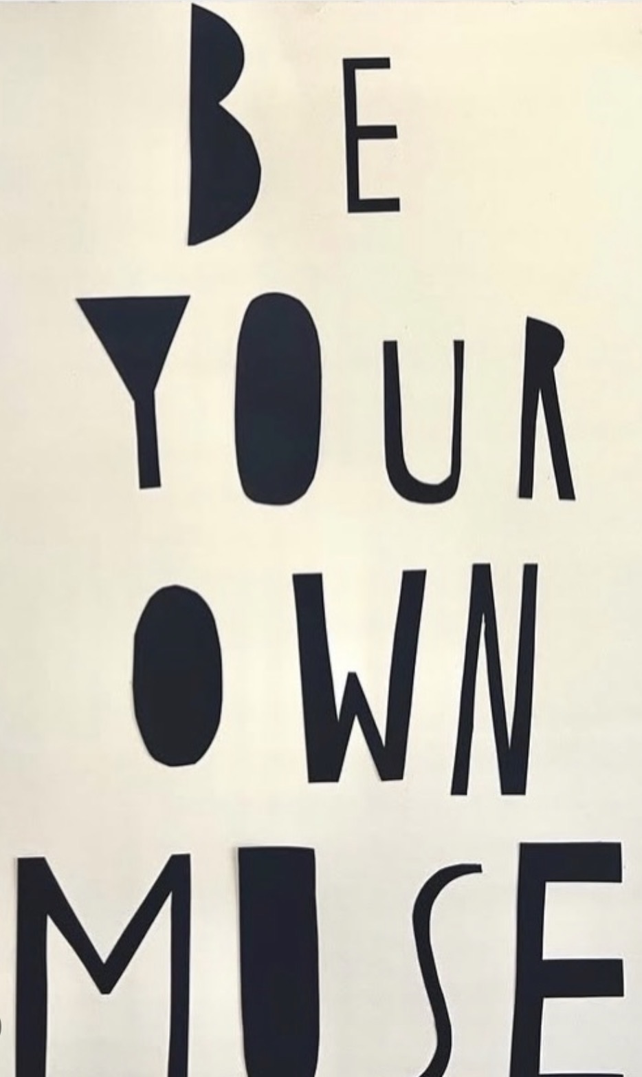
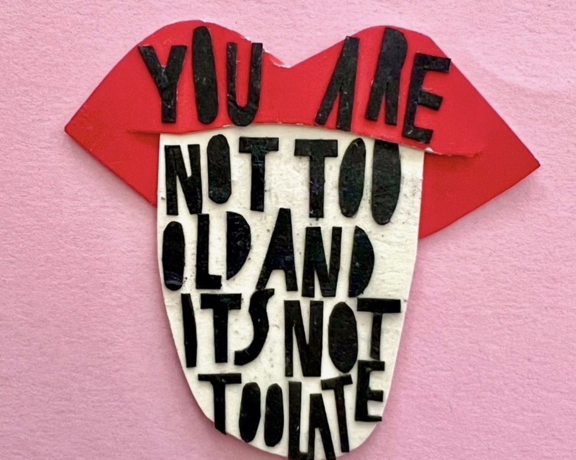
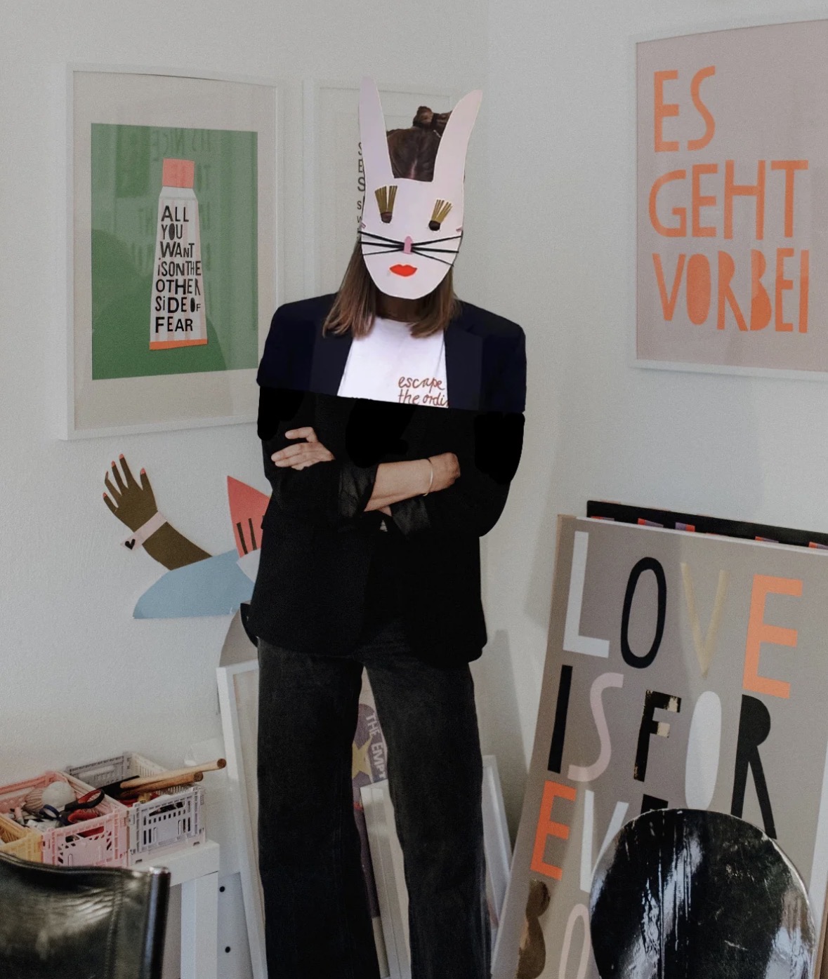
Hand lettering inspiration of the week: Nina Greif-Reitzenstein
The colorful crew is a conscious contemporary clothing label which was founded in 2016 by paper artist & creative director Nina Greif-Reitzenstein.
Working with paper accompanied Nina since her school days. She studied Product Development for the Fashion Industries at London College of Fashion and Arts & Illustration at the University of Westminster. In her work, the artist processes themes that inspire her in her everyday life.
Poetic, very personal pieces with a clear message arise, while working with her favorite material PAPER. This is how collages, sculptures and objects come to life.
For her contemporary fashion label she brings colorful (handmade) paper art on organic t-shirts, sweaters and accessories. Her designs are fresh, and modern READY TO WEAR pieces, that are simultaneously fun to wear.
Our manufacturers are Oeko Tex 100 certified. Some of our suppliers are also certified within the Fair Wear Foundation.
Words and Wildflowers Creative Prompts – Issue 110
Posted on August 24, 2026
We LOVE research and learning as a way to get inspired and boost ideas and creativity!! So, Kenzie and I are going to be sharing the inspiration that we collect here in our second newsletter…. once a week!!!
Here’s how it works:
We provide the inspiration. You interpret it however you wish… any medium, any size. It is meant to inspire lettering and floral art combined together. But, you can:
- Just do the florals, just do the lettering, or combine them together.
- Use the provided quote for your piece or select your own.
- Use colors from one of the inspiration images or select your own favorites
- Create the floral art… as a still life in a vase, a single flower, a border, a pattern, a bouquet
Hope you will create with us and post your work at #wordsandwildflowers2026 and tag @lorisiebert.studio and @snippetsofwhimsy
Quote of the week…
“The arts can transform health, wellbeing, and human connection.”
— Professor Daisy Fancourt
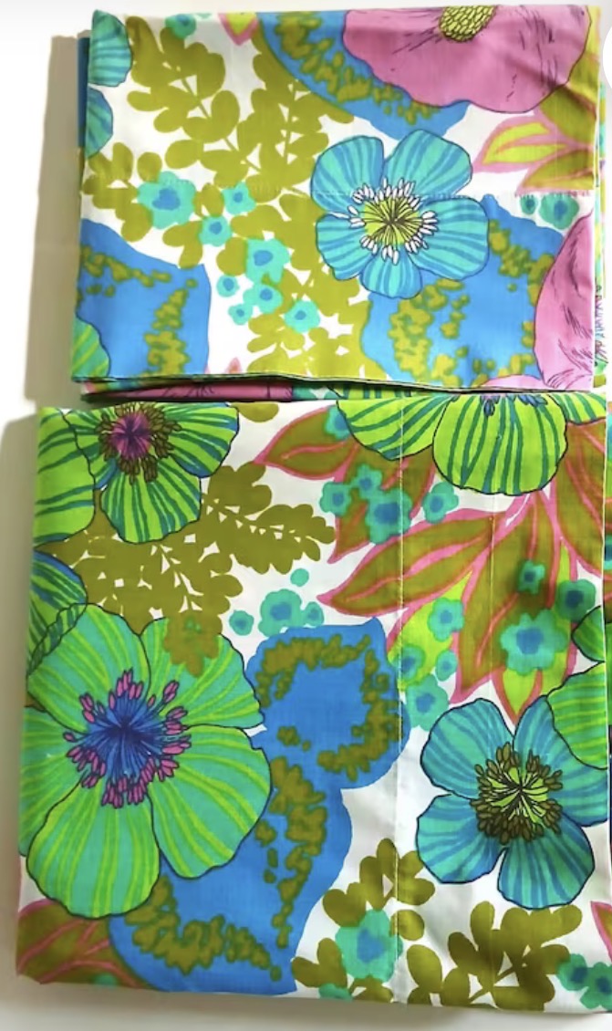
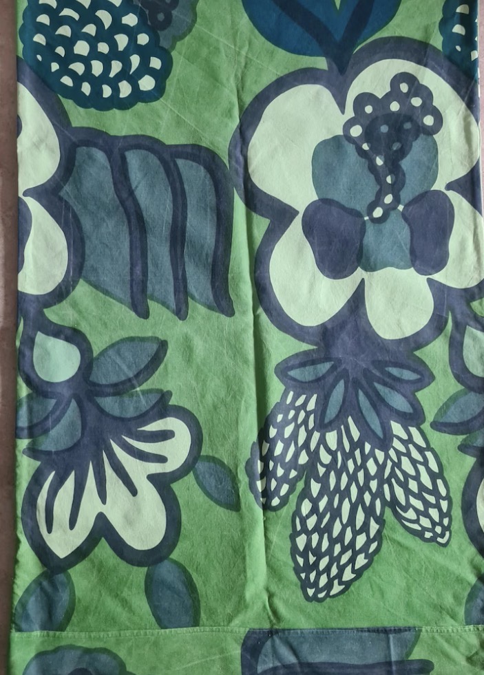
Inspiration of the week: 1960’s/70’s fabrics
I have a thing for the era of crazy floral prints in weird color combos. These are a few that recently caught my eye!! They are such happy fabrics!



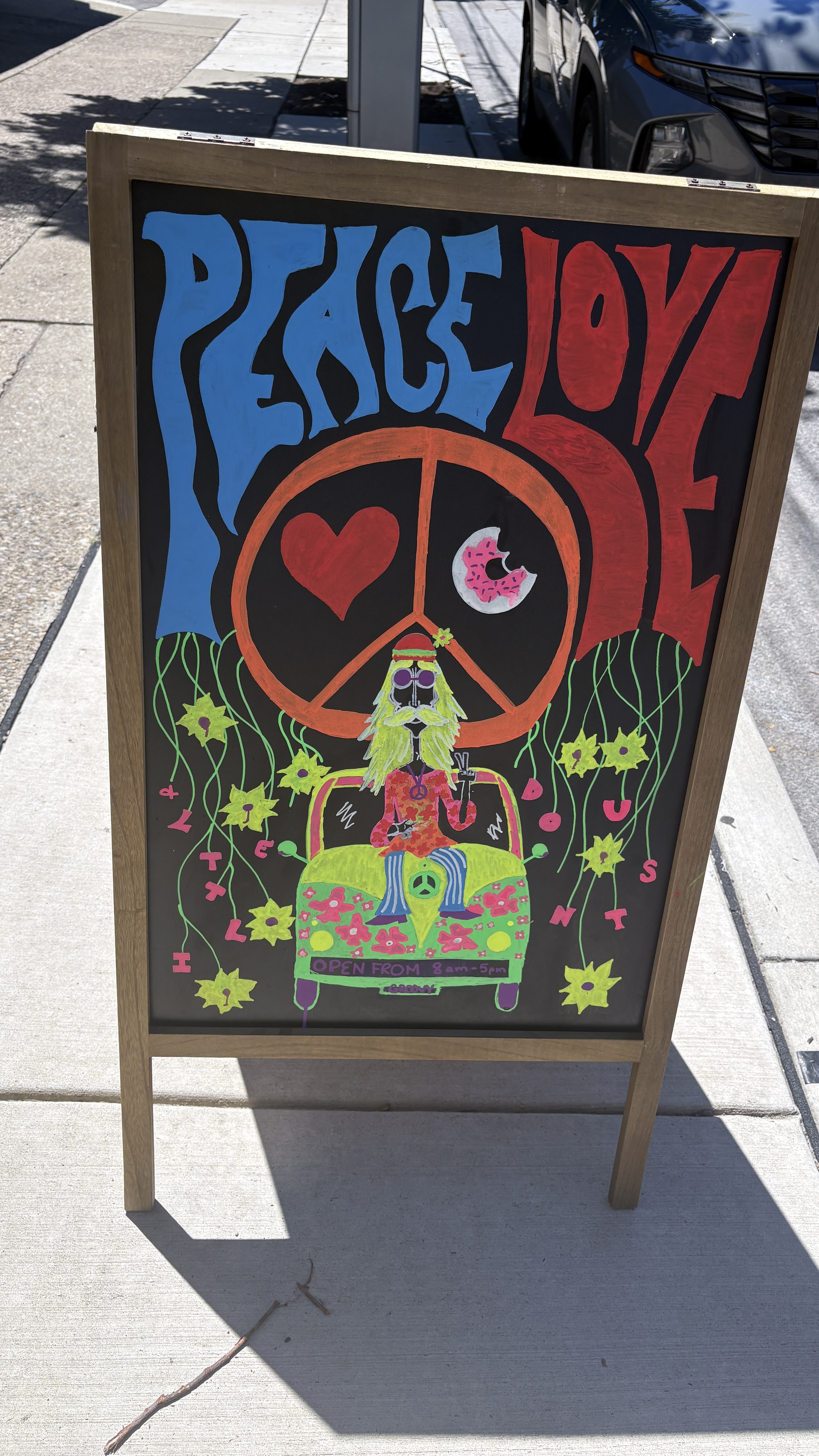
Hand lettering inspiration of the week: Hand Lettered Signs
I LOVE taking pics of hand lettered signs wherever I go. I thought these were super fun!!

Words and Wildflowers Creative Prompts – Issue 109
Posted on August 17, 2026
We LOVE research and learning as a way to get inspired and boost ideas and creativity!! So, Kenzie and I are going to be sharing the inspiration that we collect here in our second newsletter…. once a week!!!
Here’s how it works:
We provide the inspiration. You interpret it however you wish… any medium, any size. It is meant to inspire lettering and floral art combined together. But, you can:
- Just do the florals, just do the lettering, or combine them together.
- Use the provided quote for your piece or select your own.
- Use colors from one of the inspiration images or select your own favorites
- Create the floral art… as a still life in a vase, a single flower, a border, a pattern, a bouquet
Hope you will create with us and post your work at #wordsandwildflowers2026 and tag @lorisiebert.studio and @snippetsofwhimsy
Quote of the week…
“There’s a healing power in the act of creating.”
— Unattributed
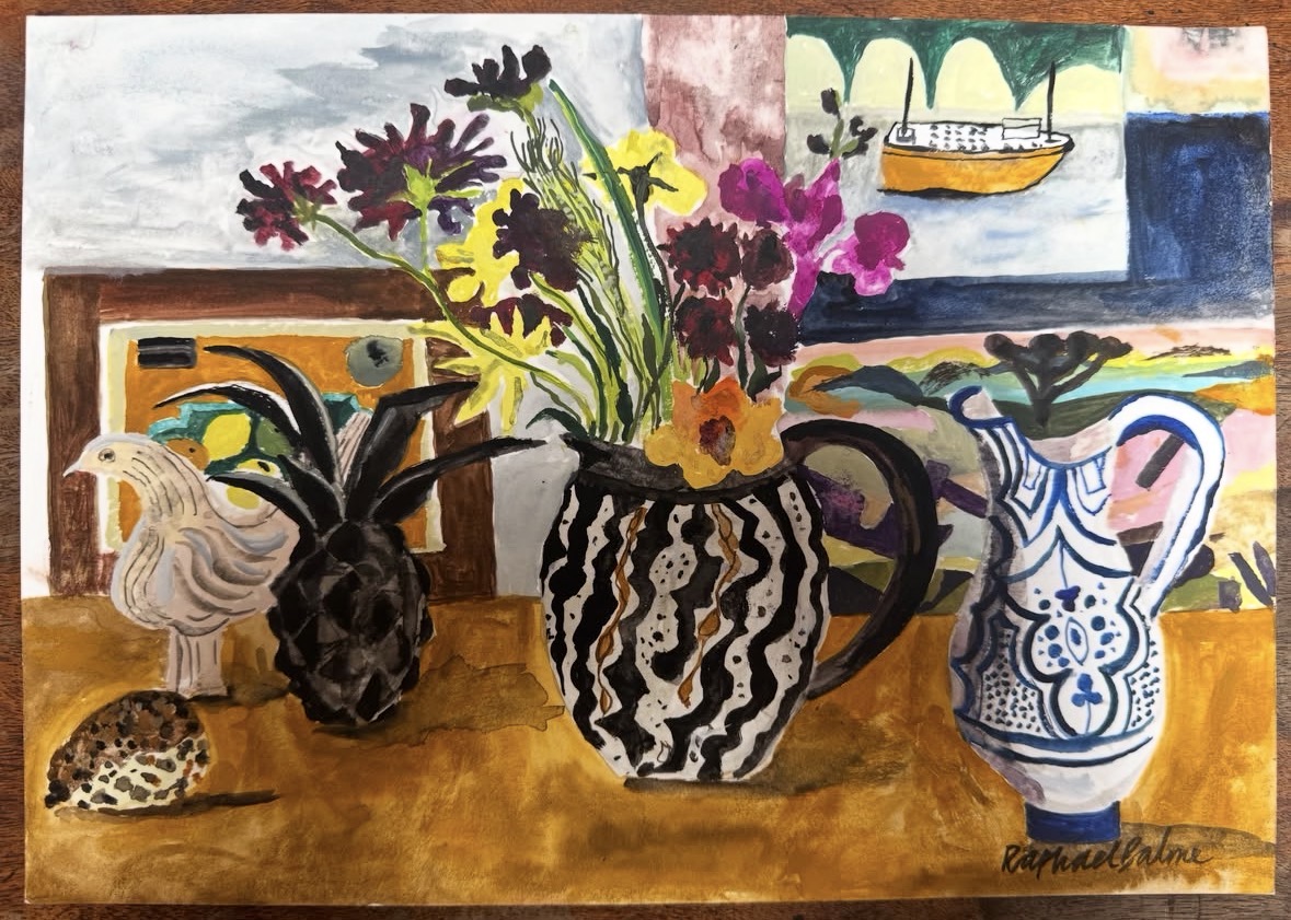
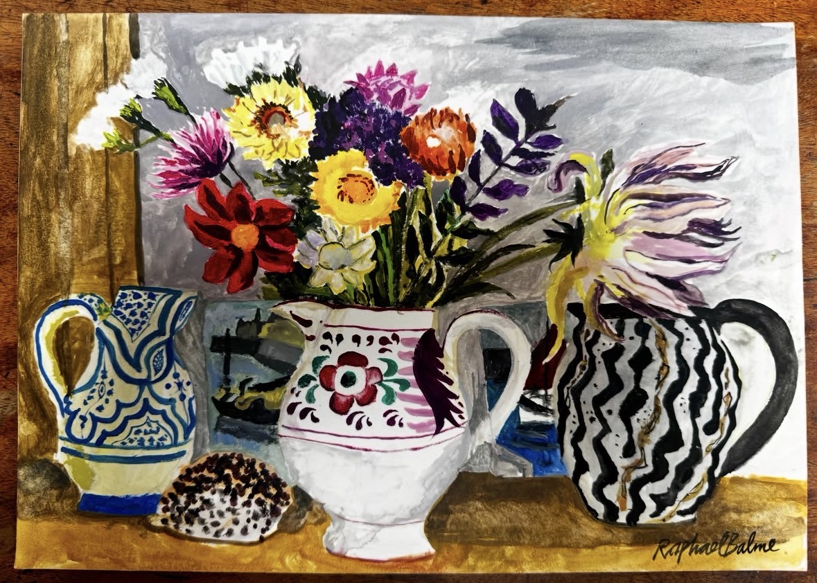
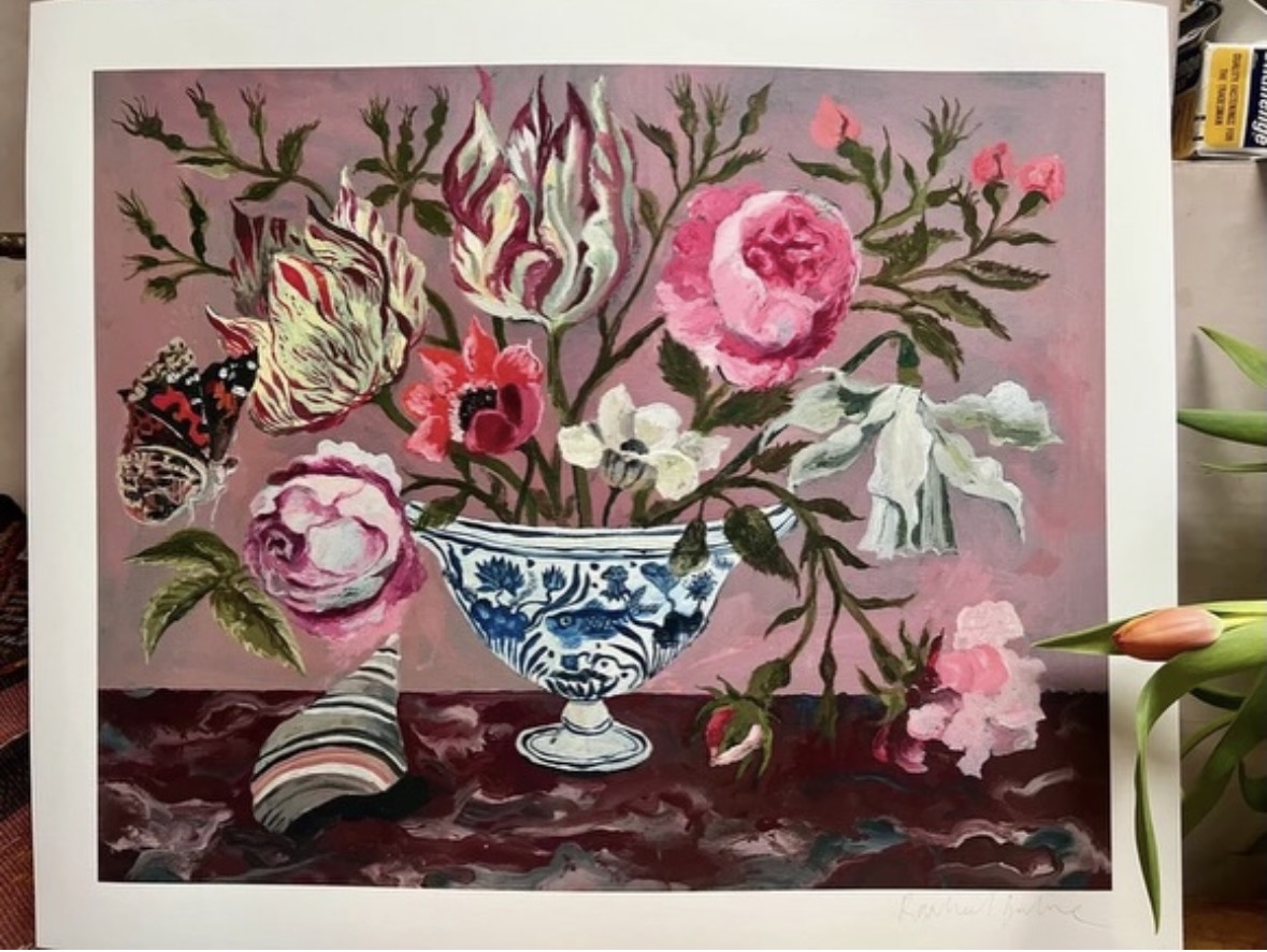
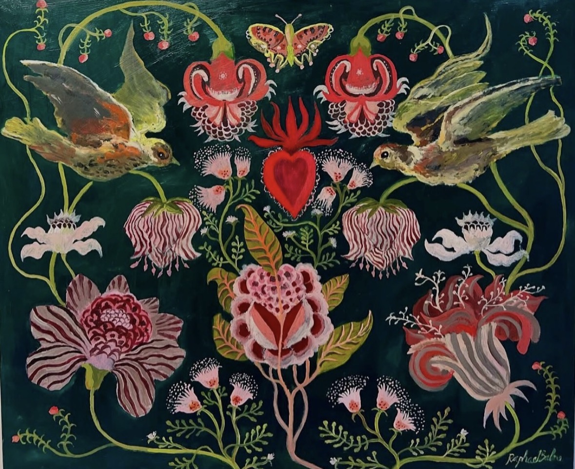
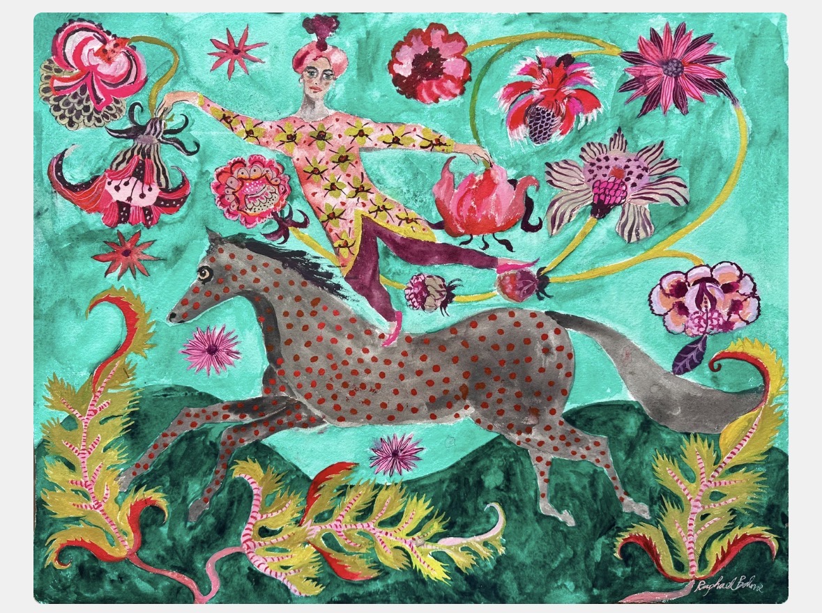
Inspiration of the week: Sarah Raphael Balme
Sarah Raphael Balme is a British artist whose richly patterned paintings explore narrative, colour, and dreamlike imagery. Inspired by folk art, nature, and storytelling, her work features figures, animals, and plants across painting, ceramics, and textiles.
A graduate of Chelsea College of Art, she has exhibited internationally and collaborated with design brands, creating vibrant, layered compositions that balance decorative surface with imaginative, often surreal themes. Her oil paintings with a narrative theme are mainly done in oil sometimes gouche.
She grew up surrounded by artists, her mother was a painter and her dad wrote academic books. Her childhood was spent in a bohemian North London house that influenced her career as an artist.
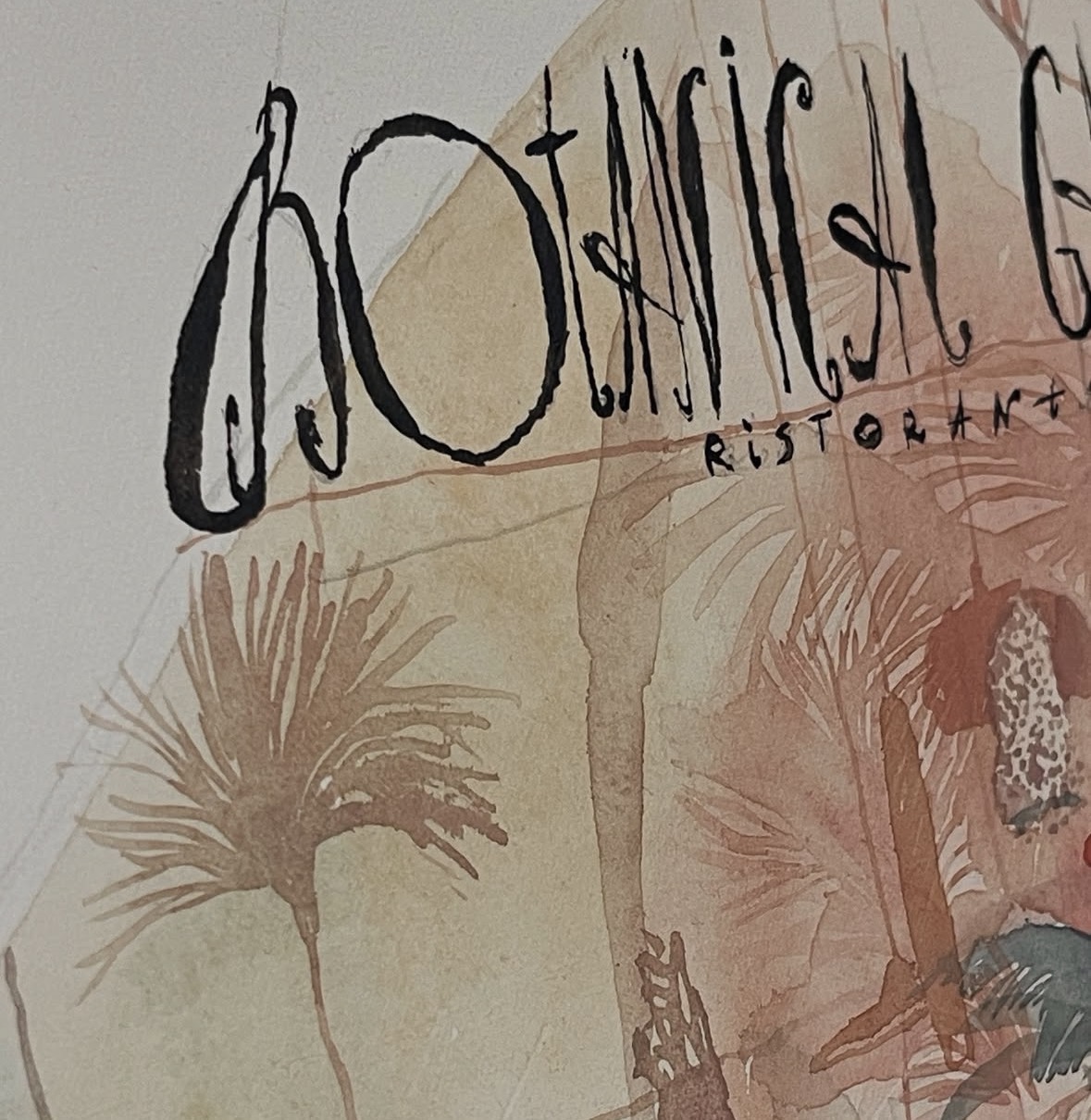
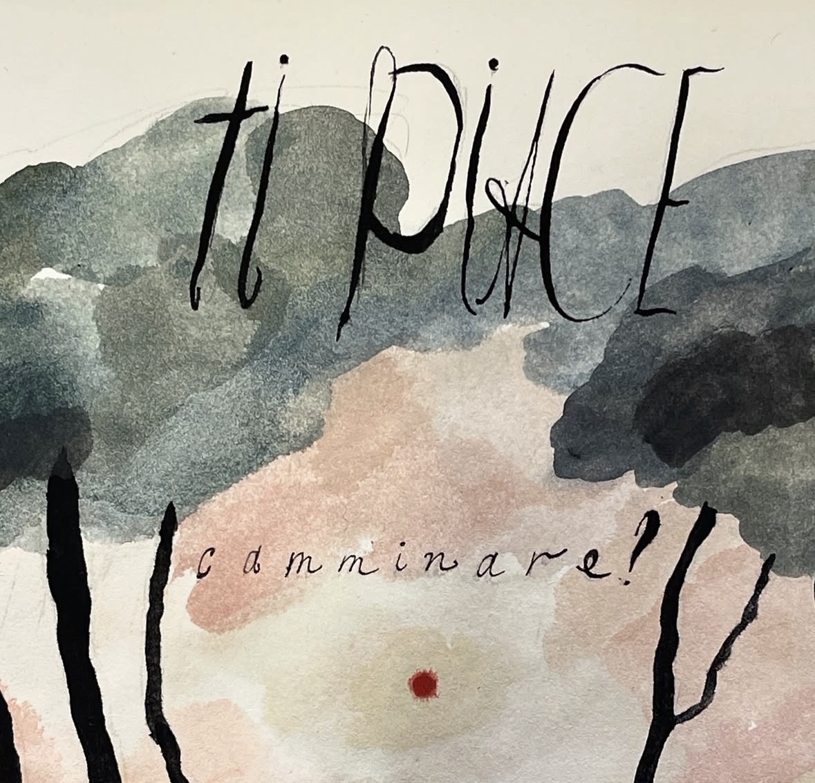
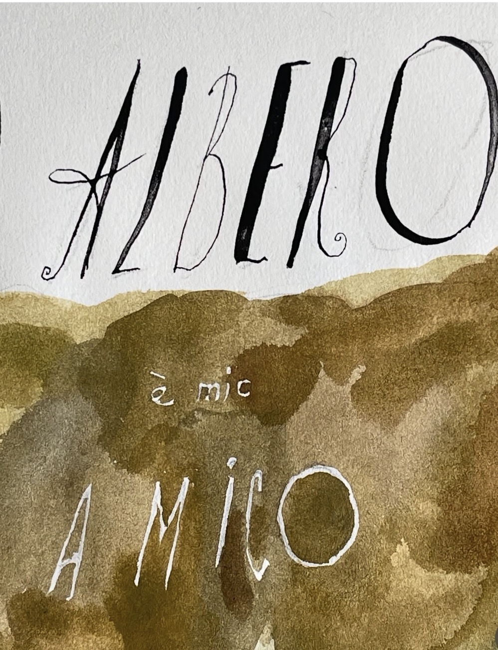
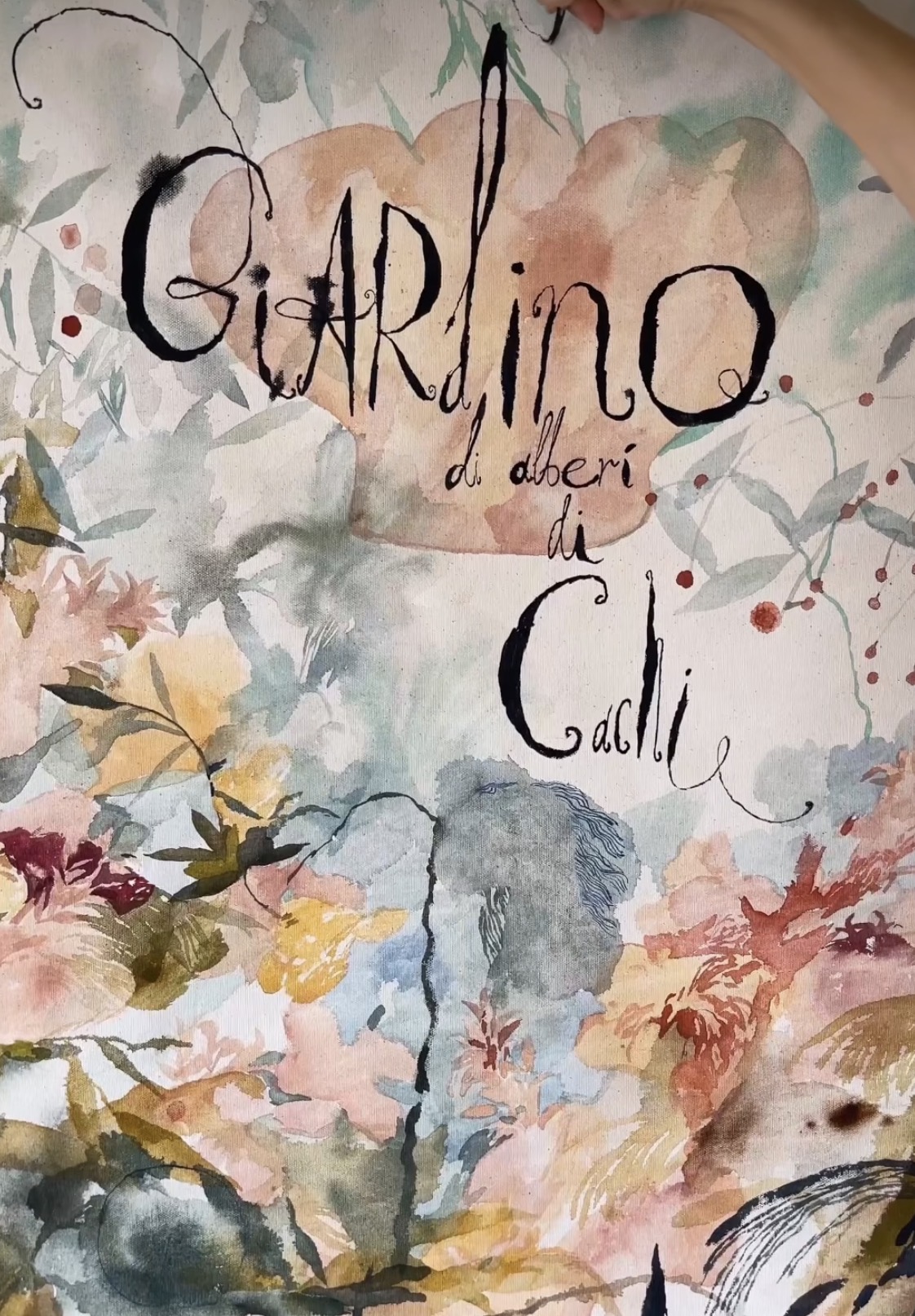
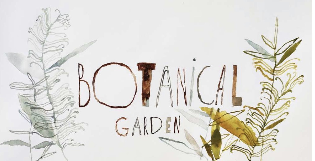
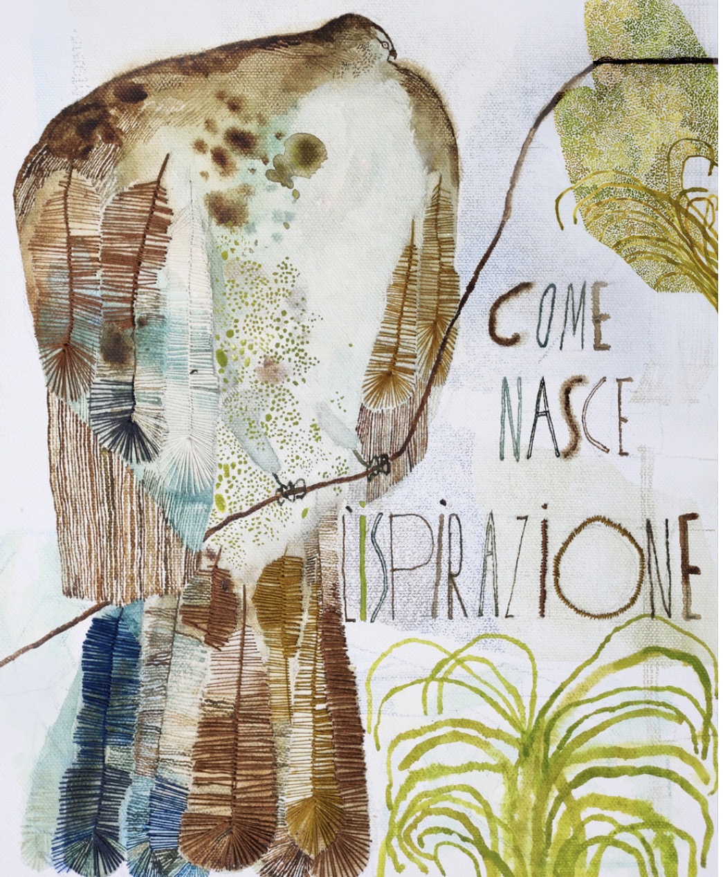
Hand lettering inspiration of the week: Olga Shevolya
Olga Shevchenko Shevolya is a contemporary Russian artist.
Currently she is engaged in painting and illustration, creating paintings with light and spontaneous subjects that reveal the depth and poetry of life. She enjoys working with watercolors, transparencies, embroidery and experimenting with printing inks. When creating illustrations, she loves to play and experiment with form and texture. She expresses her admiration for the beauty of the plant world, its uniqueness and diversity. It fascinates, inspires and fills her with delight. Her illustrations are about the relationship between nature and man and about the human soul through the prism of the plant world.
Words and Wildflowers Creative Prompts – Issue 108
Posted on August 10, 2026
We LOVE research and learning as a way to get inspired and boost ideas and creativity!! So, Kenzie and I are going to be sharing the inspiration that we collect here in our second newsletter…. once a week!!!
Here’s how it works:
We provide the inspiration. You interpret it however you wish… any medium, any size. It is meant to inspire lettering and floral art combined together. But, you can:
- Just do the florals, just do the lettering, or combine them together.
- Use the provided quote for your piece or select your own.
- Use colors from one of the inspiration images or select your own favorites
- Create the floral art… as a still life in a vase, a single flower, a border, a pattern, a bouquet
Hope you will create with us and post your work at #wordsandwildflowers2026 and tag @lorisiebert.studio and @snippetsofwhimsy
Quote of the week…
“An artist is an explorer.”
— Henri Matisse
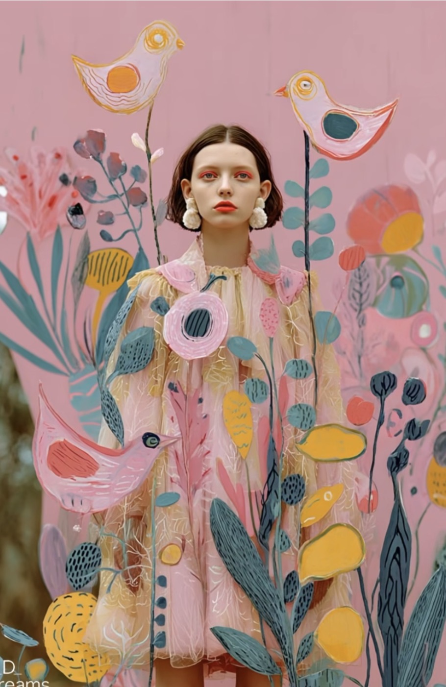
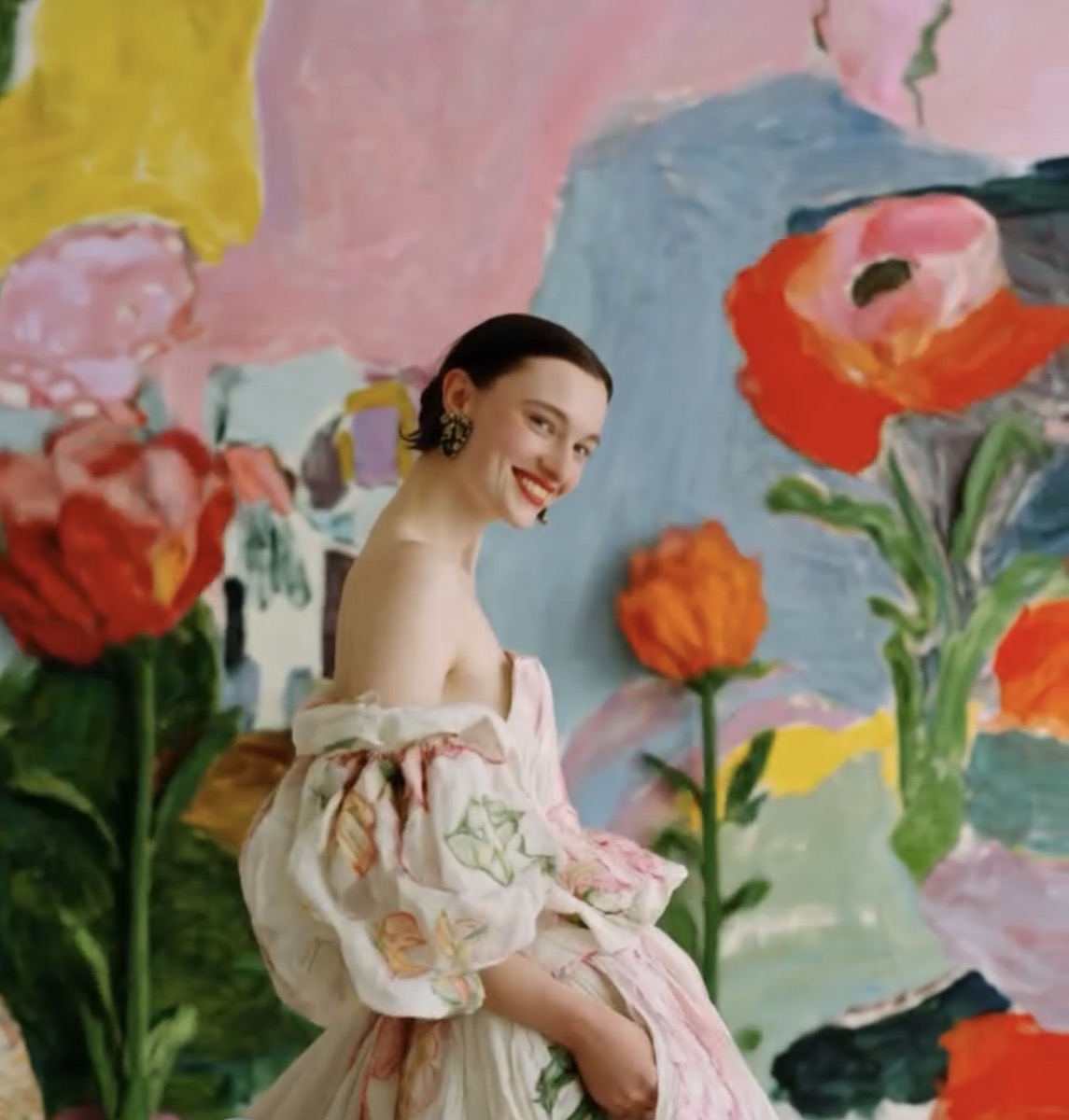
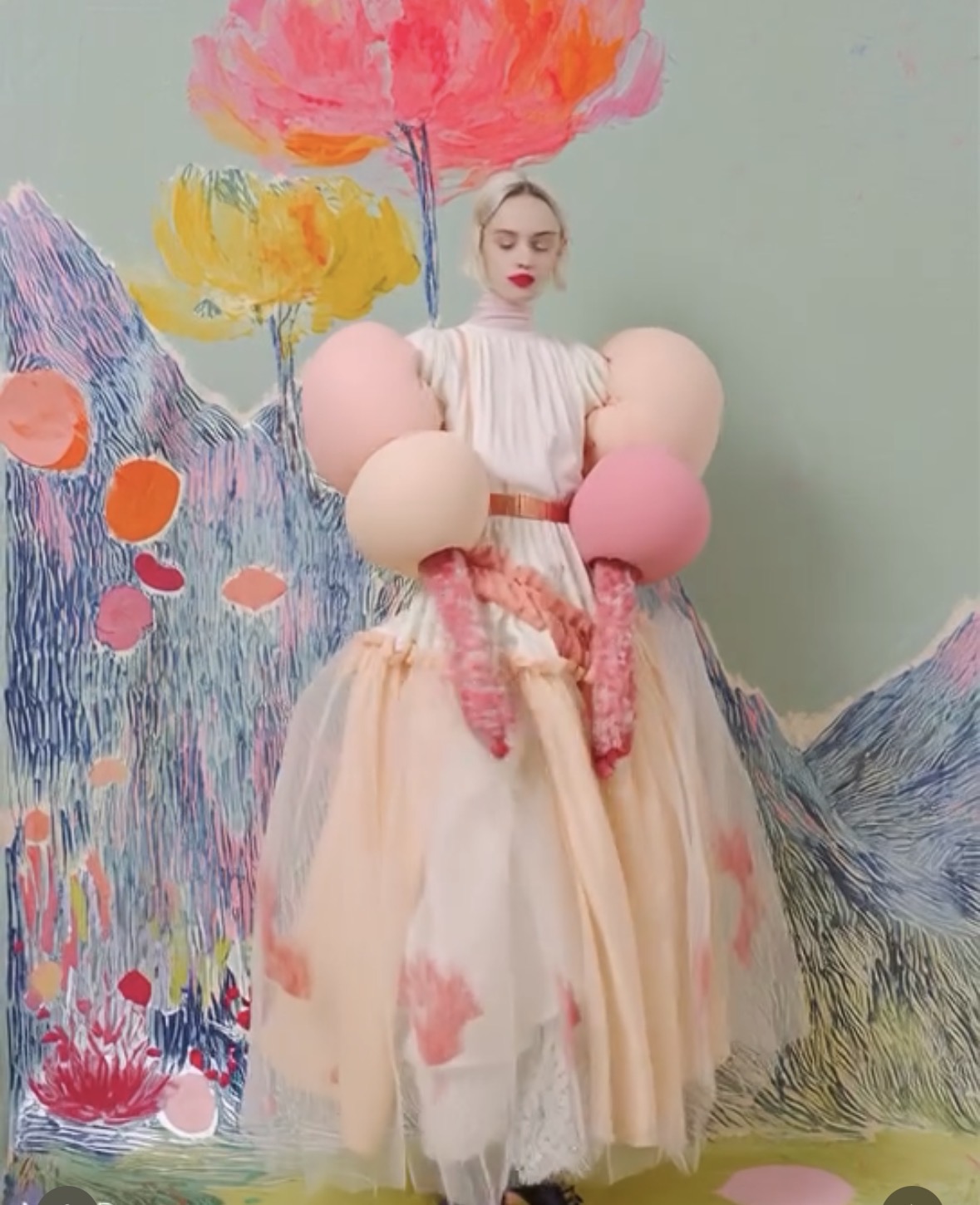
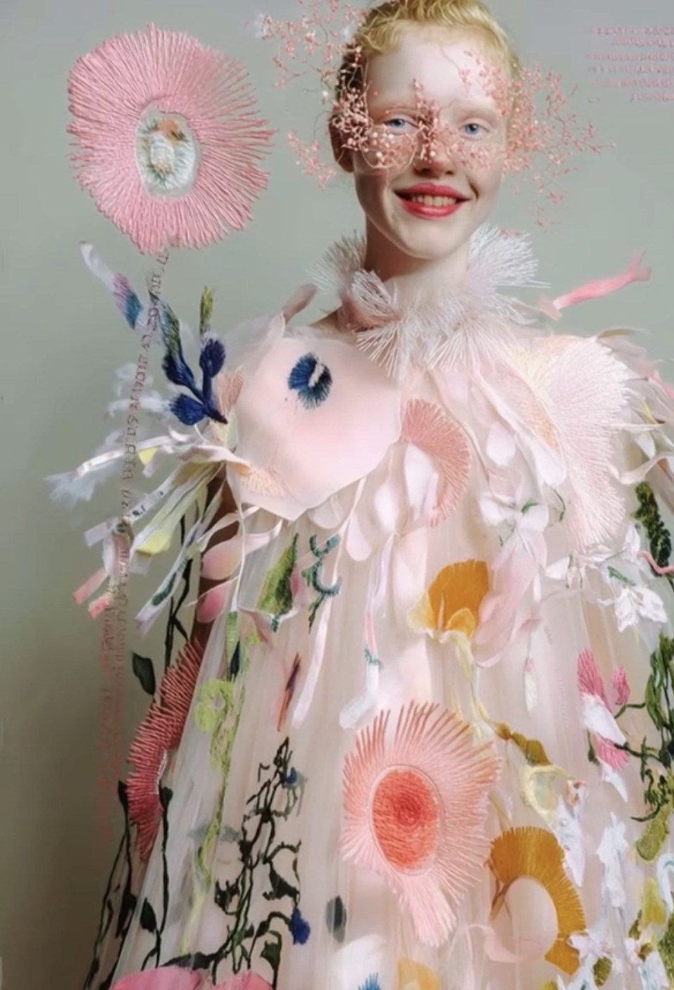
Inspiration of the week: Dafne Ederveen
Dafne Ederveen has been a photographer for 20 years. Evolving from analog to digital photography, moving images & video and now we are here, a new skill, creating Ai generative images, with a photographic eye, mind & expertise gathered over the years, blending this all into a new tool.
She graduated from the Royal Academy of Arts (KABK) in The Hague, and started her own photo studio in 2002 in Amsterdam. She works as a freelance photographer for several magazines and company’s.
Early 2023 she started creating Ai generated images with Midjourney. “It’s a completely new world, where I can let my creativity flow freely, everything is possible and nothing is wrong or weird. I started a new instagram account, because I don’t want to confuse people with this as my photography work, because it’s different, so my alter-ego Miss D Daydreams was born.
I look at Midjourney as a new tool to create images. I use several techniques to create these images. I use my own pictures, text to image and image blending. Looking at this new tool as a photographer and really enjoying this, I embraced it as a new art-form and I think we’re only at the beginning of this new way of creating images and mostly curious what the future will bring.”


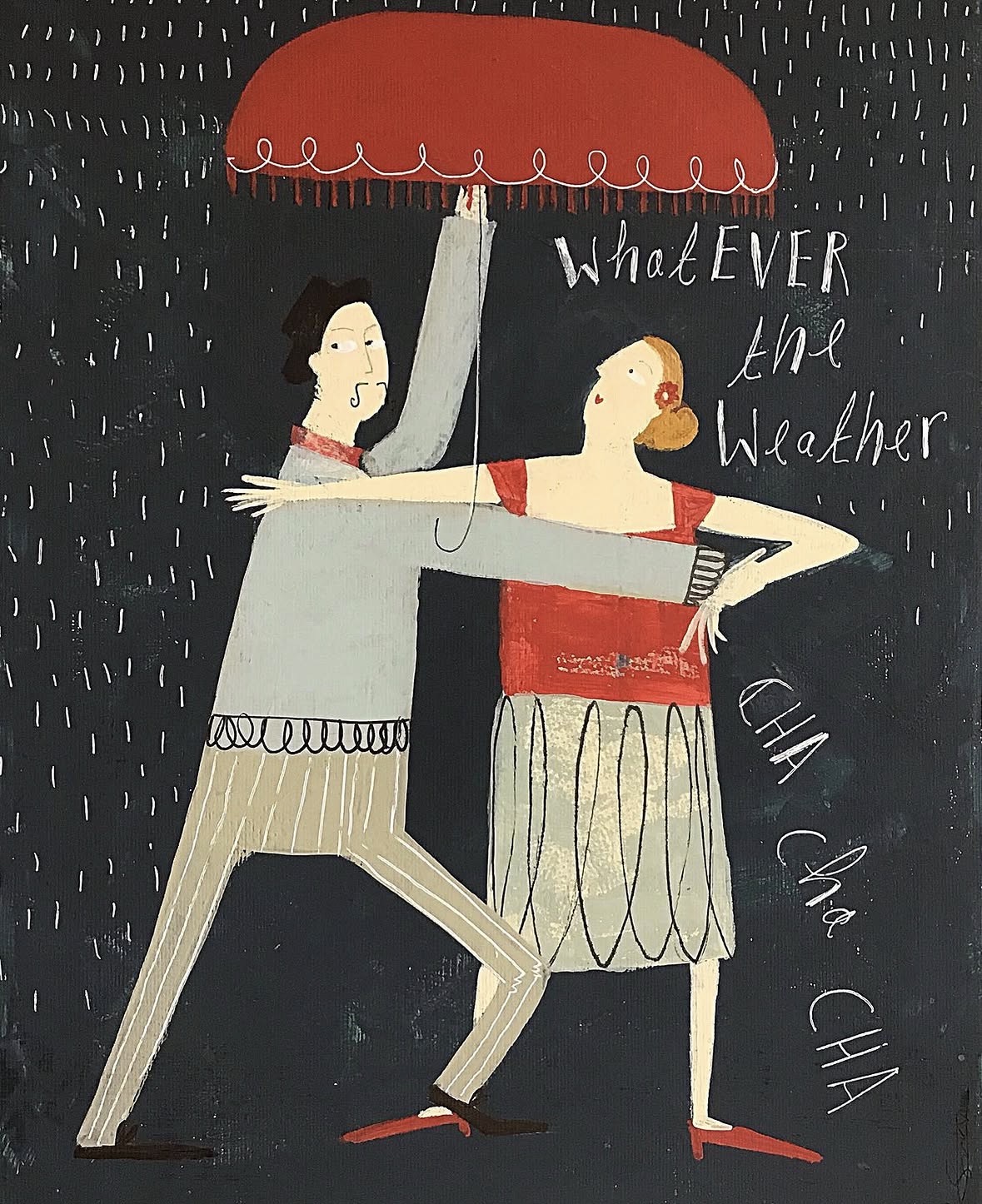
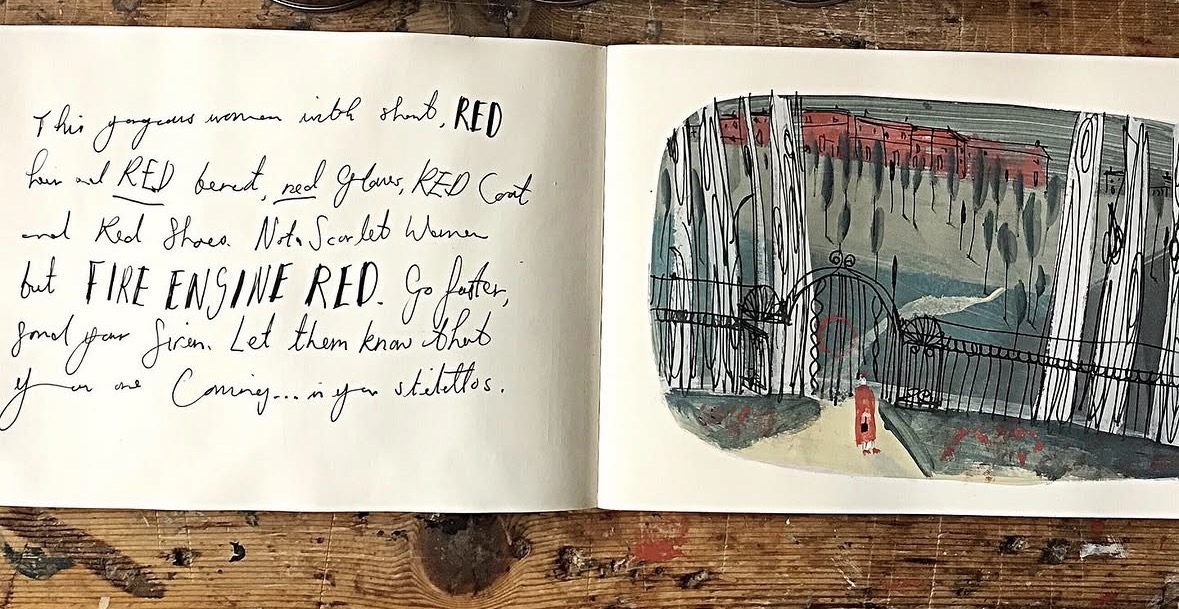
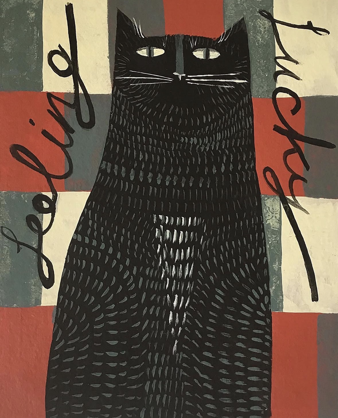
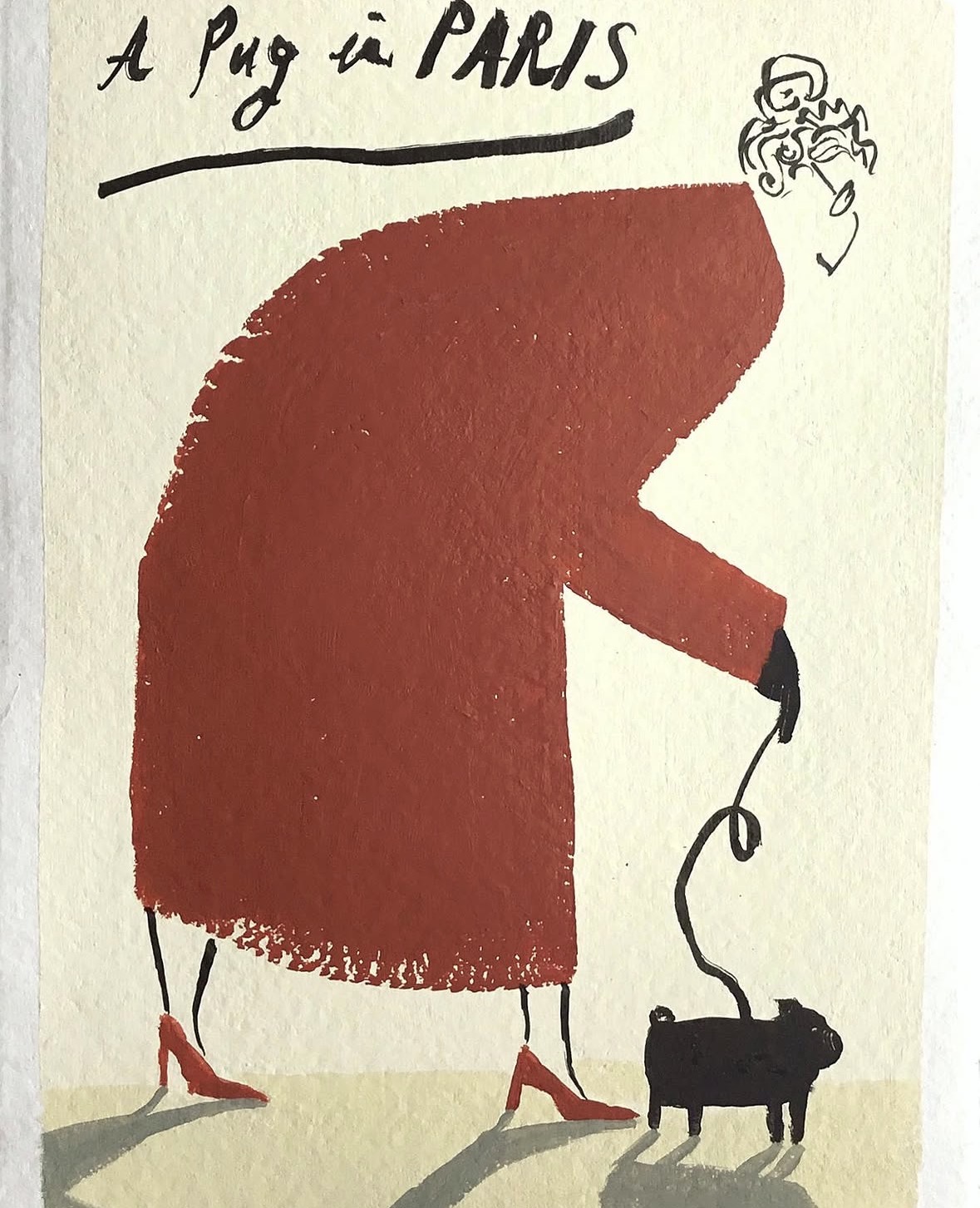
Hand lettering inspiration of the week: Angela Smyth
Angela Smyth is a self taught artist based in a small town in West Yorkshire, where she has a studio not far from her house. She has been painting professionally for over a decade, and in the time she has exhibited widely, both in the UK and abroad, and is published by Aquarelle Publishing Ltd.
She loves people watching and can sit for literally hours at a cafe table watching the world go by. Her pictures are inspired by the things she sees every day, and the interactions that take place. Even her animals are just an extension of the people she sees on a daily basis, or they represent something more personal to her, but they are never just animals in a scene. The cityscapes she paints always have something hidden in them, it makes her happy knowing that there’s an element to her work that isn’t obvious and it’s a lot deeper than people think. Her little secret.
She is dyslexic and over the years she has used text in her work more and more. Sometimes she spells words the right way, and sometimes she doesn’t but she has stopped correcting the text now, and the mistakes stay in.