Words and Wildflowers Creative Prompts – Issue 80
Posted on January 19, 2026
We LOVE research and learning as a way to get inspired and boost ideas and creativity!! So, Kenzie and I are going to be sharing the inspiration that we collect here in our second newsletter…. once a week!!!
Here’s how it works:
We provide the inspiration. You interpret it however you wish… any medium, any size. It is meant to inspire lettering and floral art combined together. But, you can:
- Just do the florals, just do the lettering, or combine them together.
- Use the provided quote for your piece or select your own.
- Use colors from one of the inspiration images or select your own favorites
- Create the floral art… as a still life in a vase, a single flower, a border, a pattern, a bouquet
Hope you will create with us and post your work at #wordsandwildflowers2026 and tag @lorisiebert.studio and @snippetsofwhimsy
Quote of the week…
“My wish for you is that you continue. Continue to be who and how you are, to astonish a mean world with your acts of kindness. Continue to allow humor to lighten the burden of your tender heart.”
— Maya Angelou
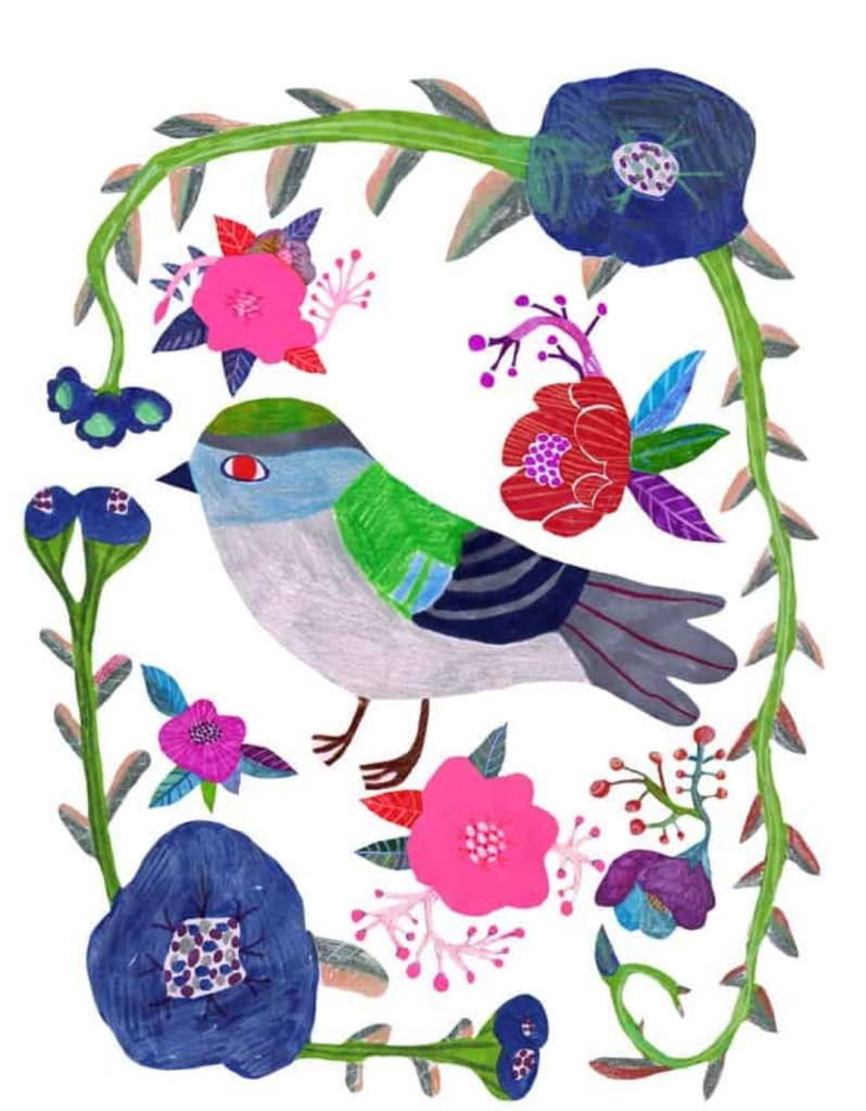
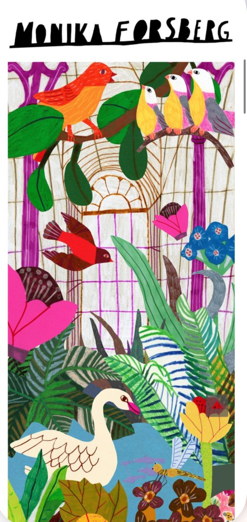
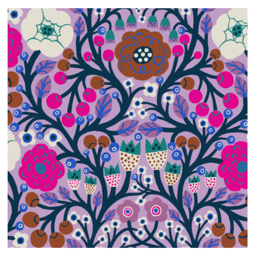
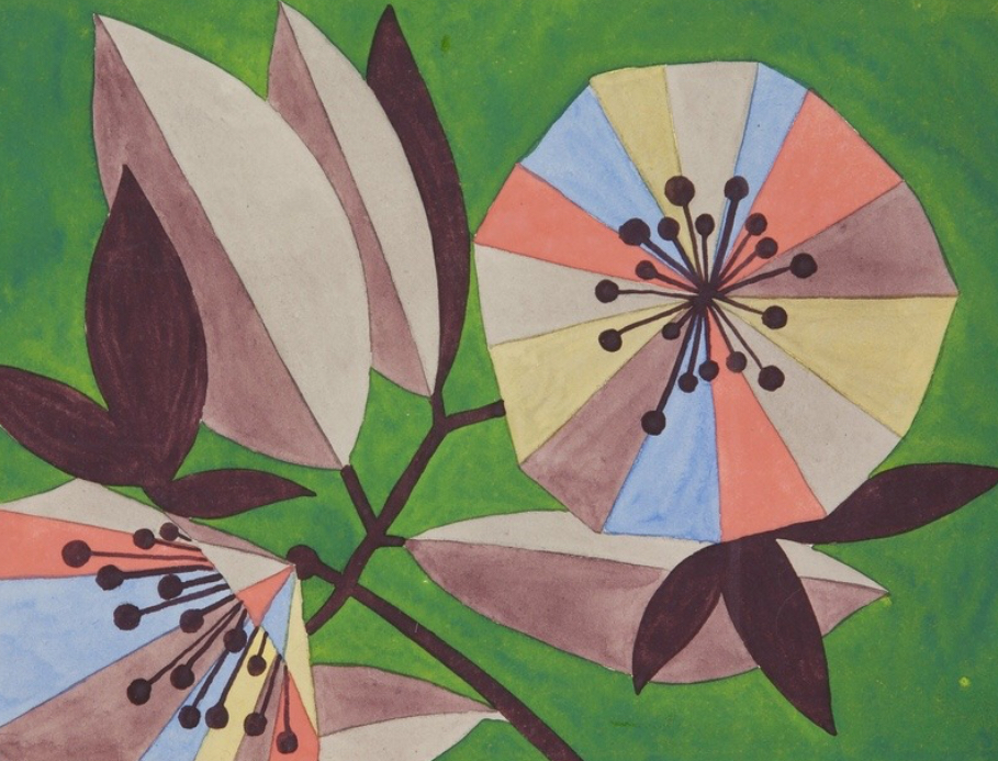
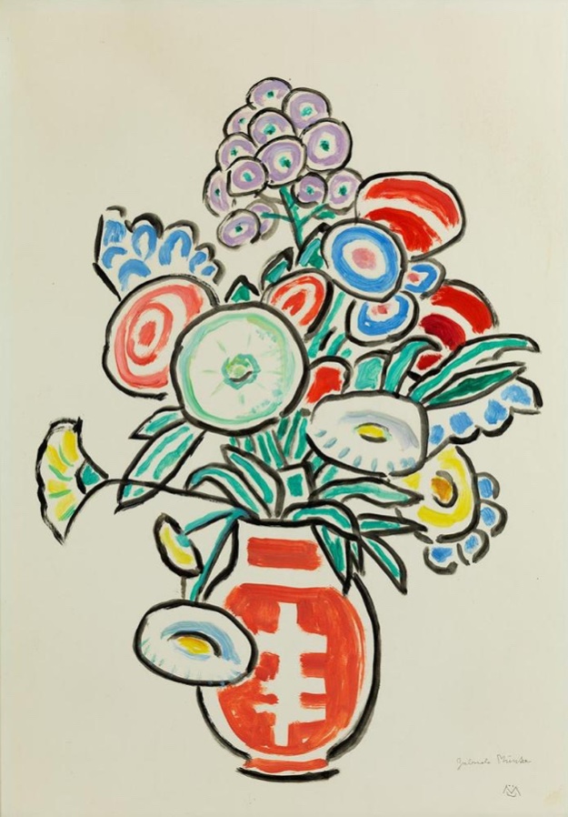
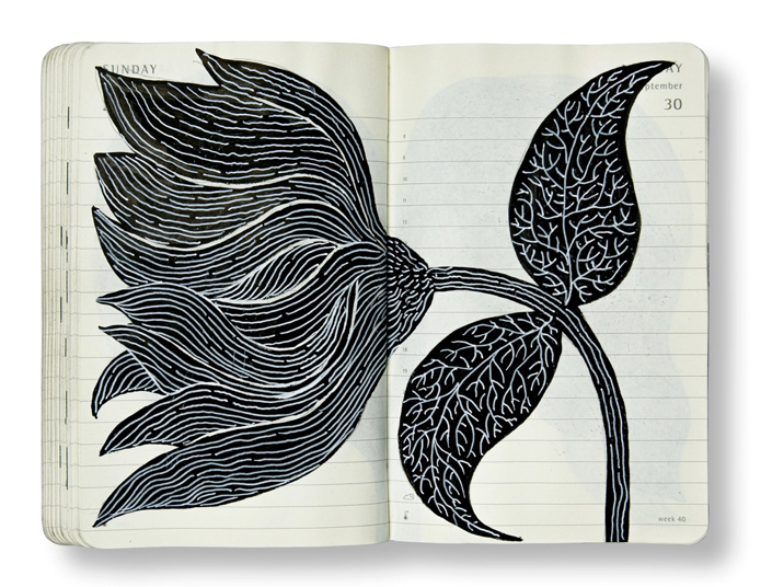
Inspirational artist of the week: Monika Forsberg
Monika is a Swedish born freelance illustrator and occasional animator based in North London. She studied art & filmmaking at the RCA. Her work is a quirky explosion of colour and humour. A technicolor world. Using pen, paper and paint her work is a fusion of everyday observation and fantasy. Recent clients include eeBoo, Anna Sui, NY Review, Liberty of London, Channel 4, UN, UNICEF, Anthropologie, Gorman Clothing, REDvalentino, URAX, Natur &Kultur, Quarto Publishing and Lagom Design.

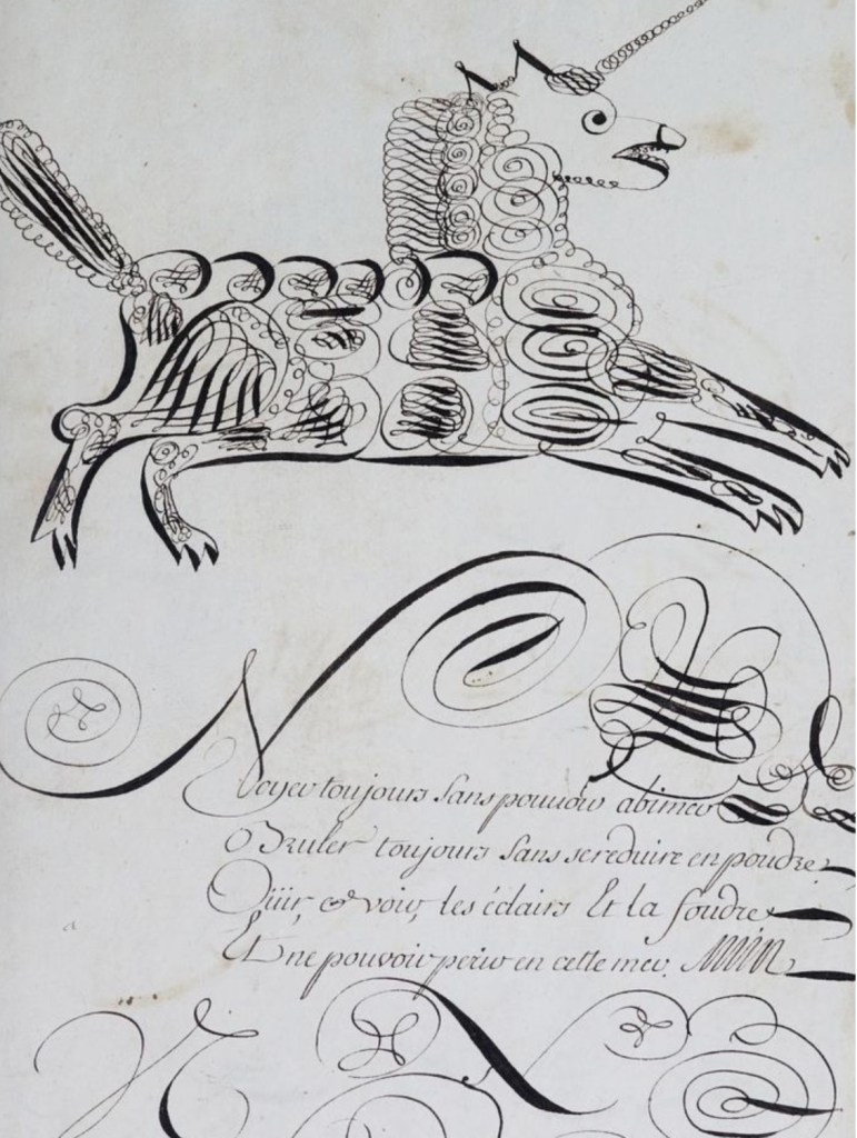
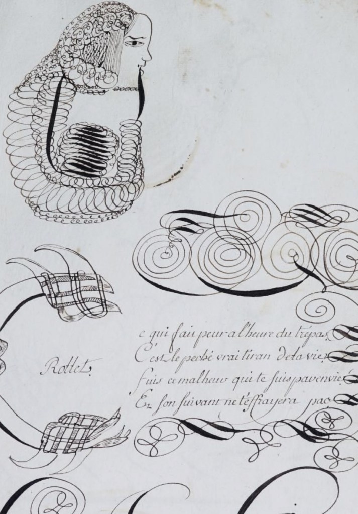
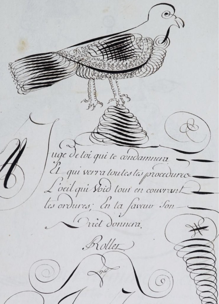
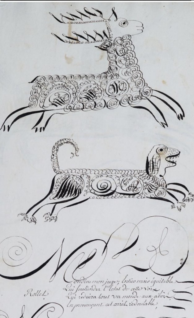
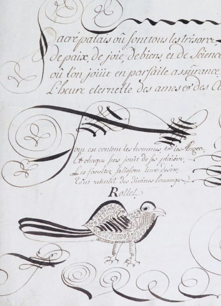
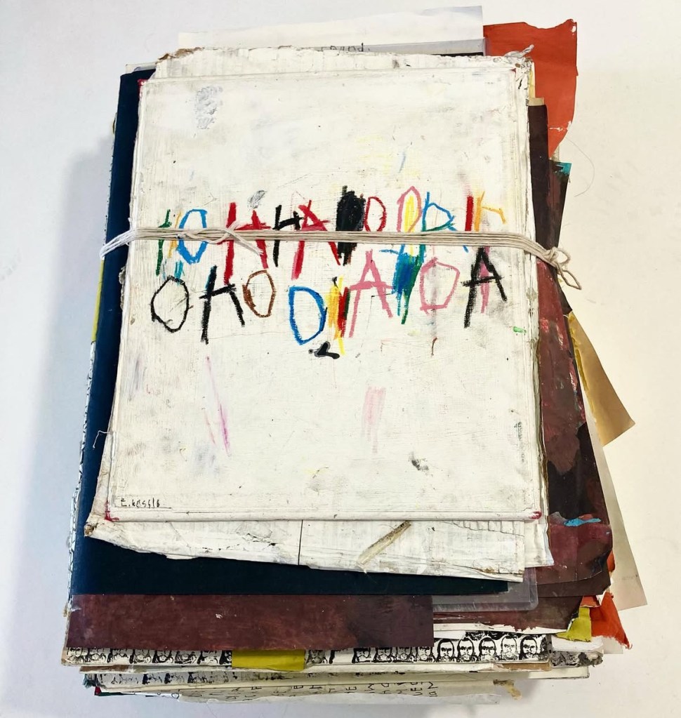
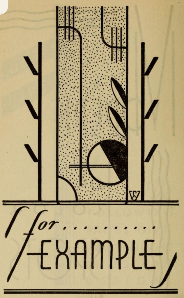
Hand lettering artist of the week: E. Rollet
E. Rollet was an 18th-century calligrapher, (born around 1741), known for a surviving manuscript titled “Calligraphie du dix-huitième siècle” (18th-Century Calligraphy), featuring alphabets, texts, and calligraphic demonstrations, showcasing fine control of hand, providing valuable historical examples of script. The work serves as a valuable resource for studying 18th-century calligraphy styles and techniques.
Words and Wildflowers Creative Prompts – Issue 79
Posted on January 12, 2026
We LOVE research and learning as a way to get inspired and boost ideas and creativity!! So, Kenzie and I are going to be sharing the inspiration that we collect here in our second newsletter…. once a week!!!
Here’s how it works:
We provide the inspiration. You interpret it however you wish… any medium, any size. It is meant to inspire lettering and floral art combined together. But, you can:
- Just do the florals, just do the lettering, or combine them together.
- Use the provided quote for your piece or select your own.
- Use colors from one of the inspiration images or select your own favorites
- Create the floral art… as a still life in a vase, a single flower, a border, a pattern, a bouquet
Hope you will create with us and post your work at #wordsandwildflowers2026 and tag @lorisiebert.studio and @snippetsofwhimsy
Quote of the week…
“I wish to live a life that causes my soul to dance inside my body.”
— Dele Olanubi
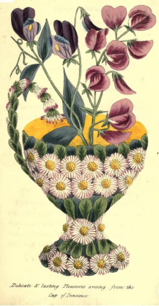
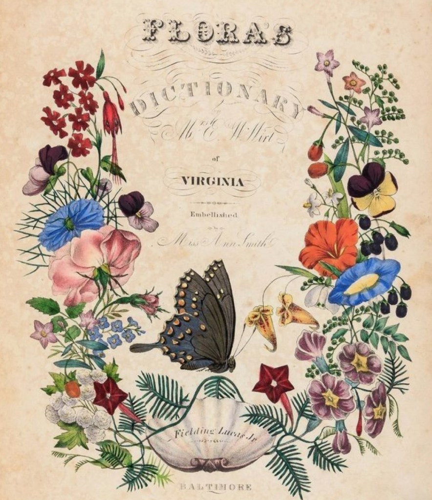
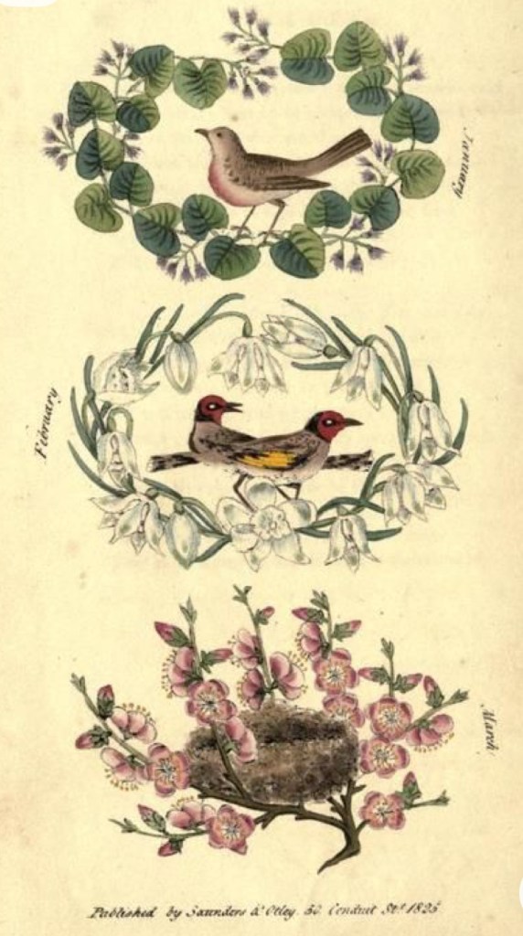
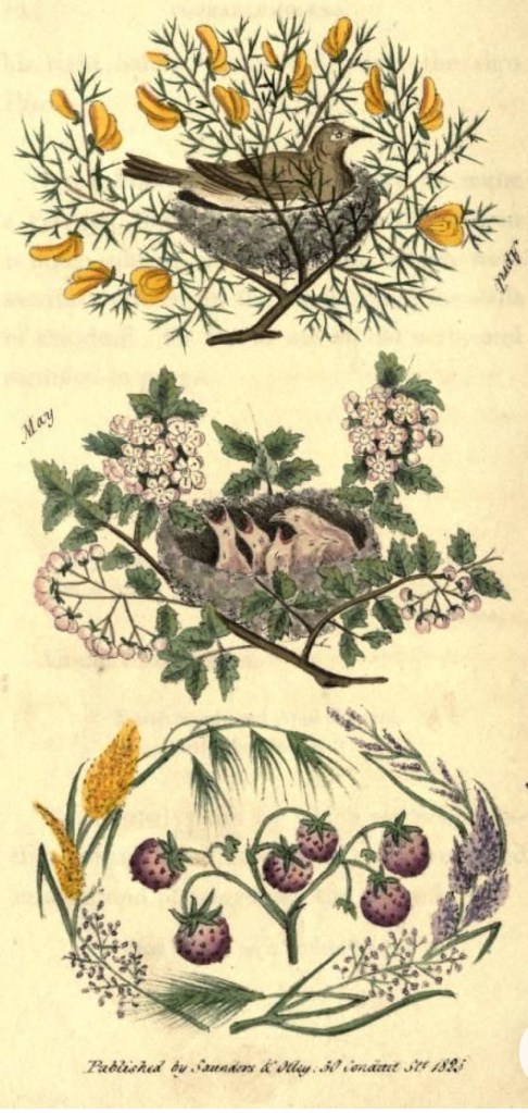
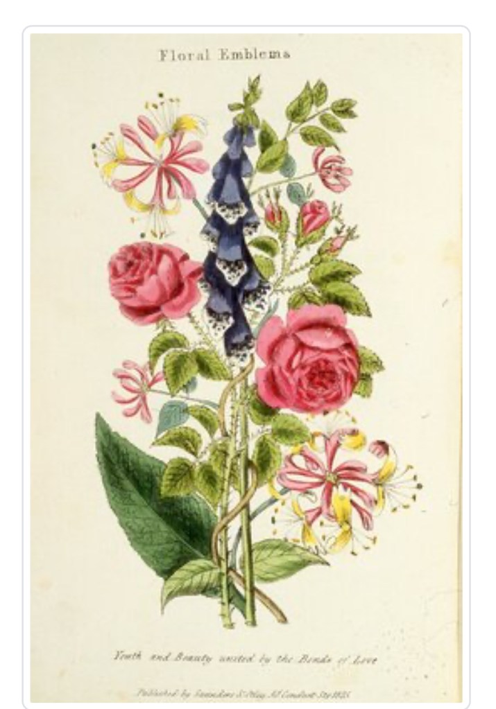
Inspirational artist of the week: Henry Phillips
Floral Emblems is a book written by Henry Phillips and published in 1825. It explores the symbolism and meanings behind different types of flowers, with each flower being associated with a particular emotion or message.
It was part of a larger trend in the early 19th century towards studying and appreciating nature. The use of flowers to convey sentiments and emotions was quite popular during that time. It includes descriptions and illustrations of a variety of flowers, along with their associated meanings. For example, the rose is often associated with love and passion, while the daisy represents innocence and purity.

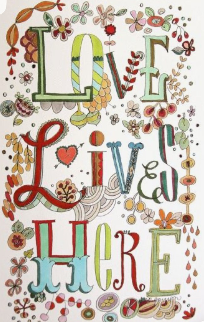
Hand lettering artist of the week: Pam Garrison
Pam Garrison is an artist, crafter, and general creative pursuit enthusiast. Her seemingly endless artistic curiosity has lead to her prolific creativity in many different mediums. She’s been published in numerous books and magazines as a contributing artist, and teaches art classes all over the world.


Words and Wildflowers Creative Prompts – Issue 78
Posted on January 5, 2026
We LOVE research and learning as a way to get inspired and boost ideas and creativity!! So, Kenzie and I are going to be sharing the inspiration that we collect here in our second newsletter…. once a week!!!
Here’s how it works:
We provide the inspiration. You interpret it however you wish… any medium, any size. It is meant to inspire lettering and floral art combined together. But, you can:
- Just do the florals, just do the lettering, or combine them together.
- Use the provided quote for your piece or select your own.
- Use colors from one of the inspiration images or select your own favorites
- Create the floral art… as a still life in a vase, a single flower, a border, a pattern, a bouquet
Hope you will create with us and post your work at #wordsandwildflowers2026 and tag @lorisiebert.studio and @snippetsofwhimsy
Quote of the week…
“Live less out of habit and more out of intent.”
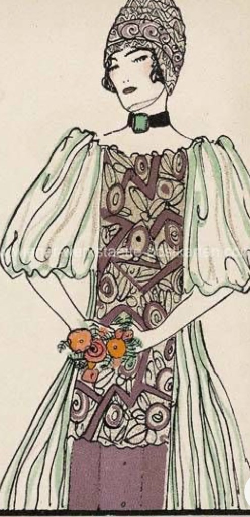
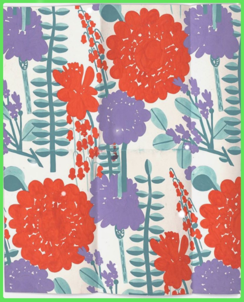
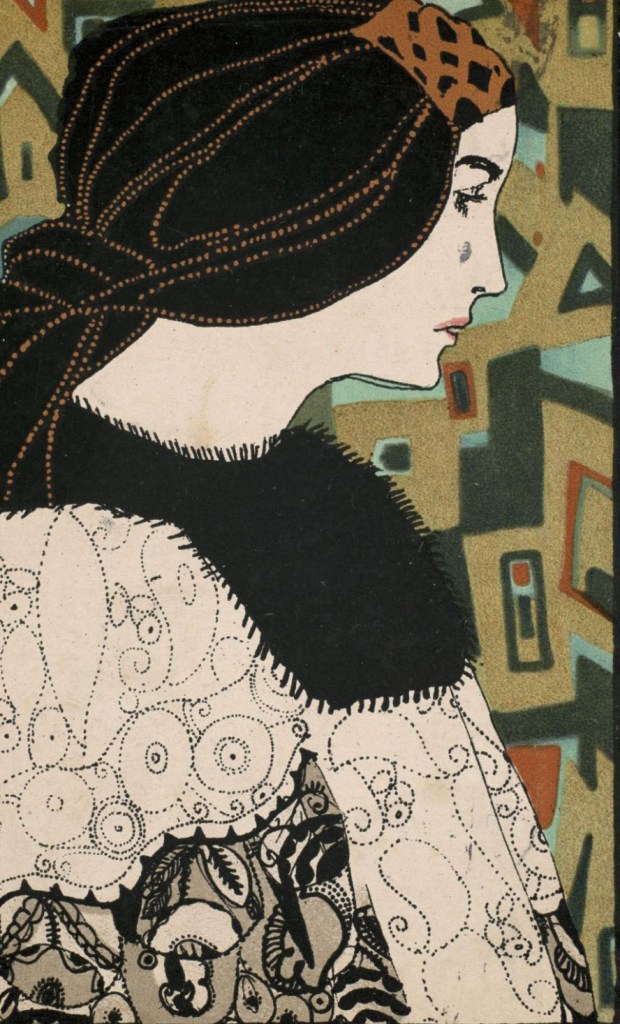
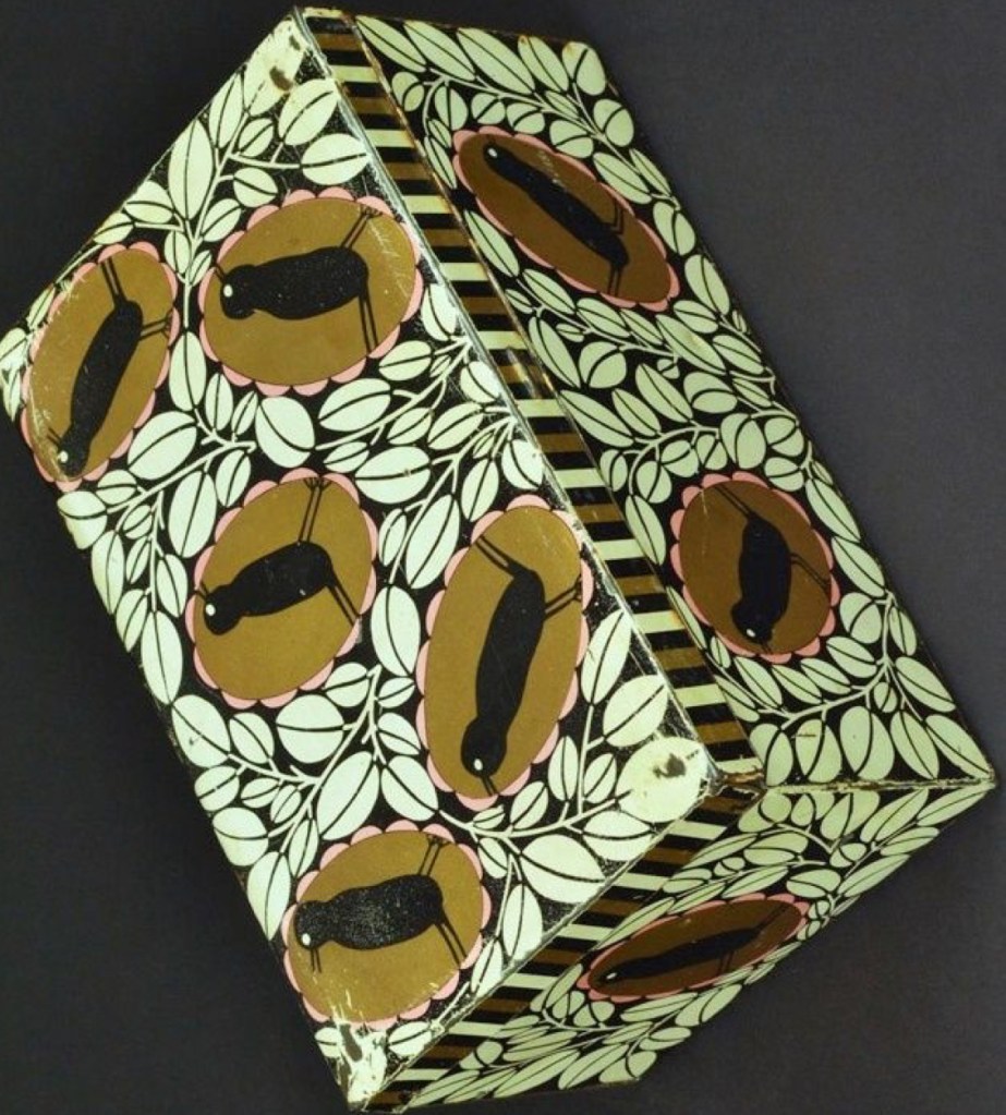
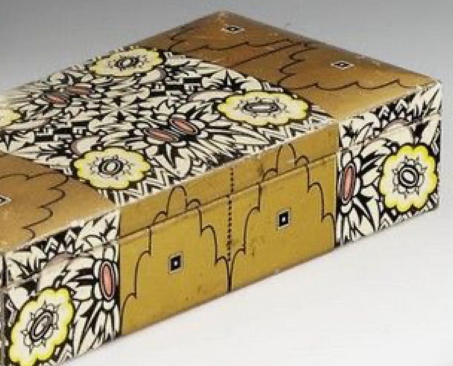
Inspirational artist of the week: Maria Likarz-Strauss
Maria Likarz-Strauss (1893-1971) pushed the envelope of textile and fashion design by looking to modernist painters who tested the limits of representational painting, including Cubists and Symbolists, in a comprehensive way no other fashion designer had done before, and thus importantly influenced modern fashion design. Her use of contrasting shapes and colors released textile design from traditional Western European styles, which relied on stylized Victorian and Arts and Crafts motifs. Through these contrasts her textiles achieved more intensity than others, and as with Cubism in painting, these contrasts created the experience of modern life in fabric. In her approach to textile design, I believe she looked specifically to the French modern painters of the 1910s, and in doing so she brought textile design into the modern era more than any other early twentieth century textile designer.
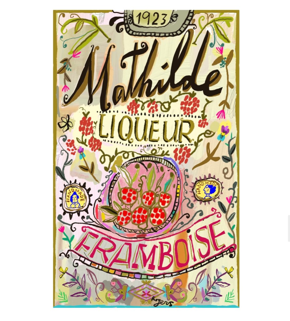
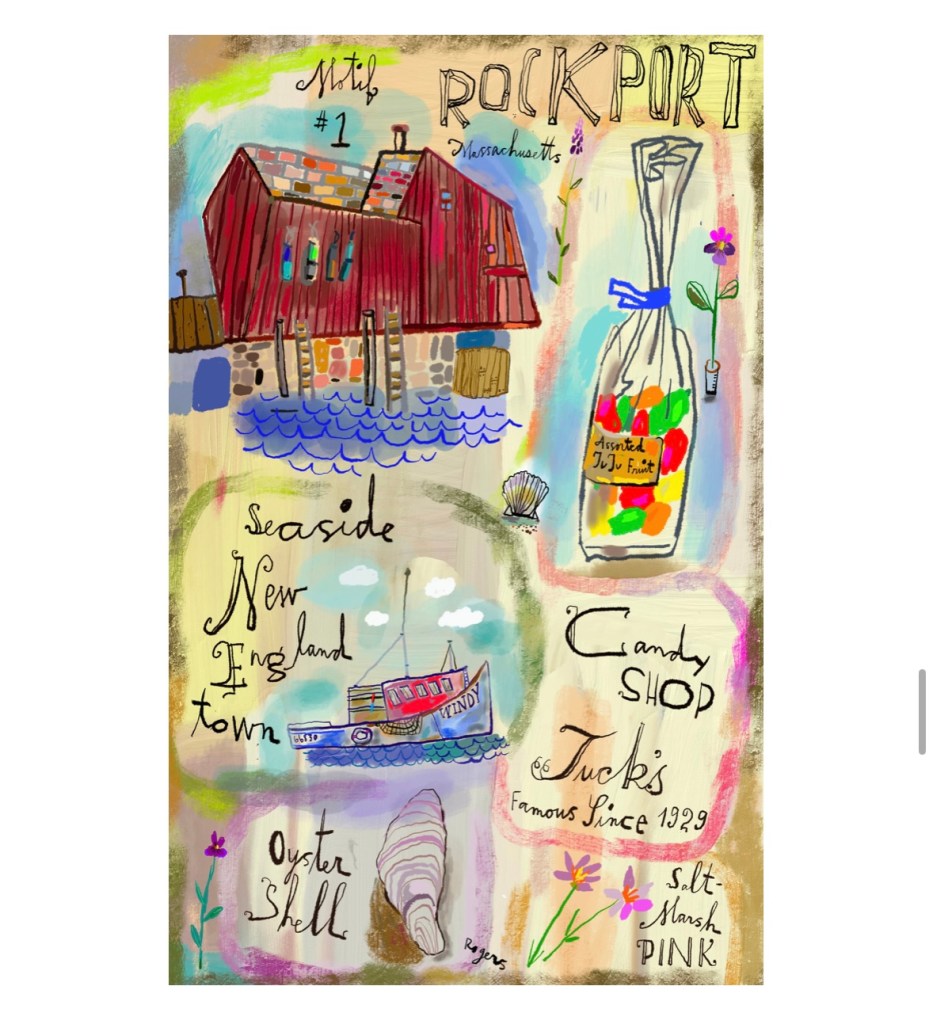
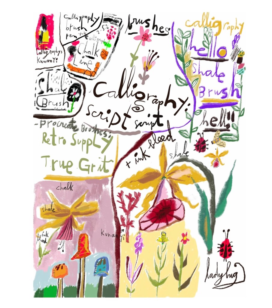
Hand lettering artist of the week: Lilla Rogers
Lilla Rogers is a mentor, illustrator, artist, author, and former top art agent, who has spent more than 40 years in the creative industry. With a degree in fine art and a second degree in illustration, she spent the 1980s working as a full-time, highly successful illustrator, whose art has featured in publications including the New York Times Magazine, Vogue magazine, Rolling Stone magazine, the Grammies, and many more.
She went on to found Lilla Rogers Studio, a visionary art agency which represented three dozen artists from around the world. Work by artists represented by Lilla Rogers Studio has appeared on products worth more than $300 million, including best-selling children’s books, home décor, major ad campaigns, magazines, wall décor, and greetings cards, for clients including Crate & Barrel, Chronicle, the New York Times, Blue Q, Godiva, Barneys New York, Warner Brothers, IKEA, Target, Paperchase, Anthropologie, and hundreds more.
Along the way, Lilla discovered that what she loves most is teaching and mentoring artists: helping them uncover what makes their work unique, and guiding them to build joyful, sustainable, successful creative careers. As both an illustrator and a teacher, Lilla fully understands the creative process. She is renowned for her warm and whimsical teaching style, and her innovative approach that includes breaking everything down into manageable steps.
Through Make Art That Sells’ raved-about, career-changing online courses and live mentorships, Lilla has helped thousands of artists around the world thrive, with many going on to land dream clients, book deals, and flourishing product lines. She also leads in-person creative retreats in Europe through Uptrek, for those craving hands-on inspiration and community.
Lilla has also lectured at venues such as ICON: the Illustration Conference, Printsource NY, the Creative Connection Event, art colleges and corporations, and is frequently interviewed for her expertise as an agent, trendsetter, and artist. She has written a best-selling book, I Just Like to Make Things, and currently writes a column for Uppercase magazine.

Words and Wildflowers Creative Prompts – Issue 77
Posted on December 29, 2025
We LOVE research and learning as a way to get inspired and boost ideas and creativity!! So, Kenzie and I are going to be sharing the inspiration that we collect here in our second newsletter…. once a week!!!
Here’s how it works:
We provide the inspiration. You interpret it however you wish… any medium, any size. It is meant to inspire lettering and floral art combined together. But, you can:
- Just do the florals, just do the lettering, or combine them together.
- Use the provided quote for your piece or select your own.
- Use colors from one of the inspiration images or select your own favorites
- Create the floral art… as a still life in a vase, a single flower, a border, a pattern, a bouquet
Hope you will create with us and post your work at #wordsandwildflowers2025 and tag @lorisiebert.studio and @snippetsofwhimsy
Quote of the week…
“Every little action of the common day makes or unmakes character.”
— Oscar Wilde
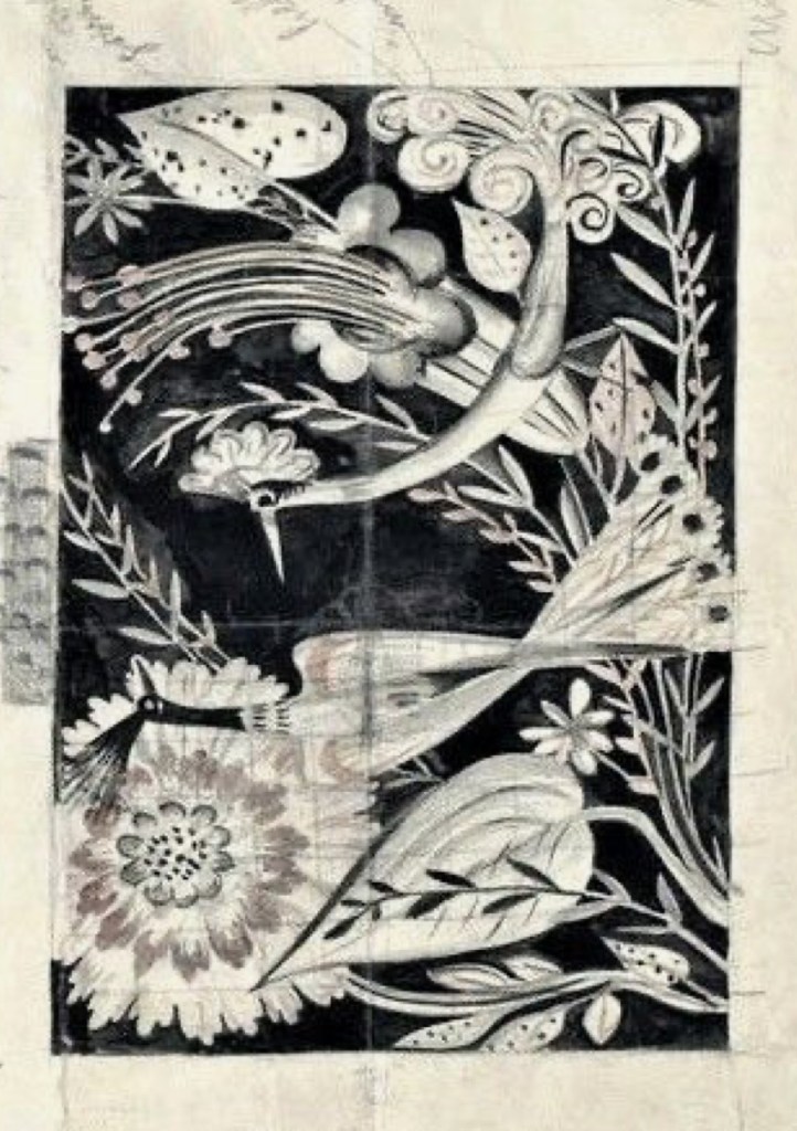
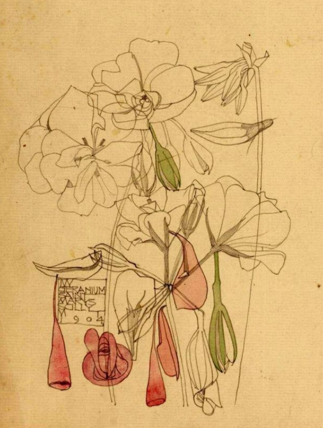
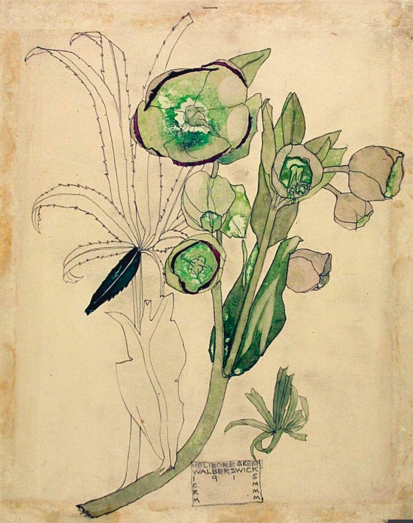
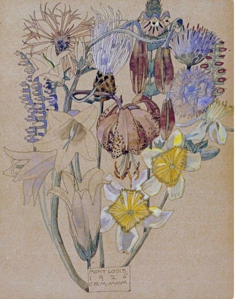
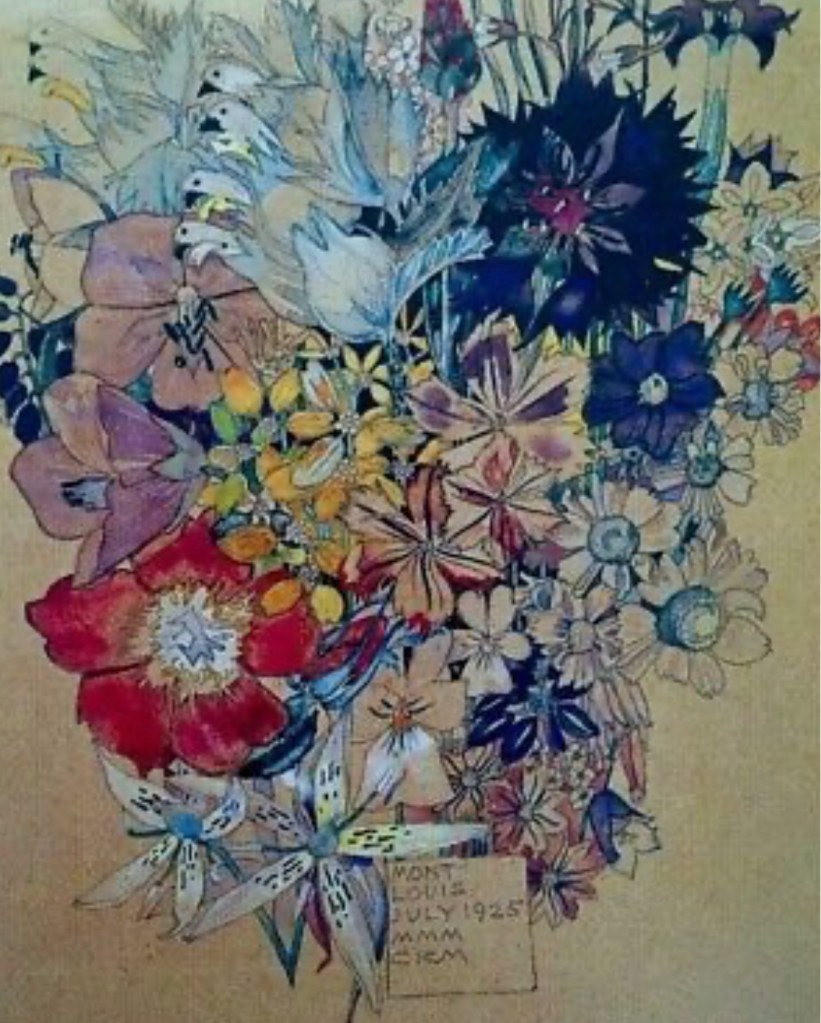
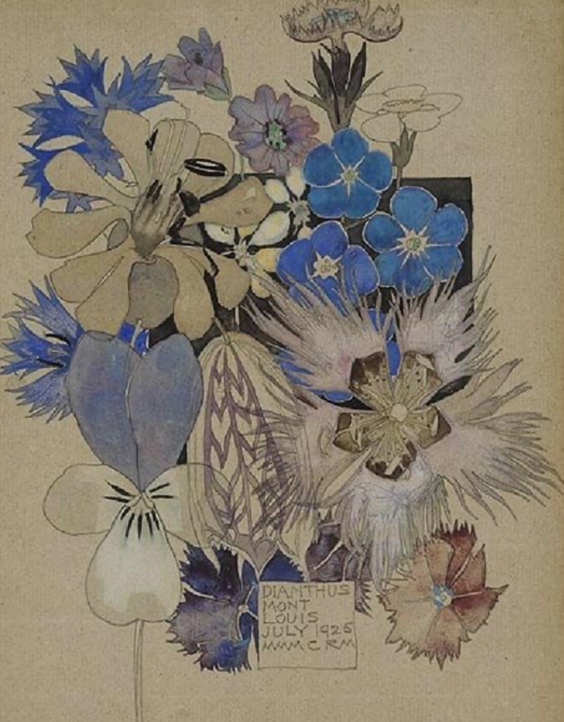
Inspirational artist of the week: Charles Rennie MacIntosh
Charles Rennie Mackintosh (1868-1928) was a pivotal Scottish architect, artist, and designer, key to the Glasgow Style, blending Art Nouveau with Japanese simplicity, known for iconic works like the Glasgow School of Art and Willow Tearooms, characterized by geometric forms, natural motifs (the Mackintosh Rose), and functional beauty, and whose later years saw a shift to expressive watercolors before his death from cancer in London.
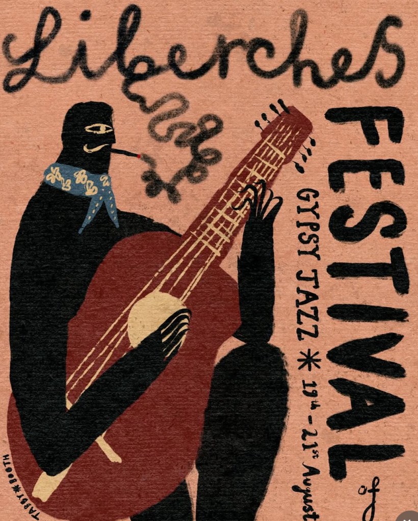
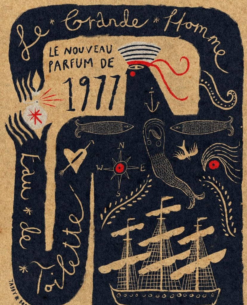
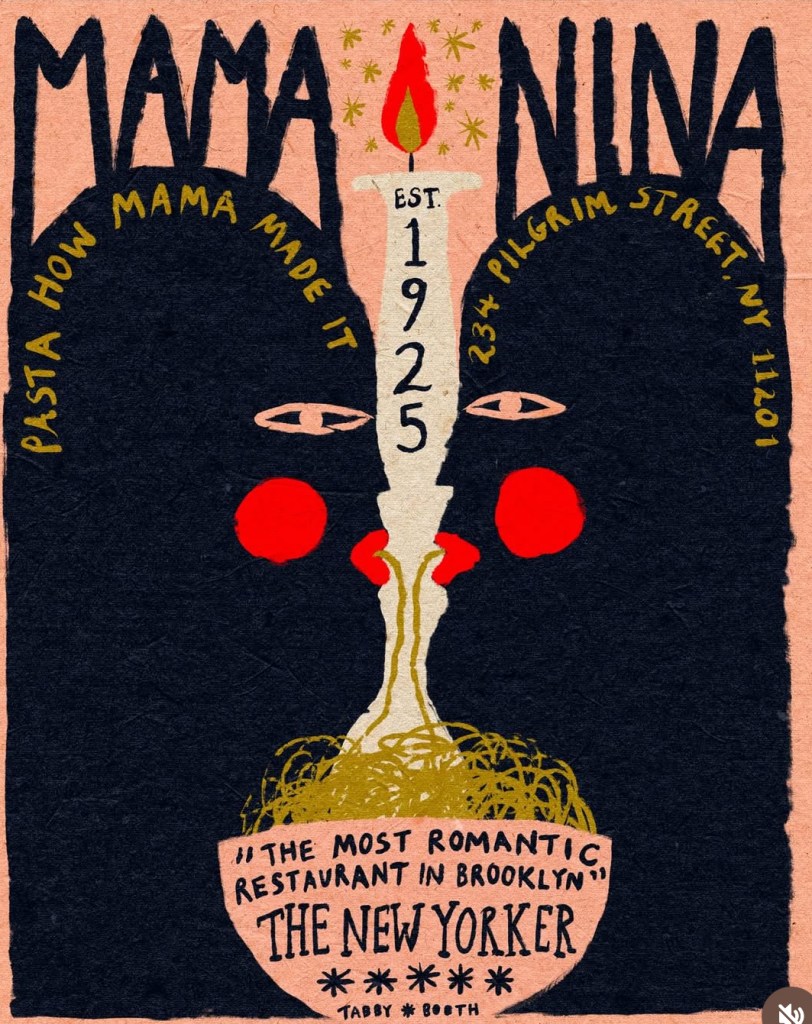
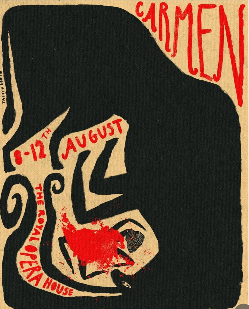
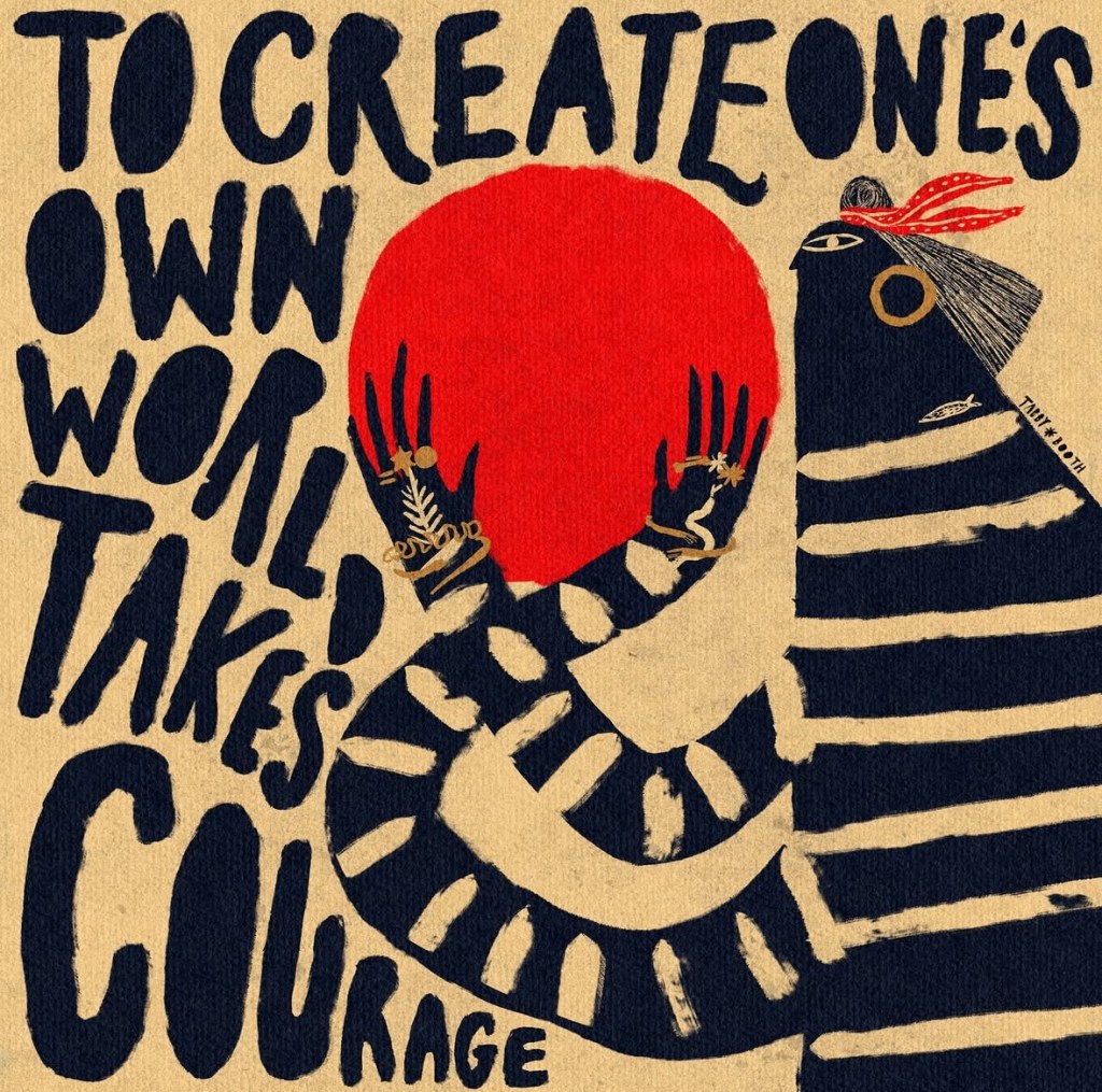
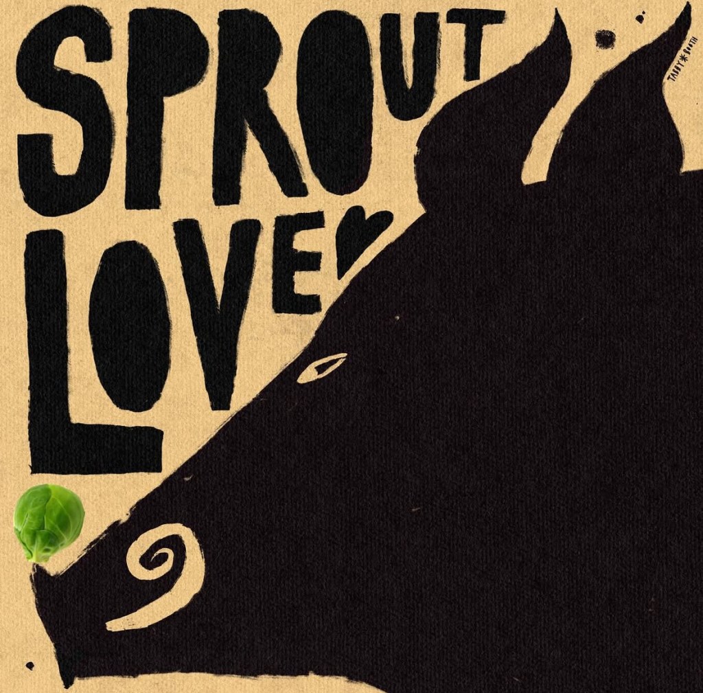
Hand lettering artist of the week: Tabby Booth
Tabby Booth is a Cornwall-based artist known for her bold, signature silhouettes that bridge the gap between illustration and traditional folk art. With a passion for interiors, each piece is designed with this in mind, threaded with themes of beasts, folklore, the sea, and the captivating charm of outsider art.
Her latest work draws inspiration from the ancient art of Scrimshaw, etching designs into bone and ivory, reinterpreting the tradition with modern sensibilities. Using the sgraffito technique, Tabby layers paint and wax onto wood, carving out intricate details with sharp tools to create richly textured, striking compositions. Each piece is uniquely crafted to complement a carefully sourced vintage frame, blending contemporary artistry with a sense of history and nostalgia.After studying Illustration at Central Saint Martins, Tabby co-founded Cygnets Art School and, more recently, Sailors Jail Gallery in Falmouth with her artist husband, James Heslip.
Words and Wildflowers Creative Prompts – Issue 76
Posted on December 22, 2025
We LOVE research and learning as a way to get inspired and boost ideas and creativity!! So, Kenzie and I are going to be sharing the inspiration that we collect here in our second newsletter…. once a week!!!
Here’s how it works:
We provide the inspiration. You interpret it however you wish… any medium, any size. It is meant to inspire lettering and floral art combined together. But, you can:
- Just do the florals, just do the lettering, or combine them together.
- Use the provided quote for your piece or select your own.
- Use colors from one of the inspiration images or select your own favorites
- Create the floral art… as a still life in a vase, a single flower, a border, a pattern, a bouquet
Hope you will create with us and post your work at #wordsandwildflowers2025 and tag @lorisiebert.studio and @snippetsofwhimsy
Quote of the week…
“I’m through accepting limits ‘Cause someone says they’re so Some things I cannot change But ’til I try, I’ll never know.”
— Stephen Schwartz
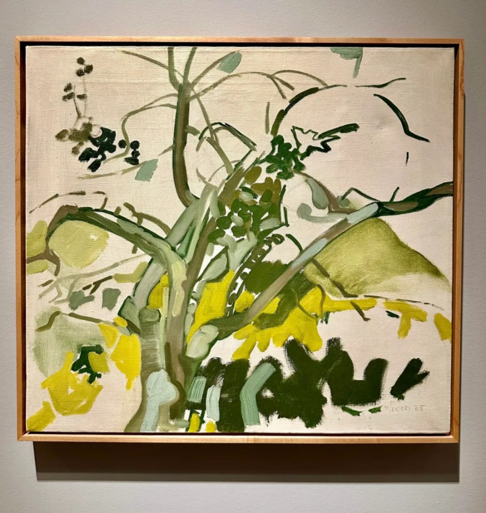
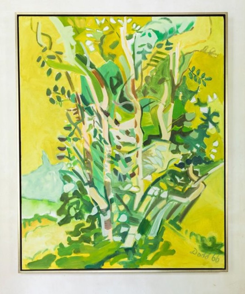
Inspirational artist of the week: Lois Dodd
Lois Dodd (born 1927 in Montclair, New Jersey) is an American painter. Dodd was a key member of New York’s postwar art scene. She played a large part and was involved in the wave of modern artists including Alex Katz and Yvonne Jacquette who explored the coast of Maine in the latter half of the 20th century.
For over fifty years Dodd has painted her immediate everyday surroundings at the places she has chosen to live and work – the Lower East Side, rural Mid-Coast Maine and the Delaware Water Gap. Dodd’s small, intimately-scaled paintings are almost always completed in one plein-air sitting. Her subjects include rambling New England out buildings, lush summer gardens, dried leafless plants, nocturnal moonlight skies and views through interior windows. She often returns to familiar motifs repeatedly at different times of the year with dramatically varied results.


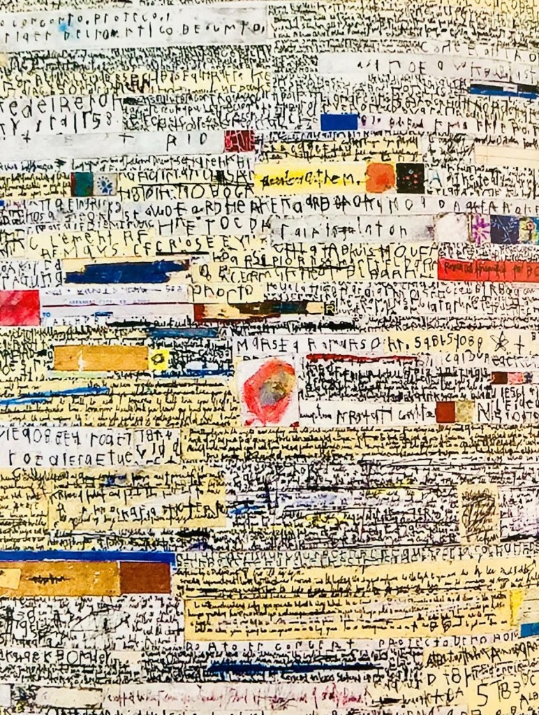
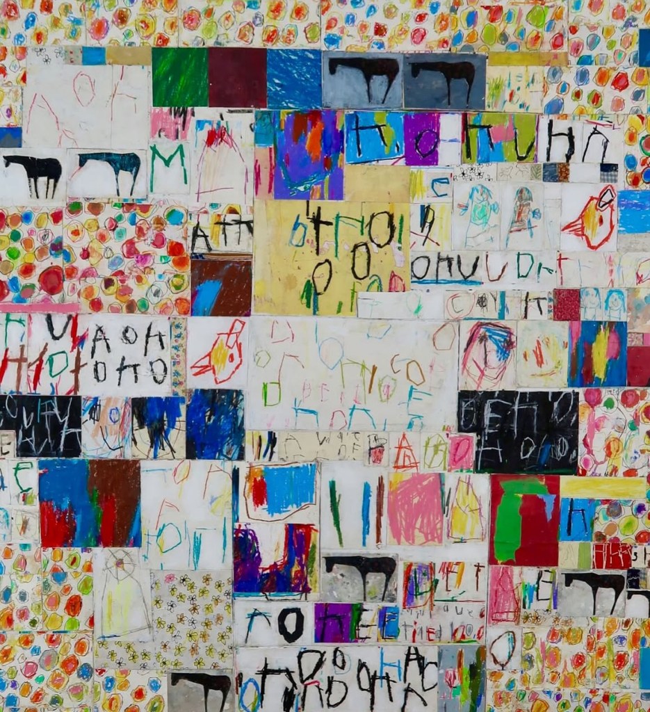
Hand lettering artist of the week: Edward Goss
Born in Toronto, Canada, Edward Goss left home at 17 to work in the construction industry before later earning a degree in horticulture. A self-taught artist, he began his creative journey in 2002. His preferred mediums are oil and coloured pencils, but his work also incorporates paper, cardboard, and adhesive tape. The concepts of repetition and layering are central to his work, evident in both his paintings and sculptures.
Goss has travelled extensively, living in New Mexico and London. His career took on an international dimension when he collaborated with Comme des Garçons, a Japanese haute couture house known for its ventures into the art world. Notable achievements of the brand include an exhibition at the Centre Pompidou in Paris in 1986 and several collections in collaboration with artists like Invader, Kaws, and Yu Minjun.
Edward Goss’s art is intentionally bold in colour and energetic in execution. His work is defined by the intricate use of collage, cut-outs, scrapings, and layered colours. His visual motifs, along with the impulse driving his brushstrokes, align with the neo-expressionist movement. His repeated use of letters across his works forms a sort of alphabet of the unconscious. Yet beyond a mere desire for repetition, his work is a constant exploration of how to recreate and reflect its impact on the world.


Words and Wildflowers Creative Prompts – Issue 75
Posted on December 15, 2025
We LOVE research and learning as a way to get inspired and boost ideas and creativity!! So, Kenzie and I are going to be sharing the inspiration that we collect here in our second newsletter…. once a week!!!
Here’s how it works:
We provide the inspiration. You interpret it however you wish… any medium, any size. It is meant to inspire lettering and floral art combined together. But, you can:
- Just do the florals, just do the lettering, or combine them together.
- Use the provided quote for your piece or select your own.
- Use colors from one of the inspiration images or select your own favorites
- Create the floral art… as a still life in a vase, a single flower, a border, a pattern, a bouquet
Hope you will create with us and post your work at #wordsandwildflowers2024 and tag @lorisiebert.studio and @snippetsofwhimsy
Quote of the week…
“Creativity is a continual surprise.”
— Ray Bradbury
Inspirational artist of the week: Emanuel Josef Margold
Emanuel Josef Margold (1889 – 1962) was an Austrian architect, interior designer, ceramicist and silversmith. Josef Hoffmann taught him at the Kunstgewerbeschule in Vienna.At the Wiener Werkstätte, he became Hoffmann’s assistant. He and Theodor Wende were the final painters to settle at the Grand Duke Louis IV of Hesse-artists’ Darmstadt’s colony Darmstadt in 1911. He was a prolific designer of furniture, glass, and porcelain in Darmstadt..


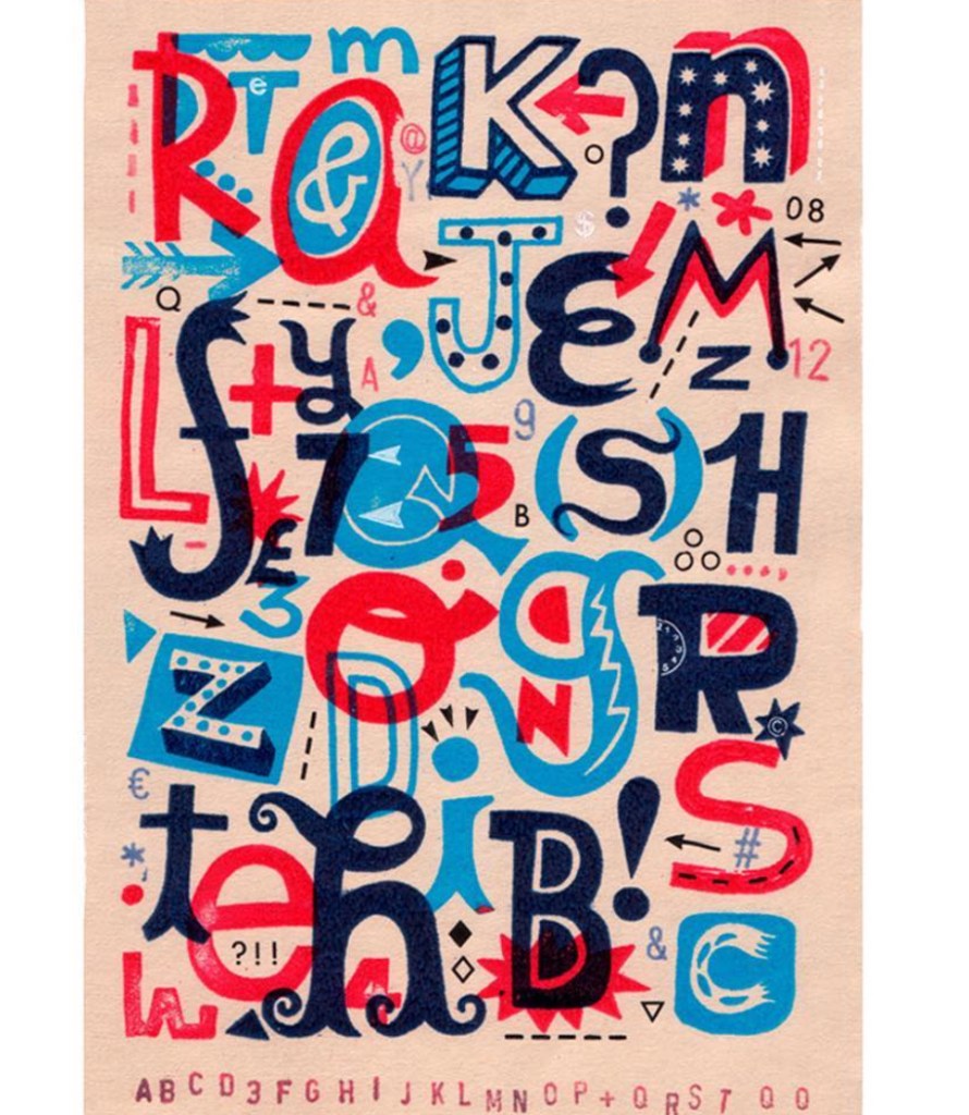
Hand lettering inspiration of the week: Linzie Hunter
Linzie Hunter is an award-winning illustrator, author and hand-lettering artist based in London, UK. In addition to illustrating numerous book covers and picture books, she has worked with a diverse range of international clients including Apple, Nike, Macy’s, Hallmark and The BBC.


Words and Wildflowers Creative Prompts – Issue 74
Posted on December 8, 2025
We LOVE research and learning as a way to get inspired and boost ideas and creativity!! So, Kenzie and I are going to be sharing the inspiration that we collect here in our second newsletter…. once a week!!!
Here’s how it works:
We provide the inspiration. You interpret it however you wish… any medium, any size. It is meant to inspire lettering and floral art combined together. But, you can:
- Just do the florals, just do the lettering, or combine them together.
- Use the provided quote for your piece or select your own.
- Use colors from one of the inspiration images or select your own favorites
- Create the floral art… as a still life in a vase, a single flower, a border, a pattern, a bouquet
Hope you will create with us and post your work at #wordsandwildflowers2024 and tag @lorisiebert.studio and @snippetsofwhimsy
Quote of the week…
“I close my eyes and I can see
The world that’s waiting up for me
That I call my own
Every night I lie in bed
The brightest colours fill my head
A million dreams are keeping me awake
A million dreams for the world we’re gonna make
For the world we’re gonna make.”— from The Greatest Showman
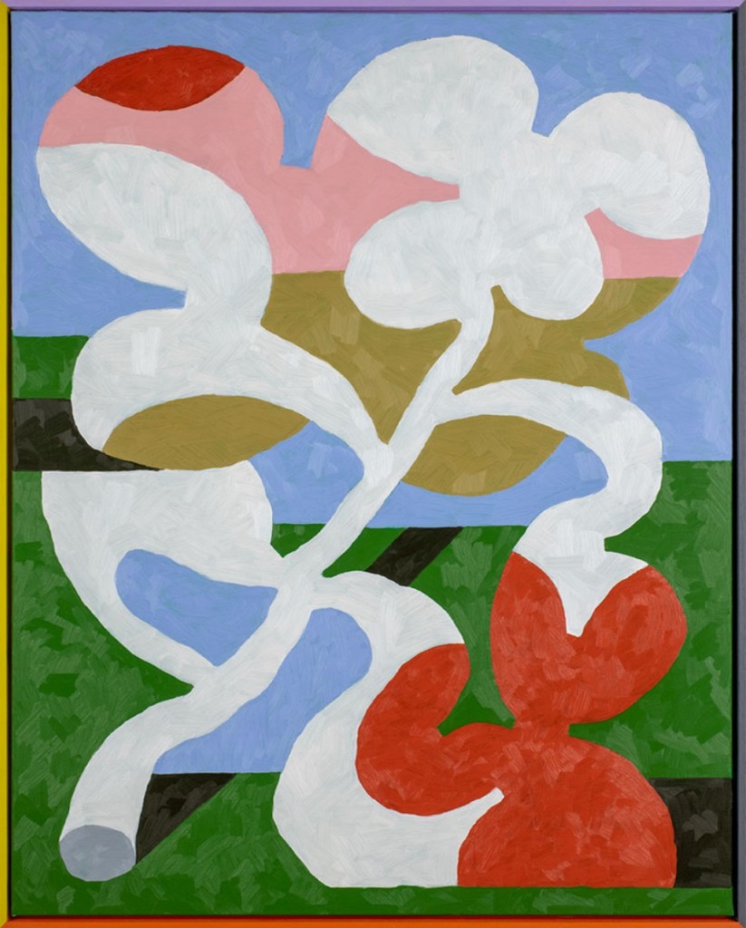
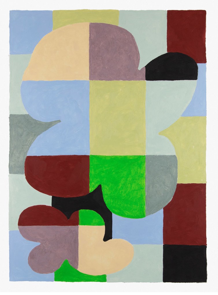
Inspirational artist of the week: Jordy van den Nieuwendijk
Jordy van den Nieuwendijk (b. 1985) is a Dutch artist currently living and working in Melbourne. He graduated from the Royal Academy of Arts in The Hague mid 2011, where he held a funeral and memorial service for his then alter-ego ‘Superoboturbo’.
Through painting, Jordy explores fundamental objects of everyday life. Working with primary colour palettes and simplified shape structures, he has a talent for examining subject matter in series that innovate inside carefully controlled boundaries. While freeing himself from the choice between abstract or figurative image forms, he creates a field of tension reinforced by the timeless character of his work. His tendency towards this style of painting could be described as new purism. He has had solo exhibitions in Amsterdam (De Voorkamer), Rotterdam (Kunsthal), Düsseldorf (Ninasagt), London (Public Gallery), New York (Moiety) and Melbourne (Sophie Gannon).
As a commercial illustrator, he has worked on projects for numerous clients such as Apple, American Express, Dropbox, Hermés, Jacquemus, The New York Times, Rimowa, Vogue and WeTransfer. Always injecting elements of fun and playfulness into his editorial work, he maintains a truly unique and discernible approach.
Jordy’s work walks a charming and endearing line between the mature and naive. Often (if not always) it conveys an underlying optimism which is assuredly refreshing in our contemporary culture. Jordy is represented by agents Monsieur l’Agent (Paris) and Big Active(London).


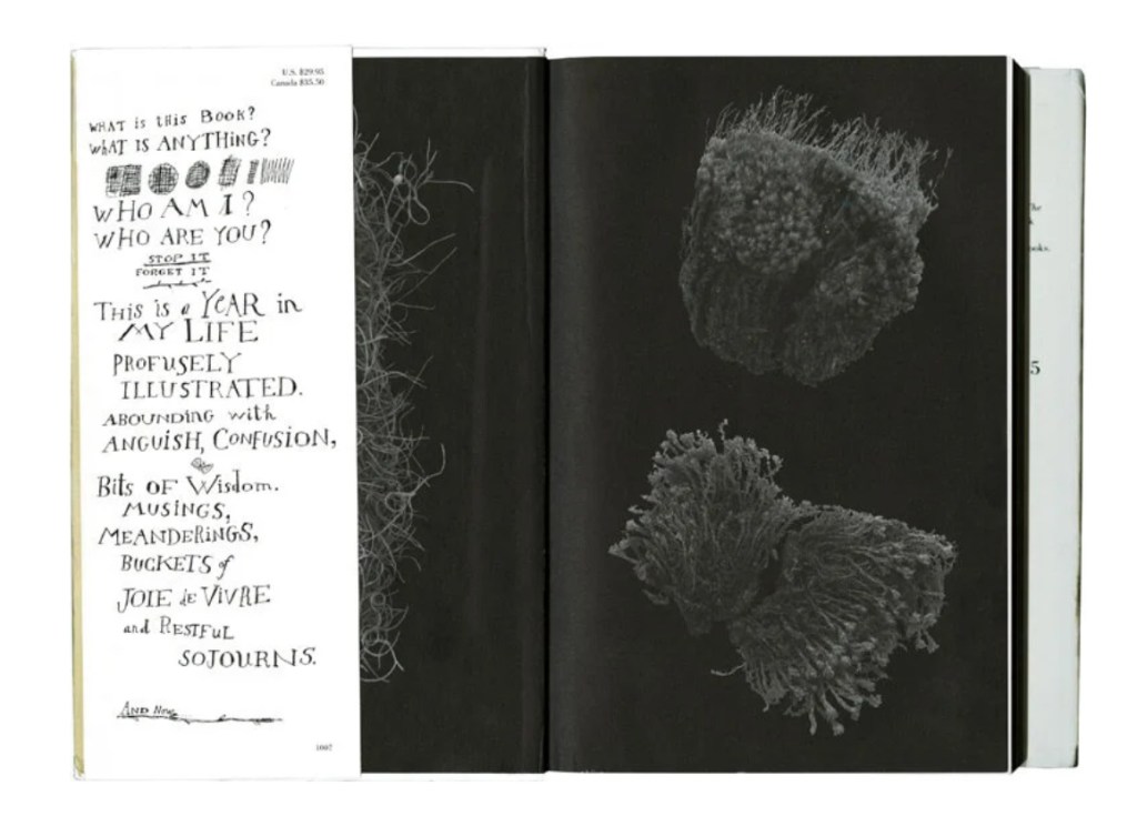
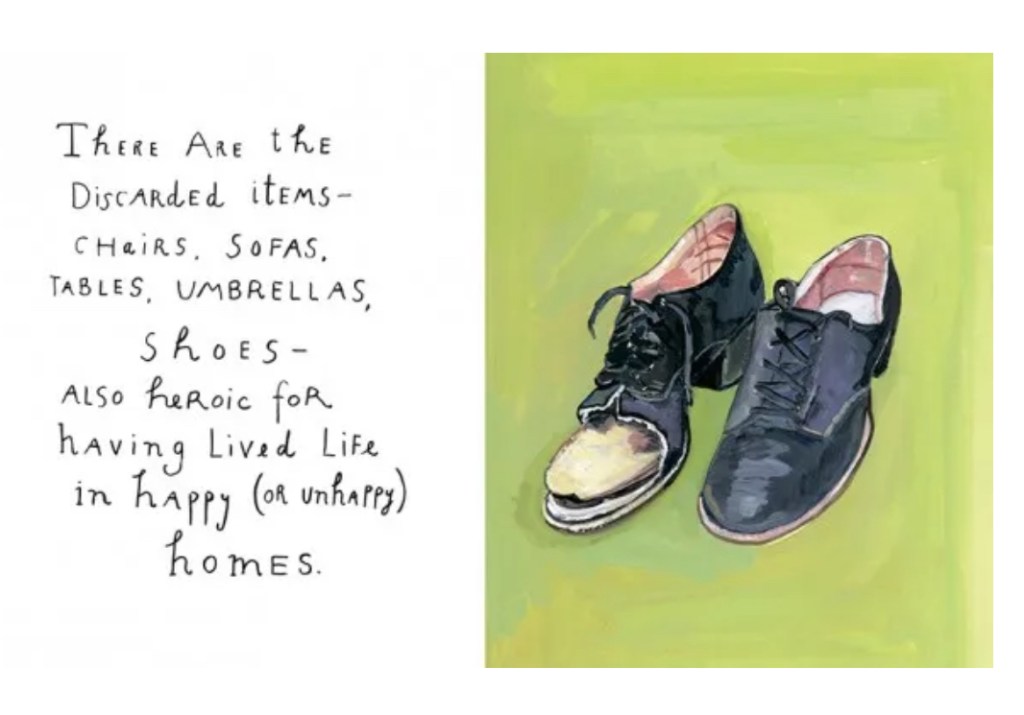
Hand lettering inspiration of the week: Maira Kalman
Maira Kalman was born in Tel Aviv and moved to New York City with her family at the age of four.
She was raised in bucolic Riverdale, the Bronx. She now lives in Manhattan.
MK has written/illustrated over 30 books for adults and children.
She has been a frequent contributor to The New York Times and The New Yorker.
She has created textiles for Isaac Mizrahi and Kate Spade and sets for Mark Morris.
Other collaborations have been with Nico Muhly, Alex Kalman, Michael Pollan, David Byrne, John Heginbotham and Gertrude Stein.
Her watch and clock designs appear under the M&Co label, the design studio created by her late husband Tibor Kalman.
She has won many awards and given numerous talks, including several TED talks.
Her art has been exhibited in galleries and museums around the world.


Words and Wildflowers Creative Prompts – Issue 73
Posted on December 1, 2025
We LOVE research and learning as a way to get inspired and boost ideas and creativity!! So, Kenzie and I are going to be sharing the inspiration that we collect here in our second newsletter…. once a week!!!
Here’s how it works:
We provide the inspiration. You interpret it however you wish… any medium, any size. It is meant to inspire lettering and floral art combined together. But, you can:
- Just do the florals, just do the lettering, or combine them together.
- Use the provided quote for your piece or select your own.
- Use colors from one of the inspiration images or select your own favorites
- Create the floral art… as a still life in a vase, a single flower, a border, a pattern, a bouquet
Hope you will create with us and post your work at #wordsandwildflowers2024 and tag @lorisiebert.studio and @snippetsofwhimsy
Quote of the week…
“All we have to decide is what to do with the time that is given to us.”
— Gandalf
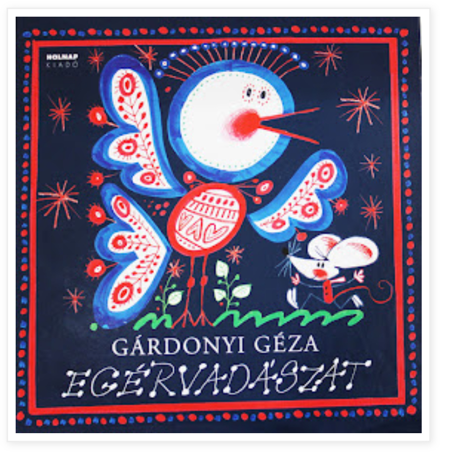
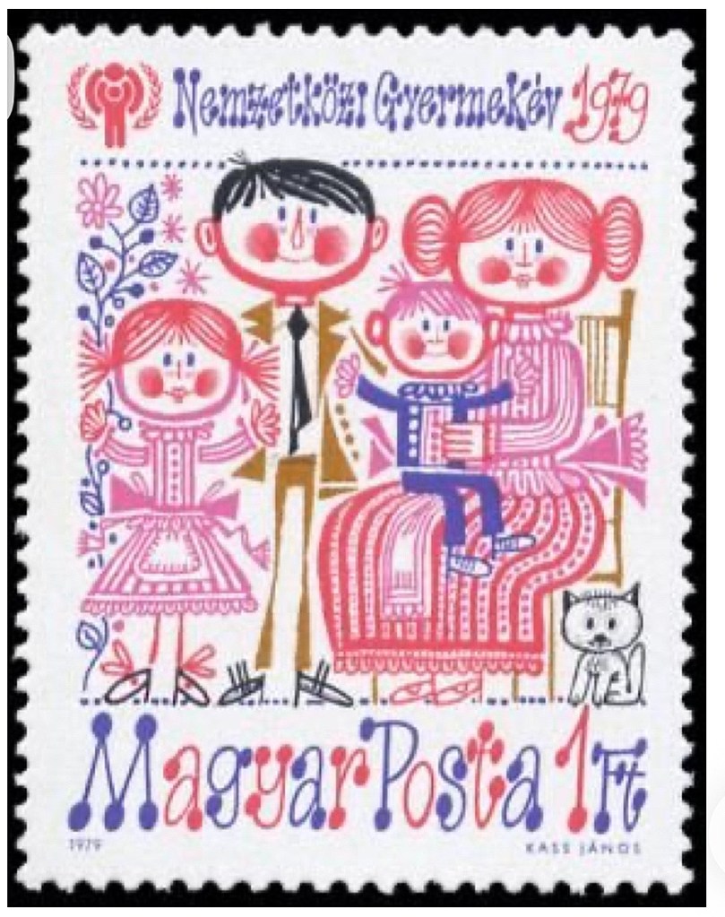
Inspirational artist of the week: János Kass
János Kass (1927-2010) was a sculptor, graphic designer and printer, who also worked in film and animation. He illustrated over 400 books and was honoured with many awards in his life time including Hungary’s highest award, the Kossuth prize. János Kass’s style is a mixture of fine black lines and broader colour lines there is no mixing of colour, which is kept bold and singular. This is not János Kass’s only style of work, but it is very distinctive and instantly recognisable as well as being bright, fun and happy.


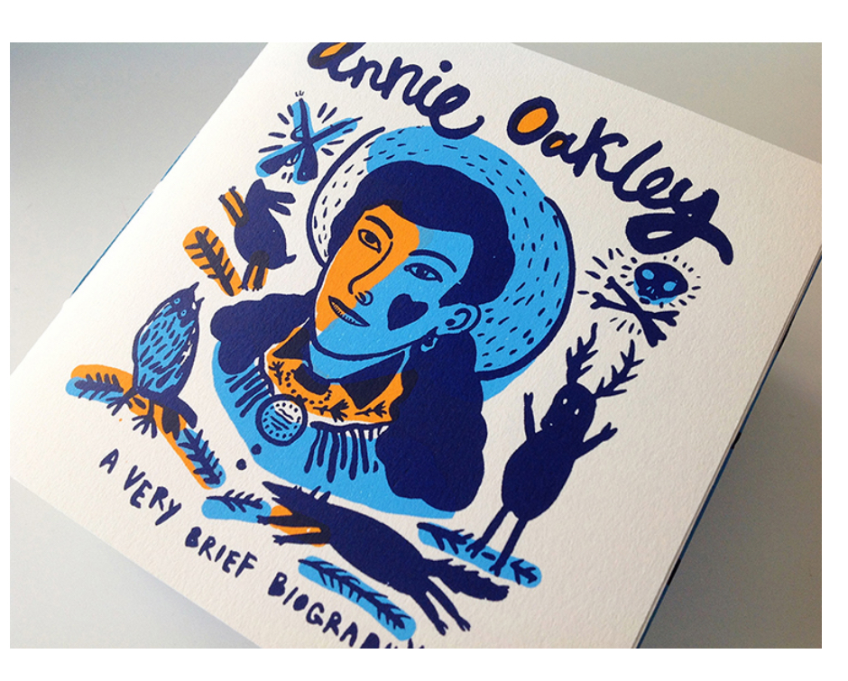
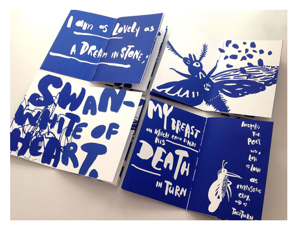
Hand lettering inspiration of the week: Natalya Balnova
Natalya Balnova is a New York–based illustrator, printmaker, and designer known for her bold, expressive black-ink drawings and richly layered silkscreen techniques. Originally from Saint Petersburg, Russia, she trained in classical fine art before earning a degree in design and printmaking from the Academy of Industrial Art and Design. After moving to the U.S., she completed a BFA in Communication Design at Parsons and an MFA in Illustration at the School of Visual Arts.
Balnova’s work blends fine art, graphic design, and illustration, often infusing dark whimsy, poetic humor, and a hand-crafted sensibility. Her illustrations appear across editorial publications, books, posters, packaging, and self-published art projects including zines and silkscreened books. In addition to her freelance practice, she has taught courses in book design, color and design, and hand-lettering.


Words and Wildflowers Creative Prompts – Issue 72
Posted on November 24, 2025
We LOVE research and learning as a way to get inspired and boost ideas and creativity!! So, Kenzie and I are going to be sharing the inspiration that we collect here in our second newsletter…. once a week!!!
Here’s how it works:
We provide the inspiration. You interpret it however you wish… any medium, any size. It is meant to inspire lettering and floral art combined together. But, you can:
- Just do the florals, just do the lettering, or combine them together.
- Use the provided quote for your piece or select your own.
- Use colors from one of the inspiration images or select your own favorites
- Create the floral art… as a still life in a vase, a single flower, a border, a pattern, a bouquet
Hope you will create with us and post your work at #wordsandwildflowers2024 and tag @lorisiebert.studio and @snippetsofwhimsy
Quote of the week…
“…Mistakes…are the portals of discovery.”
— James Joyce
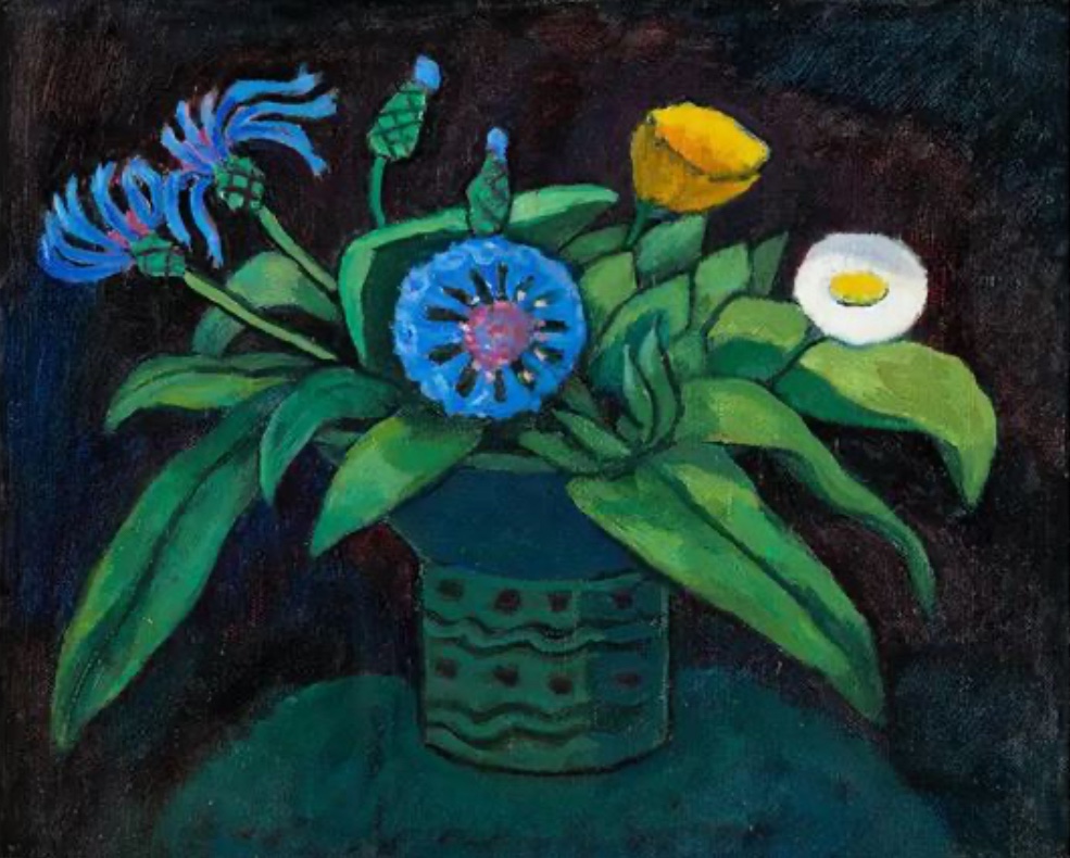
Inspiring artist of the week: Gabriele Münter
Gabriele Münter (19 February 1877 – 19 May 1962) was a German expressionist painter who was at the forefront of the Munich avant-garde in the early 20th century. She studied and lived with the painter Wassily Kandinsky and was a founding member of the expressionist group Der Blaue Reiter.


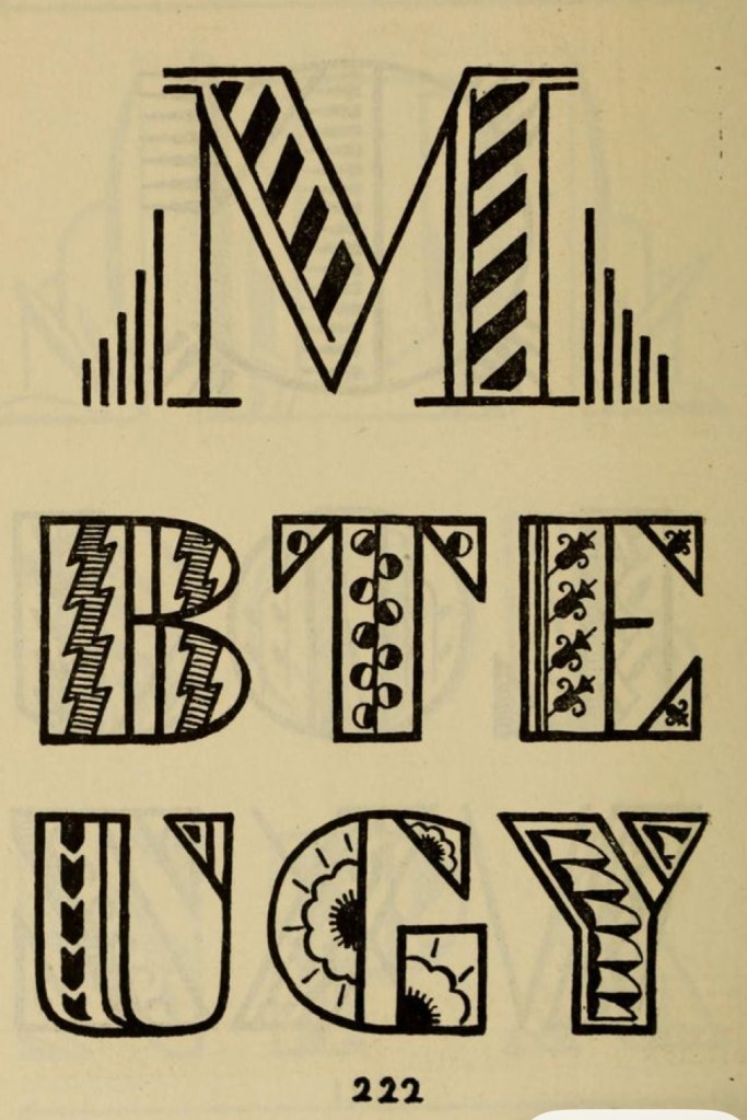
Hand lettering inspiration of the Week: Samuel Welo
Samuel Welo was an American advertising calligrapher, typographer, designer and lettering artist whose work appeared in the 1920s. Scans by Gene Gable of many pages of Studio Handbook Letter & Design for Artists and Advertisers (1927, Samuel Welo). This book has 233 pages and is entirely hand-lettered!


Words and Wildflowers Creative Prompts – Issue 71
Posted on November 17, 2025
We LOVE research and learning as a way to get inspired and boost ideas and creativity!! So, Kenzie and I are going to be sharing the inspiration that we collect here in our second newsletter…. once a week!!!
Here’s how it works:
We provide the inspiration. You interpret it however you wish… any medium, any size. It is meant to inspire lettering and floral art combined together. But, you can:
- Just do the florals, just do the lettering, or combine them together.
- Use the provided quote for your piece or select your own.
- Use colors from one of the inspiration images or select your own favorites
- Create the floral art… as a still life in a vase, a single flower, a border, a pattern, a bouquet
Hope you will create with us and post your work at #wordsandwildflowers2024 and tag @lorisiebert.studio and @snippetsofwhimsy
Quote of the week…
“Art is something that makes you breathe with a different kind of happiness”,
— Anni Albers
Inspirational Artist of the week: Pep Carrió
Pep Carrió (Spain, 1963) is an artist, graphic designer and book illustrator known for his exploration of the subconscious and spontaneous creativity. His Visual Diary project stands out for the inclusion of drawings, paintings and collages with recurring motifs such as heads, houses, birds, and other natural elements where he reflects human themes such as loneliness, search and natural beauty. In his work he uses various techniques and is characterized by a color palette dominated by blues and grays, evoking calm, reflection and melancholy.


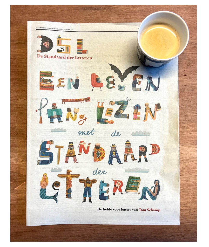
Hand lettering inspiration of the week: Tom Schamp
Born in 1970, Tom Schamp grew up in and around Brussels. He now lives in the suburb of that same city. After graduating from the Applied Arts department at the Sint-Lukas Art School in Brussels, he spent an additional year studying Graphic Design in Poznan (Poland).
Tom has a long track record. His illustrations are aimed at both adults and children. He receives assignments from an international mix of customers, from the very commercial commissions over magazine illustrations to picture books. Over the past twenty years, Tom published thirty-five picture books, many of which have been translated in different languages.
Tom has a ‘complex-naive’ style, often spiced with a touch of humor. With acrylic paint he achieves the typical color intensity. The past decade Tom paints the different elements of an illustration separately on cardboard, which he later scans to make digital compositions. This technique allows him to find the right rithme more easily and offers Tom the right balance between craft and technology.
Tom’s later work is far more detailed than his older illustration up to the point that his illustratons need a trained eye to catch every subtlety. He has a fascination for strange objects, little hand painted boxes, stamps, animal-shaped coffeepots, you name it.