Words and Wildflowers Creative Prompts – Issue 70
Posted on November 10, 2025
We LOVE research and learning as a way to get inspired and boost ideas and creativity!! So, Kenzie and I are going to be sharing the inspiration that we collect here in our second newsletter…. once a week!!!
Here’s how it works:
We provide the inspiration. You interpret it however you wish… any medium, any size. It is meant to inspire lettering and floral art combined together. But, you can:
- Just do the florals, just do the lettering, or combine them together.
- Use the provided quote for your piece or select your own.
- Use colors from one of the inspiration images or select your own favorites
- Create the floral art… as a still life in a vase, a single flower, a border, a pattern, a bouquet
Hope you will create with us and post your work at #wordsandwildflowers2024 and tag @lorisiebert.studio and @snippetsofwhimsy
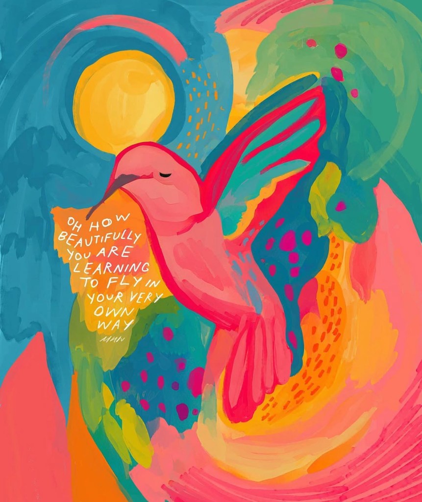
Quote of the week…
You’re off to great places, today is your day. Your mountain is waiting, so get on your way.
— Dr. Seuss
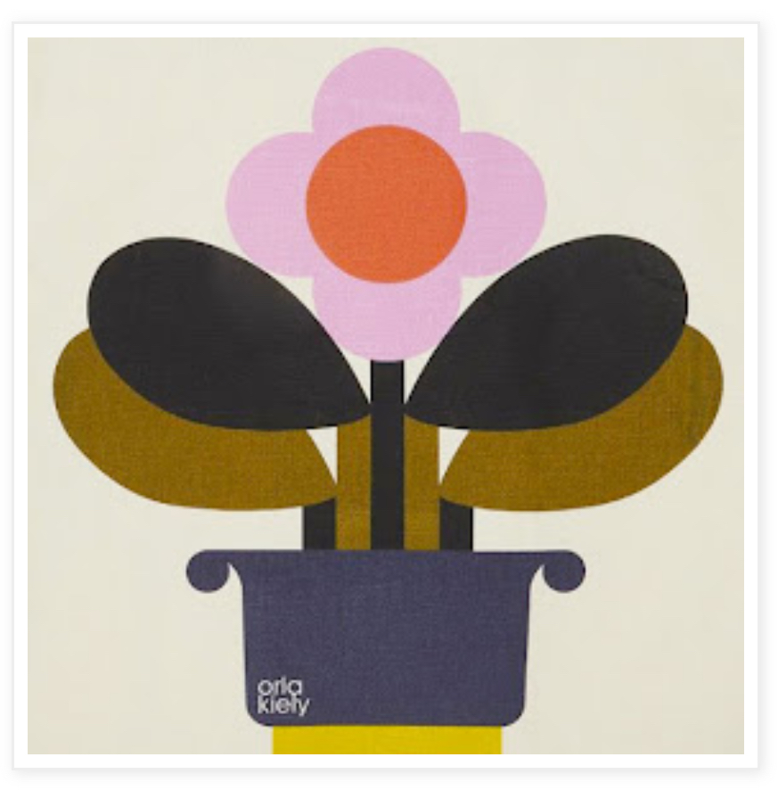
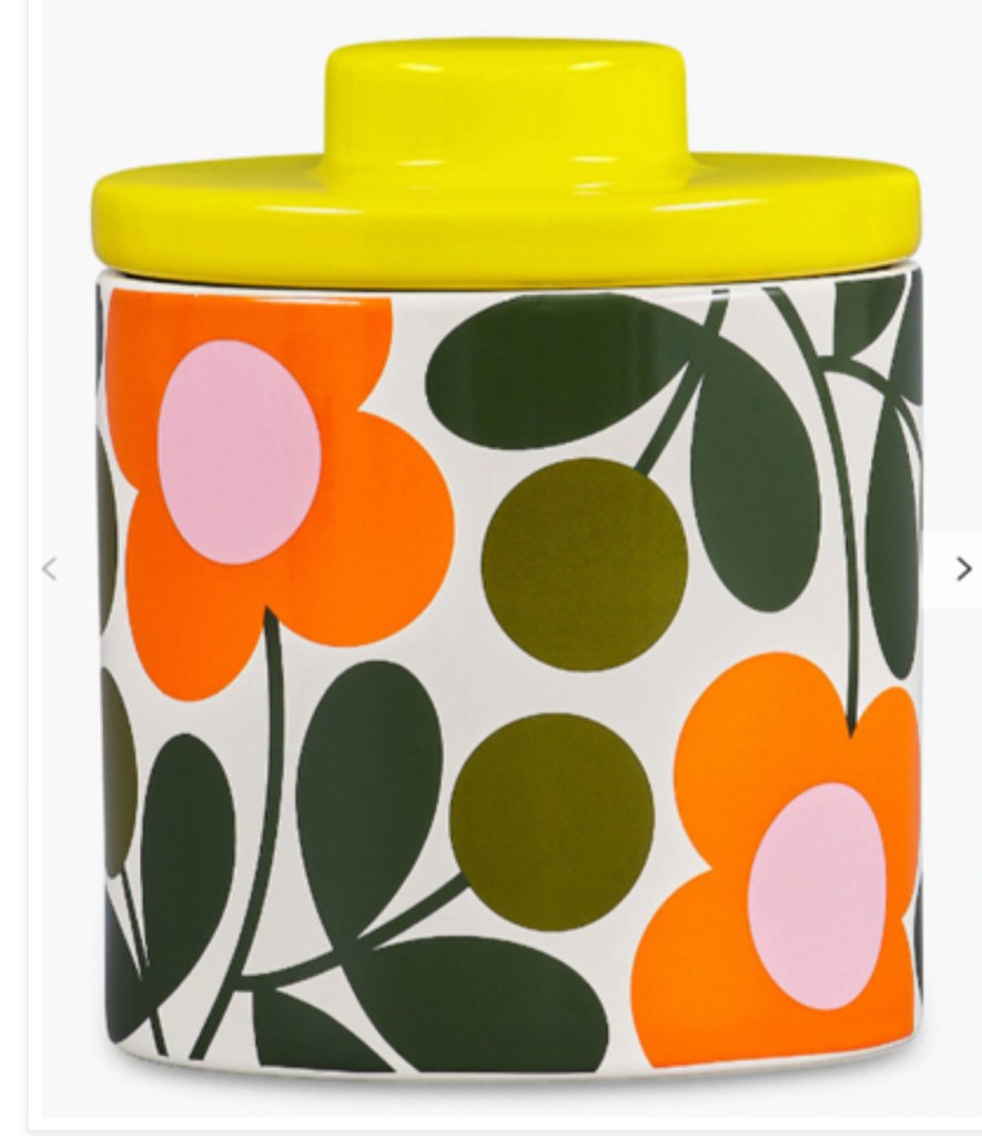
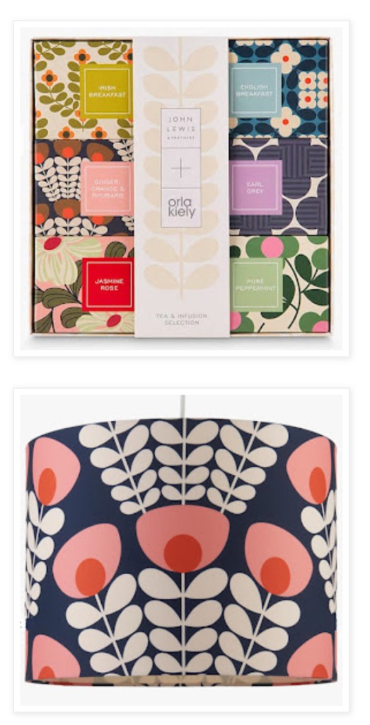
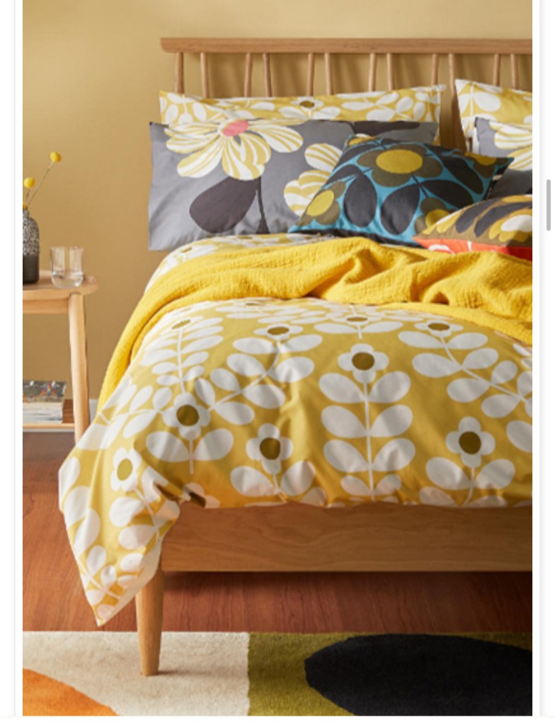
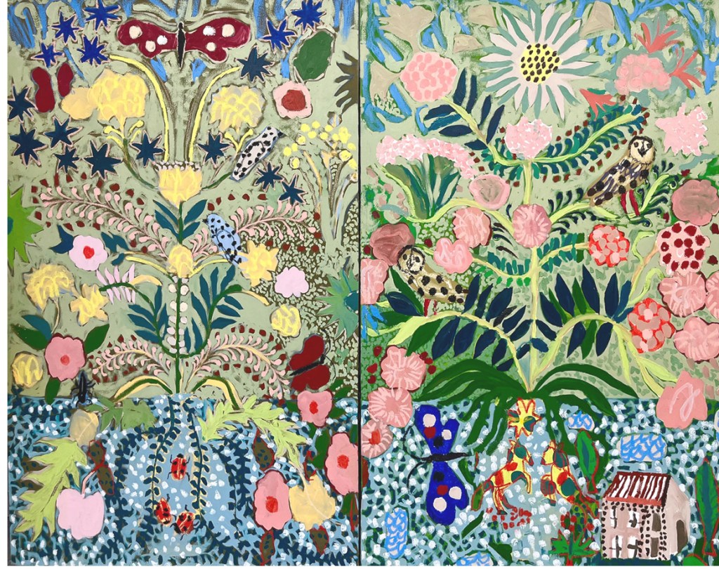
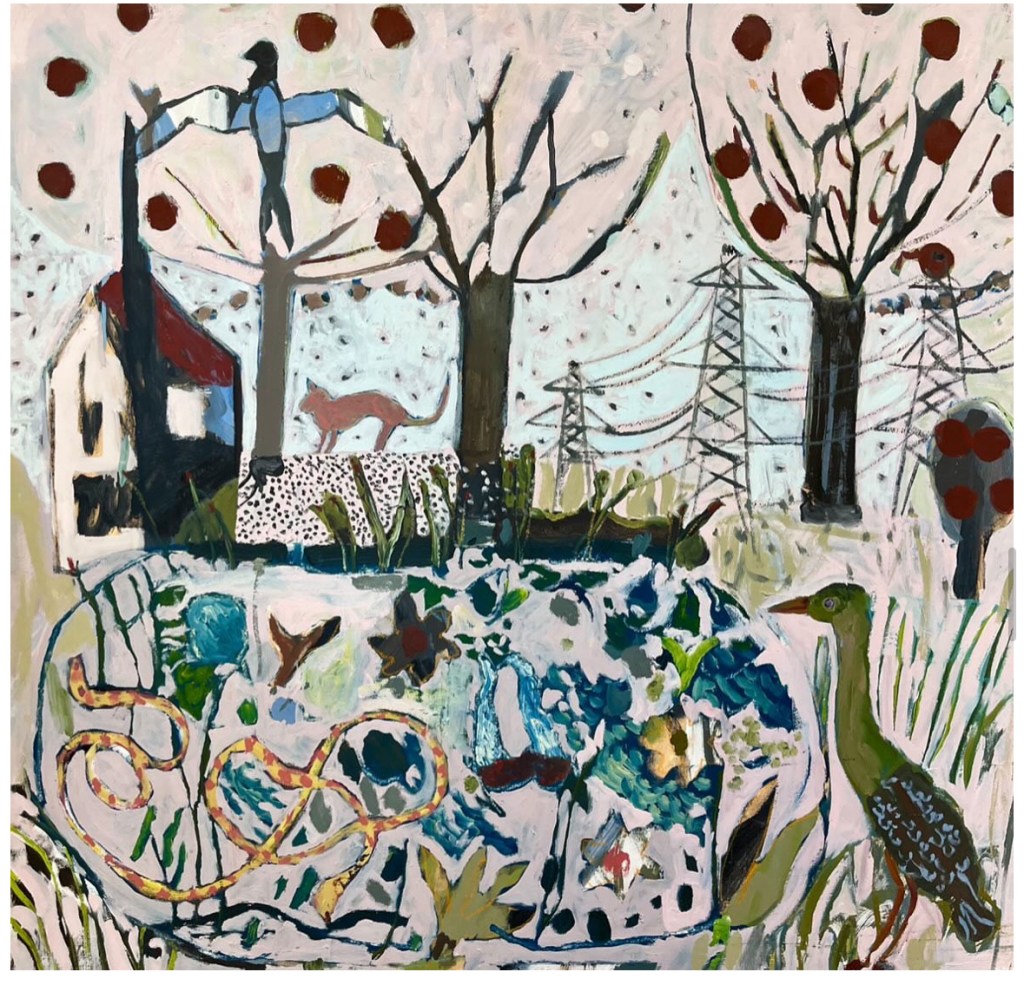
Inspirational Artist of the week: Orla Kiely
Orla Kiely is an Irish fashion and lifestyle designer known for her distinctive retro-inspired, graphic prints based on nature. Her career began with designing hats and textiles after earning degrees from the National College of Art and Design in Dublin and the Royal College of Art in London. With her husband, Dermott Rowan, she founded the Orla Kiely Partnership in 1997, building a brand that has expanded to include ready-to-wear fashion, homeware, and accessories.


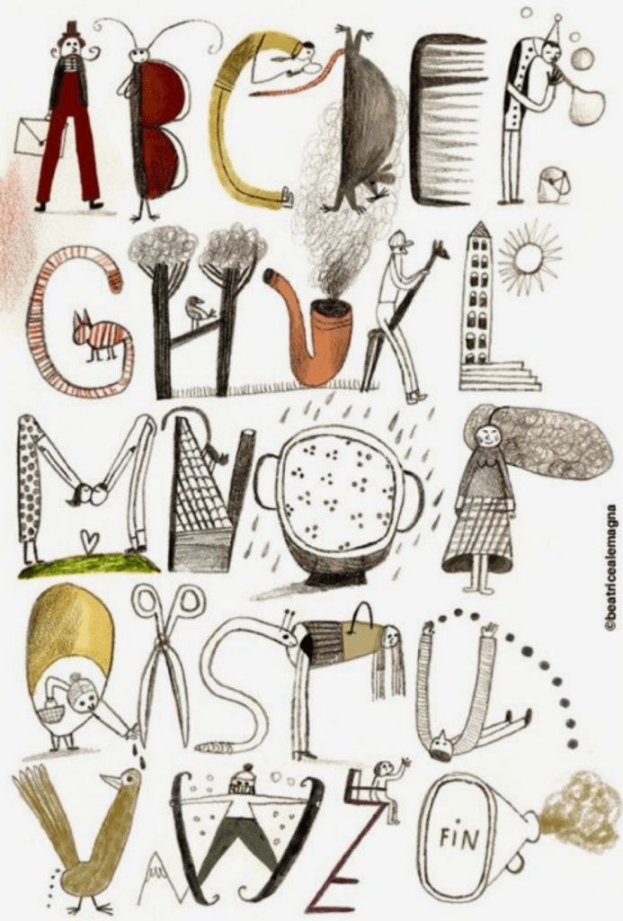
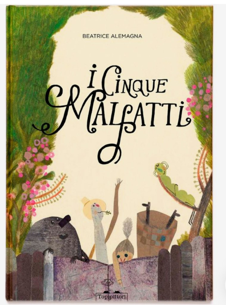
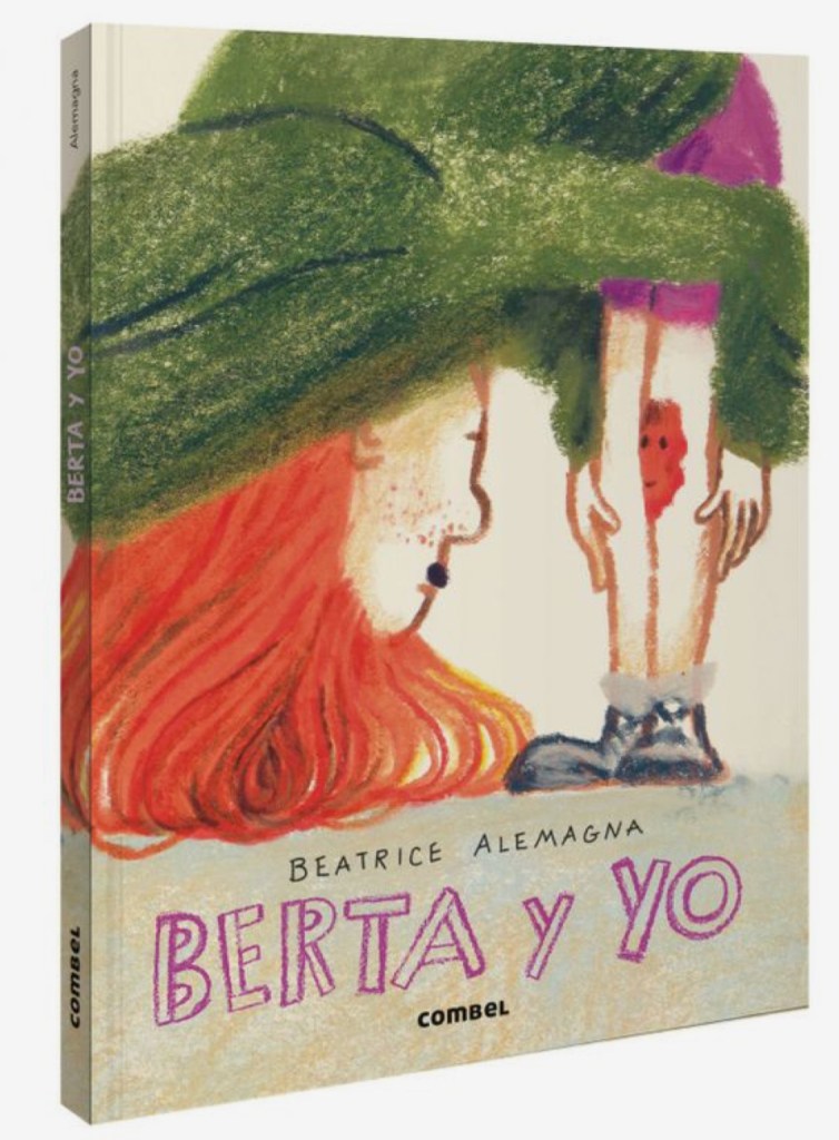
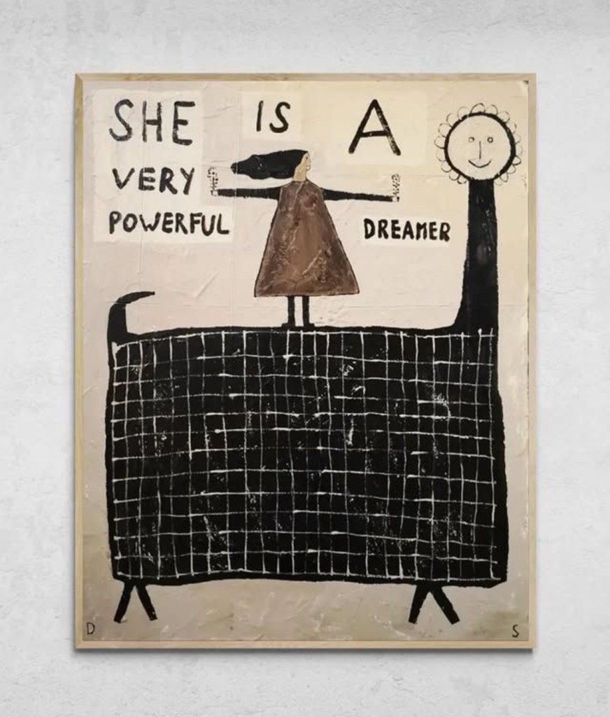
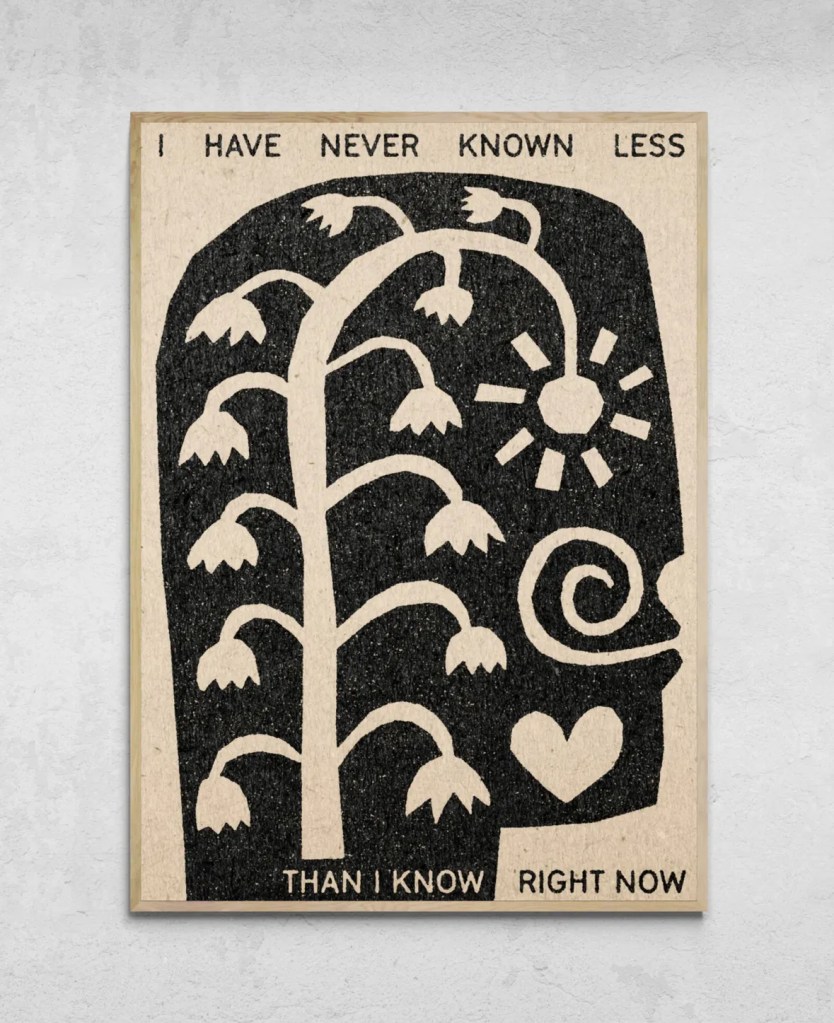
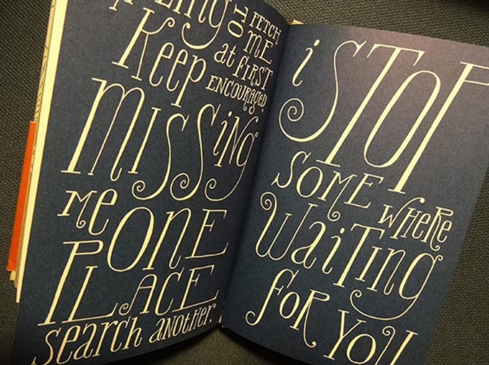
Hand lettering inspiration of the week: Beatrice Alemagna
Beatrice Alemagna is an award-winning Italian author and illustrator known for her children’s books, which have been translated into numerous languages and received international acclaim. Born in Bologna, Italy, in 1973, she studied graphic design and moved to Paris, France, in 1997, where she now lives and works. She is celebrated for her unique artistic style.


Words and Wildflowers Creative Prompts – Issue 69
Posted on November 3, 2025
We LOVE research and learning as a way to get inspired and boost ideas and creativity!! So, Kenzie and I are going to be sharing the inspiration that we collect here in our second newsletter…. once a week!!!
Here’s how it works:
We provide the inspiration. You interpret it however you wish… any medium, any size. It is meant to inspire lettering and floral art combined together. But, you can:
- Just do the florals, just do the lettering, or combine them together.
- Use the provided quote for your piece or select your own.
- Use colors from one of the inspiration images or select your own favorites
- Create the floral art… as a still life in a vase, a single flower, a border, a pattern, a bouquet
Hope you will create with us and post your work at #wordsandwildflowers2024 and tag @lorisiebert.studio and @snippetsofwhimsy
Quote of the week…
“Mistakes are the portals to discovery.”
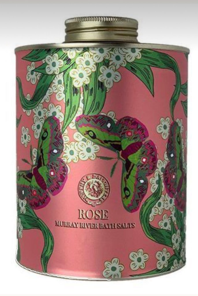
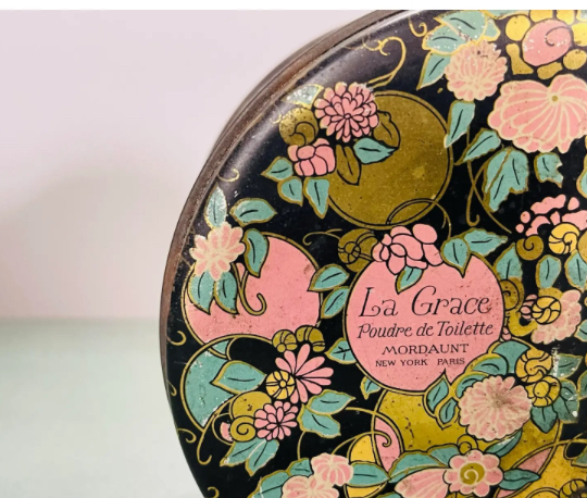
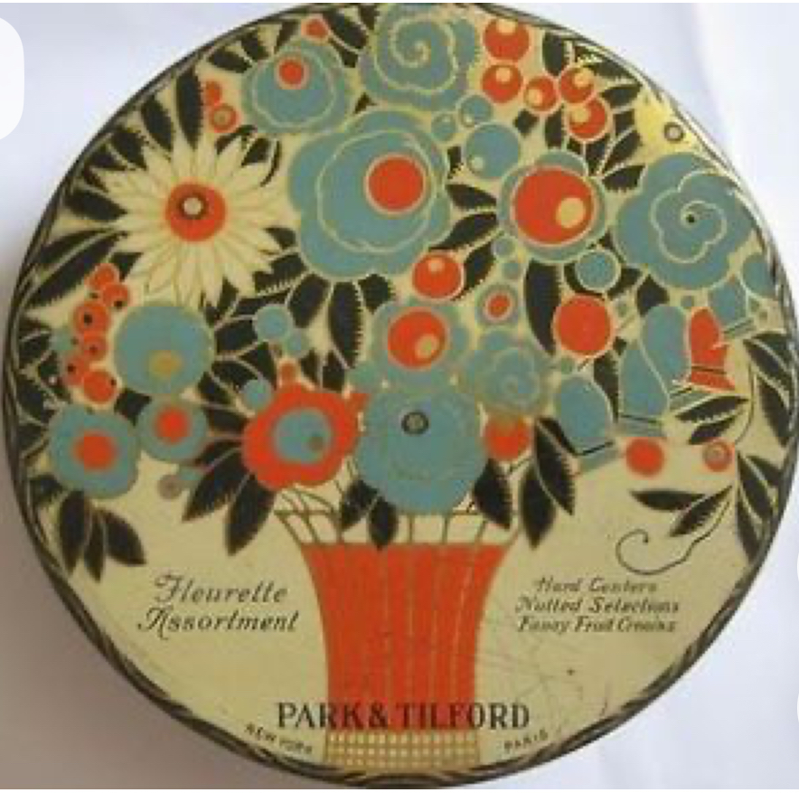
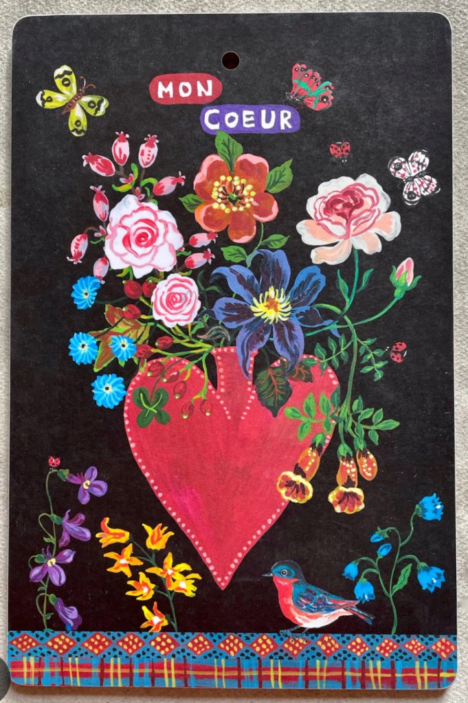
Inspirational art of the week: floral tins
I LOVE tins! I have a big collection! I find the colors, the graphics, the typography and the patterns so inspiring.


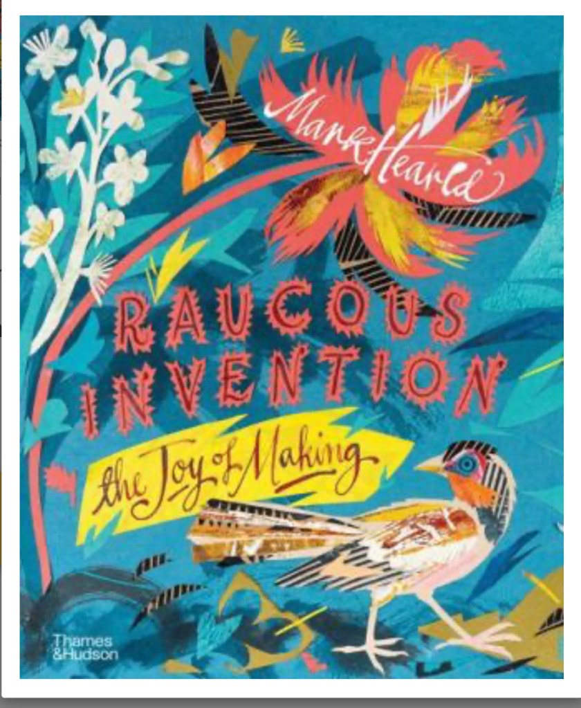
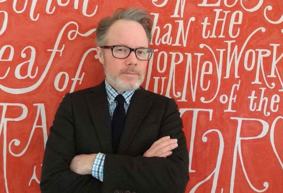
Hand lettering inspiration of the week: Mark Hearld
Born 1974, based in York.
Mark Hearld is endlessly inspired by nature, creating exuberant, joyful and vibrant collages. He is an artist and designer whose distinctive style is influenced by mid-twentieth-century neo-romanticism, the gaiety of 1930s modernism and British folk art. Mark Hearld is inspired by artists such as Eric Ravilious, John Piper and Edward Bawden.
Mark Hearld has an unbridled passion for making, and his extraordinary creativity leads to collaborative projects with artists and traditional craft makers across multiple disciplines.
Collage is central to Mark Hearld’s artistic output, not only as a medium but as a process that is firmly rooted in twentieth-century art. Collage was a technique used by Matisse, Picasso and John Piper to introduce abstraction into their images. Mark similarly uses this means of abstraction, combined with his traditional academic training and careful observation, to inform his creativity.


Words and Wildflowers Creative Prompts – Issue 68
Posted on October 27, 2025
We LOVE research and learning as a way to get inspired and boost ideas and creativity!! So, Kenzie and I are going to be sharing the inspiration that we collect here in our second newsletter…. once a week!!!
Here’s how it works:
We provide the inspiration. You interpret it however you wish… any medium, any size. It is meant to inspire lettering and floral art combined together. But, you can:
- Just do the florals, just do the lettering, or combine them together.
- Use the provided quote for your piece or select your own.
- Use colors from one of the inspiration images or select your own favorites
- Create the floral art… as a still life in a vase, a single flower, a border, a pattern, a bouquet
Hope you will create with us and post your work at #wordsandwildflowers2024 and tag @lorisiebert.studio and @snippetsofwhimsy
Quote of the week…
“The world of reality has its limits… the world of imagination is boundless.”
— Quote from the movie “White Bird”
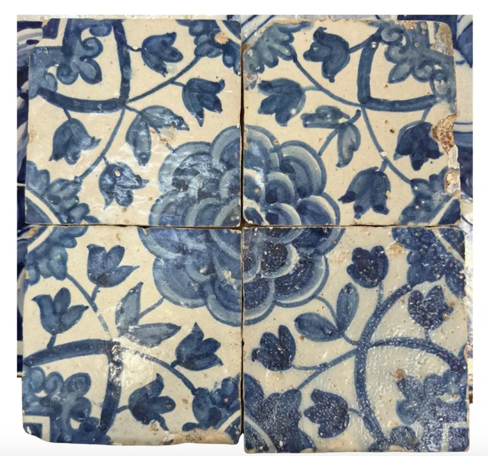
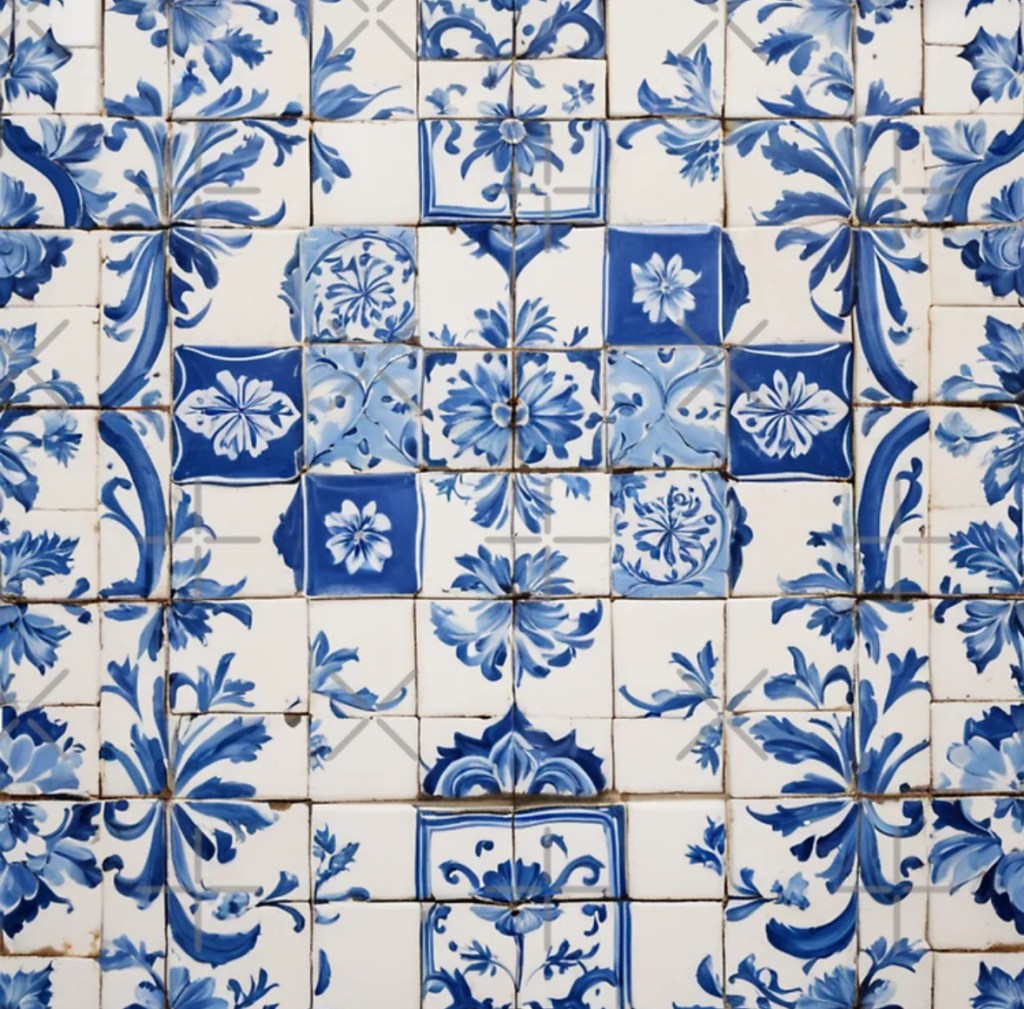
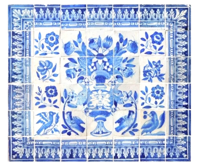
Inspiration of the week: Portuguese tiles
The significance of cobalt blue in azulejos lies in its association with the prestigious Chinese porcelain and its evolution in the painting of Portuguese tiles from the late 17th century.
This color became prominent, often used in combination with white, and played an important role in the aesthetics and evolution of tile art in Portugal. Its popularity endures to this day, being considered a fashionable color for home painting and a lasting trend. Additionally, cobalt blue also played a revolutionary role in Chinese ceramics, being one of the most well-known tones in blue and white porcelain. Therefore, the importance of cobalt blue in azulejos is rooted in its history, influence on art and design, and its enduring aesthetic appeal. This color scheme has become prominent due to the influence of the Mudejar-style tiles, which King Manuel I of Portugal discovered in Seville, Spain, in 1498. Blue and white tiles have become a distinctive feature of tile art in Portugal and are widely used in the decoration of buildings, churches, and monuments throughout the country. The popularity and durability of these colors have contributed to their prominence in Portuguese tile art and culture.


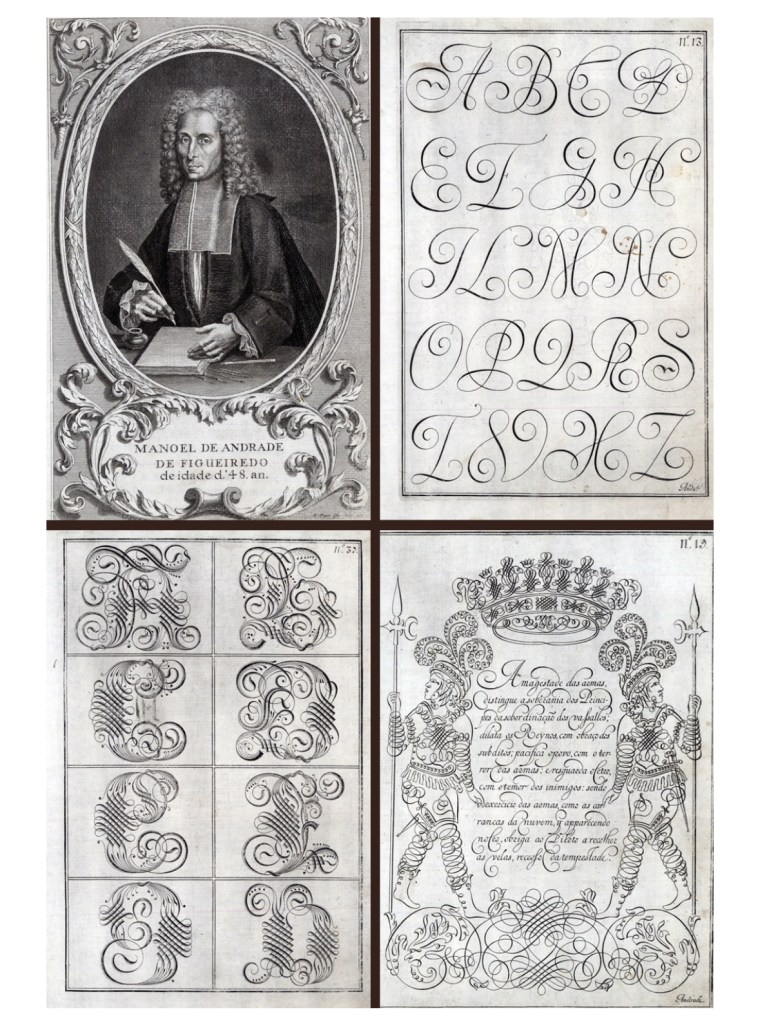
Hand lettering inspiration of the week: Andrade de Figueiredo
Portuguese penman of the 17th century, 1670-1722. Some say 1670–1735. Andrade de Figueiredo was born in Espirito Santo, where his father was Governor of the Capitania. His work follows the style of the great Italian masters in its use of clubbed ascenders and descenders, and of Diaz Morante, the famous Spanish writing master, in its very elaborate show of command of hand.
Author of Writing Book (1721, in Portuguese), in which we can find exceptional flourish work.
His work inspired Ventura da Silva, a Portuguese typographer who published Regras Methodicas in 1803, who redesigned some of Figueiredo’s type specimens.


Words and Wildflowers Creative Prompts – Issue 67
Posted on October 20, 2025
We LOVE research and learning as a way to get inspired and boost ideas and creativity!! So, Kenzie and I are going to be sharing the inspiration that we collect here in our second newsletter…. once a week!!!
Here’s how it works:
We provide the inspiration. You interpret it however you wish… any medium, any size. It is meant to inspire lettering and floral art combined together. But, you can:
- Just do the florals, just do the lettering, or combine them together.
- Use the provided quote for your piece or select your own.
- Use colors from one of the inspiration images or select your own favorites
- Create the floral art… as a still life in a vase, a single flower, a border, a pattern, a bouquet
Hope you will create with us and post your work at #wordsandwildflowers2024 and tag @lorisiebert.studio and @snippetsofwhimsy
Quote of the week…
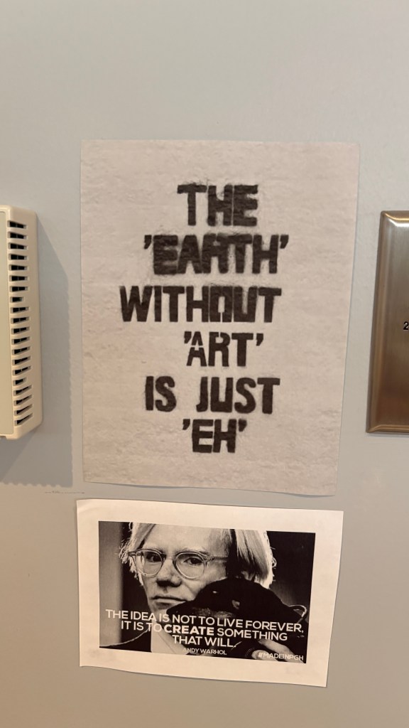
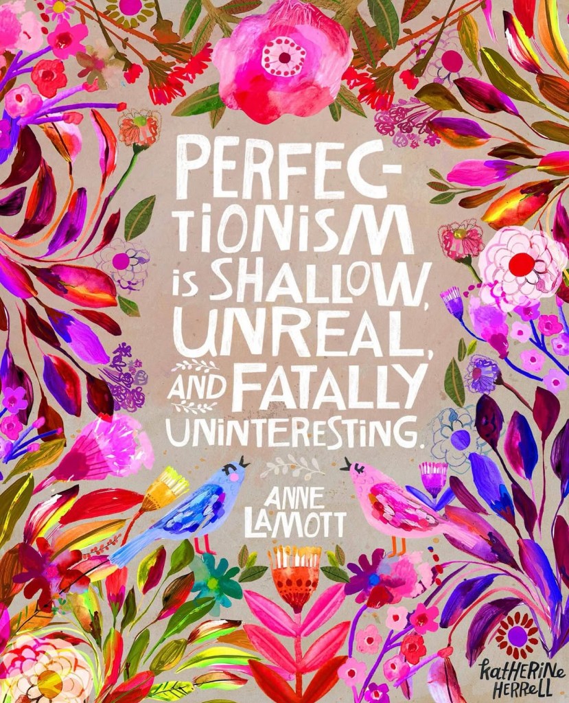
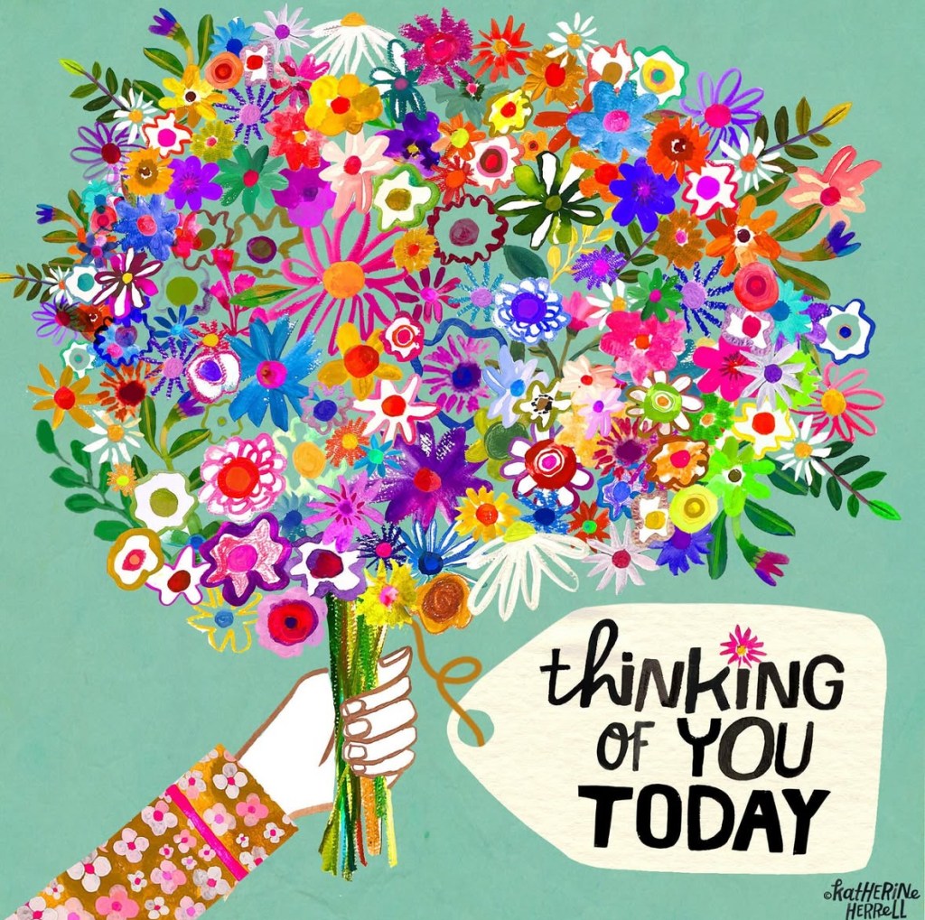
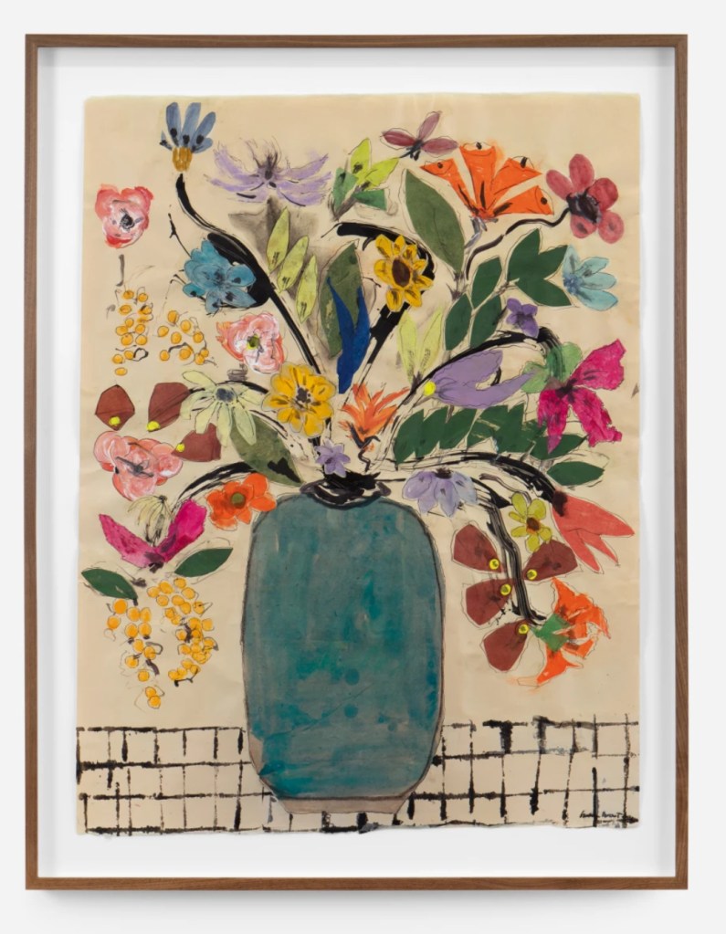
Inspirational Artist of the week: Katherine Herrell
Katherine Herrell is an illustrator and designer whose love for art began long before she knew it had a name. Her work features handcrafted details and bold joy. Her signature approach combines traditional mediums such as gouache, watercolor, and colored pencils, finessed with a hint of technology. Inspired by the wonders of nature, vibrant florals, and playful typography, her art radiates warmth and whimsy. Katherine honed her artistic voice working over a decade as an in-house artist and product designer for several well-known manufacturers. Today, she works as a freelance artist from her cozy home studio in Alpharetta, GA. When she’s not creating, you can find Katherine reading on her back porch or drawing at the kitchen table with her two young daughters.


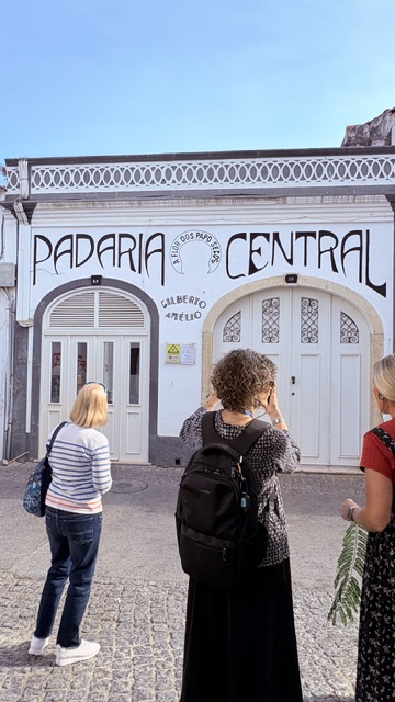
Hand lettering inspiration of the week…
I am teaching in Portugal with Kenz. Whenever I travel, I snap photos of typography. Here are a few from Lagos.


Words and Wildflowers Creative Prompts – Issue 66
Posted on October 14, 2025
We LOVE research and learning as a way to get inspired and boost ideas and creativity!! So, Kenzie and I are going to be sharing the inspiration that we collect here in our second newsletter…. once a week!!!
Here’s how it works:
We provide the inspiration. You interpret it however you wish… any medium, any size. It is meant to inspire lettering and floral art combined together. But, you can:
- Just do the florals, just do the lettering, or combine them together.
- Use the provided quote for your piece or select your own.
- Use colors from one of the inspiration images or select your own favorites
- Create the floral art… as a still life in a vase, a single flower, a border, a pattern, a bouquet
Hope you will create with us and post your work at #wordsandwildflowers2024 and tag @lorisiebert.studio and @snippetsofwhimsy
Quote of the week…
“Don’t give up on yourself. So you make a mistake here and there; you do too much or you do too little. Just have fun. Smile. And keep putting on lipstick.” — Diane Keaton
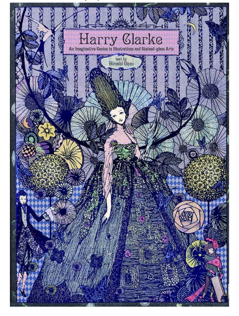
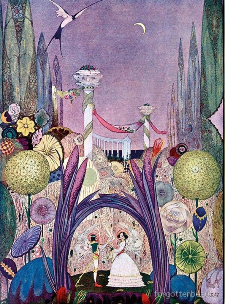
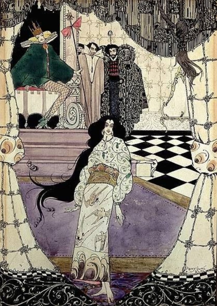
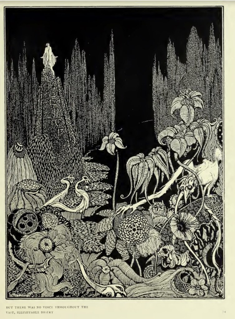
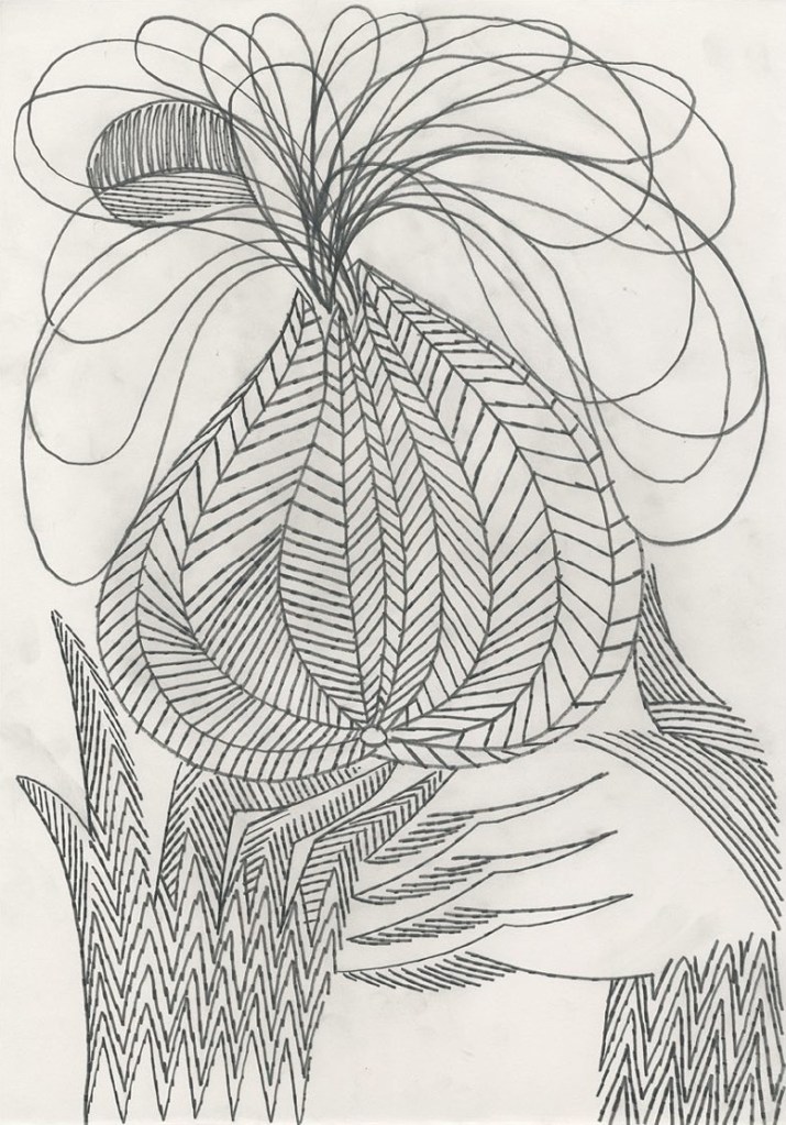
Inspirational Artist of the week: Henry Patrick Clarke
Henry Patrick Clarke RHA (17 March 1889 – 6 January 1931) was an Irish stained-glass artist and book illustrator. Born in Dublin, he was a leading figure in the Irish Arts and Crafts Movement.
His work was influenced by both the Art Nouveau and Art Deco movements. His stained glass was particularly informed by the French Symbolist movement.


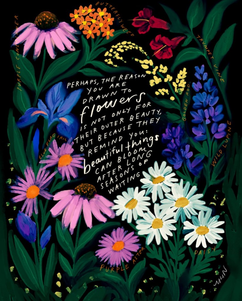
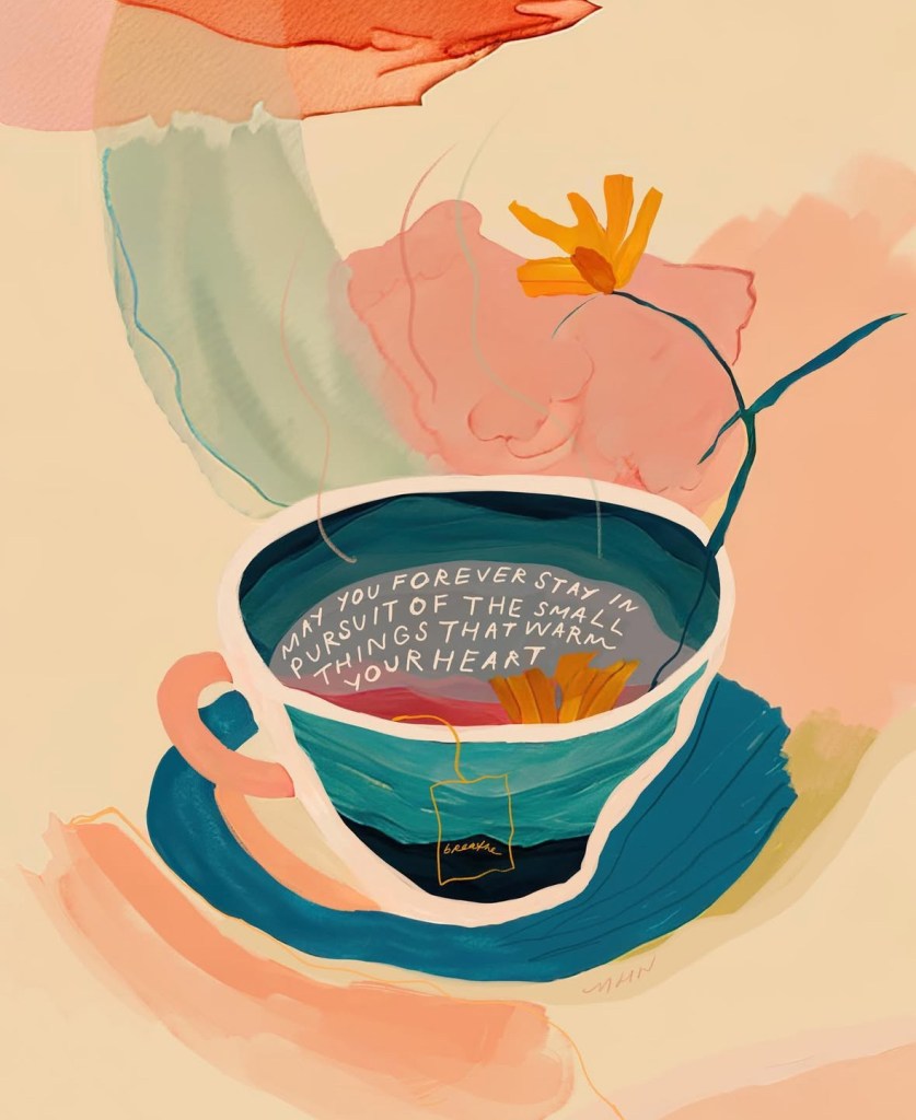
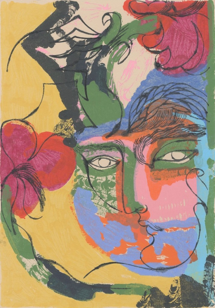
Hand lettering artist of the week: Morgan Harper Nichols
Morgan Harper Nichols (born February 4, 1990, as Morgan Novelate Harper) is an American Christian musician, songwriter, mixed-media artist, and writer, whose work is centered around the question “how can we create connection?”. Her first album, Morgan Harper Nichols, was released by Gotee Records in 2015. She now works full time as a writer, artist, and musician, traveling to speak, teach, and perform. She shares her work daily across a variety of platforms, including her app Storyteller, online shop and blog titled Garden24, YouTube, Instagram, and podcast.


Words and Wildflowers Creative Prompts – Issue 64
Posted on September 29, 2025
We LOVE research and learning as a way to get inspired and boost ideas and creativity!! So, Kenzie and I are going to be sharing the inspiration that we collect here in our second newsletter…. once a week!!!
Here’s how it works:
We provide the inspiration. You interpret it however you wish… any medium, any size. It is meant to inspire lettering and floral art combined together. But, you can:
- Just do the florals, just do the lettering, or combine them together.
- Use the provided quote for your piece or select your own.
- Use colors from one of the inspiration images or select your own favorites
- Create the floral art… as a still life in a vase, a single flower, a border, a pattern, a bouquet
Hope you will create with us and post your work at #wordsandwildflowers2024 and tag @lorisiebert.studio and @snippetsofwhimsy
Quote of the week…
Being creative makes you a weird little beast because everything seems so bloody interesting for some strange reason.
Inspirational Artist of the week: Mary Delany
Mary Delany began making paper collages, or ‘mosaicks’ as she called them, at the age of 72. The idea came to her while staying with her companion, Margaret Bentinck, duchess of Portland, at Bulstrode in Buckinghamshire. She had noticed the similarity of color between a geranium and a piece of red paper that was on her bedside table. Taking up her scissors she imitated the petals. Upon entering the room, the Duchess mistook them for real: ‘Her approbation was such a sanction to my undertaking… and gave me courage to go on with confidence’. Delany later wrote that her work was intended as an imitation of a hortus siccus or collection of dried flowers.


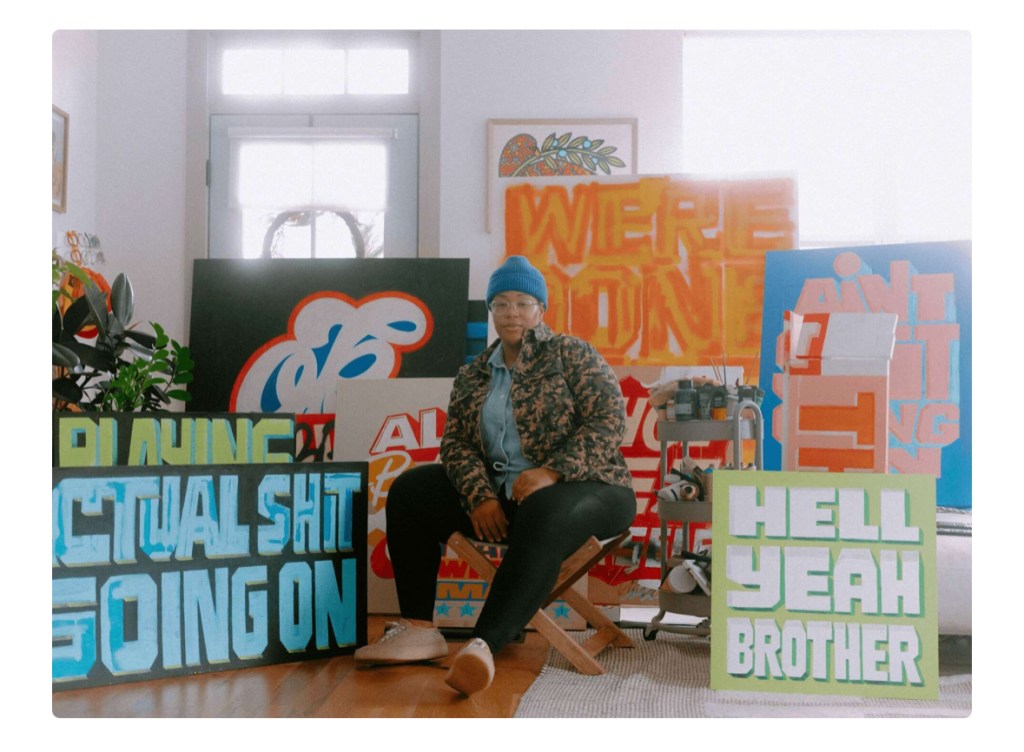
Hand lettering artist of the week: Cymone Wilder
Cymone Wilder is a senior art director and lettering artist based in Nashville. Since 2013 she has collaborated with amazing clients (Netflix, Nickelodeon, HBO Max, Cosmopolitan, Planned Parenthood and New Belgium) — creating custom lettering artwork for established brands, books, apparel and much more. She is fiercely passionate about producing meaningful and long-lasting work, drawing inspiration from the black experience.


Words and Wildflowers Creative Prompts – Issue 63
Posted on September 22, 2025
We LOVE research and learning as a way to get inspired and boost ideas and creativity!! So, Kenzie and I are going to be sharing the inspiration that we collect here in our second newsletter…. once a week!!!
Here’s how it works:
We provide the inspiration. You interpret it however you wish… any medium, any size. It is meant to inspire lettering and floral art combined together. But, you can:
- Just do the florals, just do the lettering, or combine them together.
- Use the provided quote for your piece or select your own.
- Use colors from one of the inspiration images or select your own favorites
- Create the floral art… as a still life in a vase, a single flower, a border, a pattern, a bouquet
Hope you will create with us and post your work at #wordsandwildflowers2024 and tag @lorisiebert.studio and @snippetsofwhimsy
Quote of the week…
“Play is the highest form of research”
—Albert Einstein
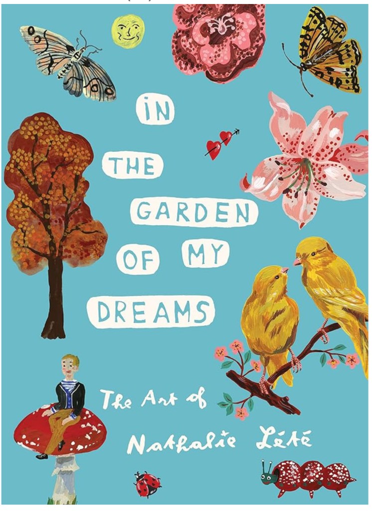
Inspirational artist of the week: Nathalie Lété
Nathalie Lété was born in 1964. She lives and works in Paris. She works in many ways, mixing different techniques and mediums, illustration, ceramics, textile and painting… She is inspired by her travels, but also by the mixing of vintage toys and old engravings of flowers and animals.
Her work is colourful, naive and poetic, sometimes strange, to the point of tending towards art brut. Her world is nurtured by popular and folk art from her both origins (her chinese father and her german mother).
She produces children’s and graphic’s books, knitted and stuffed toys, glass pictures, patterned dishes, but also postcards, ceramic sculptures, silkscreen printed t-shirts, rugs and jewels in limited edition… both for herself and for commissions.


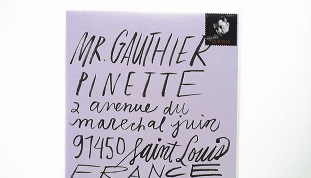
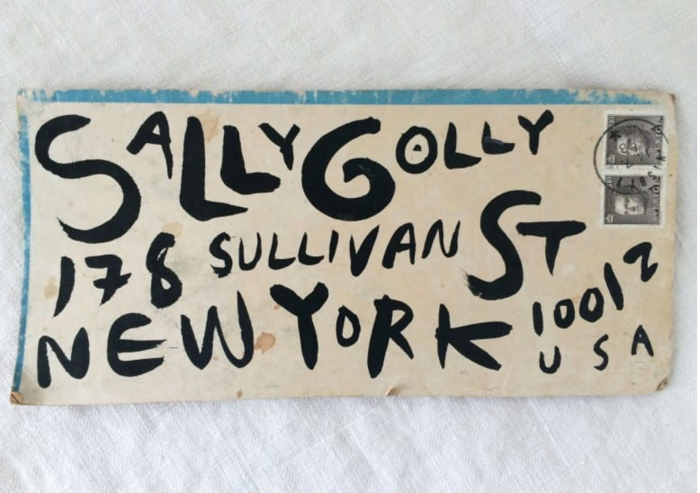
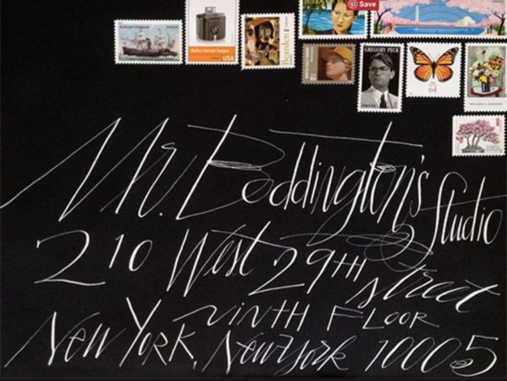
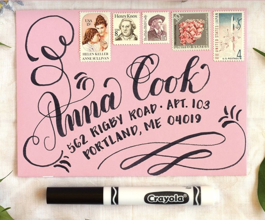
Hand lettered inspiration of the week: Snail mail
I absolutely LOVE getting mail from my artist friends!! Works of art on envelopes. Here are a few examples I found that I ADORE.

Words and Wildflowers Creative Prompts – Issue 57
Posted on August 11, 2025
We LOVE research and learning as a way to get inspired and boost ideas and creativity!! So, Kenzie and I are going to be sharing the inspiration that we collect here in our second newsletter…. once a week!!!
Here’s how it works:
We provide the inspiration. You interpret it however you wish… any medium, any size. It is meant to inspire lettering and floral art combined together. But, you can:
- Just do the florals, just do the lettering, or combine them together.
- Use the provided quote for your piece or select your own.
- Use colors from one of the inspiration images or select your own favorites
- Create the floral art… as a still life in a vase, a single flower, a border, a pattern, a bouquet
Hope you will create with us and post your work at #wordsandwildflowers2024 and tag @lorisiebert.studio and @snippetsofwhimsy
Quote of the week…
“The world is full of magic things, patiently waiting for our senses to grow sharper.”
— W.B. Yeats
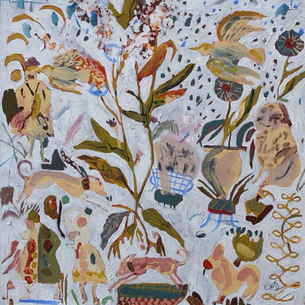
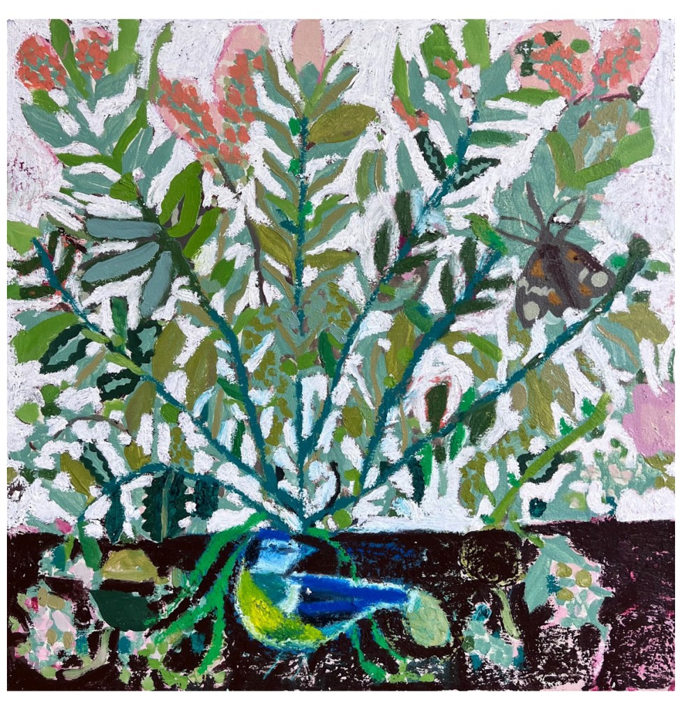
Inspirational artist of the week: Cornelia O’Donovan
Cornelia O’Donovan was born in 1981, and trained at the Royal College of Art, London.
O’Donovan plays with old folklore and poetry, but in a loose and dreamlike way. She draws particularly on tales native to the British Isles, and especially Celtic poetry and myth – from the tale of Prince Llewellyn’s grief at the sacrifice of his greyhound Gellert, to the figurative ballads of Ellen O’Leary and lines from WB Yeats.
Her paintings are flat, stripped of all perspective or realism, their surfaces hazy and meandering like an old tale retold a thousand times. Roughly rendered yet delicately arranged, she creates patterned compositions reminiscent of old tapestries, into which she plants naïve pre-Modern motifs. Outlines of old figures, ancient heralds, esoteric herbs and familiar animals all appear like inherited objects worn smooth by the touch of innumerable hands.
They retain the homespun quality of medieval rustic artworks, flowing across the canvas like a stroll through a country garden.


Hand lettering artist of the week: David Schmitt
David Schmitt, born on March 11, 1994 in Bamberg, Germany is a self-taught painter and printmaker. After studying Graphic Design at the University of Applied Sciences in Augsburg he moved to Barcelona to pursue his career as an artist. In his work, he combines an archaic and childlike aesthetic with bold visual presence and commentary, highlighting texture and rough shapes to capture a timeless simplicity.
“I have always been drawn to a certain aspect of storytelling in painting, I think of it as a crossover between Folk-, Pop-, and Cave-art so for me it feels deeply human. There is so much beauty and truth to be found in traditional craftsmanship and old tales of folklore. I hope that we can continue to maintain our appreciation for the involvement of the human hand and mind with all its imperfections as preserving these practices means preserving the soul in the world that surrounds us.”


Words and Wildflowers Creative Prompts – Issue 56
Posted on August 4, 2025
We LOVE research and learning as a way to get inspired and boost ideas and creativity!! So, Kenzie and I are going to be sharing the inspiration that we collect here in our second newsletter…. once a week!!!
Here’s how it works:
We provide the inspiration. You interpret it however you wish… any medium, any size. It is meant to inspire lettering and floral art combined together. But, you can:
- Just do the florals, just do the lettering, or combine them together.
- Use the provided quote for your piece or select your own.
- Use colors from one of the inspiration images or select your own favorites
- Create the floral art… as a still life in a vase, a single flower, a border, a pattern, a bouquet
Hope you will create with us and post your work at #wordsandwildflowers2024 and tag @lorisiebert.studio and @snippetsofwhimsy
Quote of the week…
“Let us come alive to the splendor that is all around us and see the beauty in ordinary things.”
— Thomas Merton
Inspiring artist of the week: Petra Börner
Petra Börner (b. 1973) is an award-winning artist based in London, building her artistic universe with a signature line. Translating ideas into series, paired or mirrored artworks; repetition, movement and energy is ever-present in her practice.
Obsessed by exploring methods and materials in new contexts; intuitive work also transform into animation, prints, patterns and take sculptural form; all playful to the eye. Often inspired by natural themes, her Swedish roots ingrained in her intimate work.
With over twenty years of expertise collaborating with a world wide clientele, paired with a unique ability to successfully combine her signature line with tailored projects, she creates timeless, yet eye- catching design.


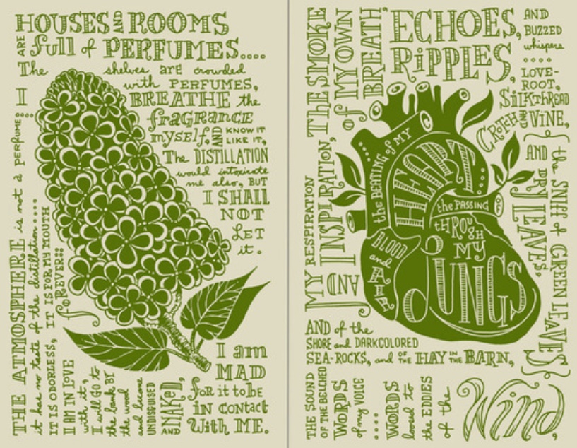
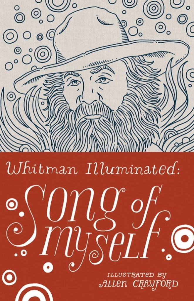
Hand lettering inspiration of the week: Allen Crawford
Allen Crawford is a graphic artist, naturalist, and author. He’s worked on a broad range of independent projects over the course of his career, including advertising campaigns, editorial illustrations, animations, videos, packaging, product design, logos, identity systems, typefaces, and books.
He and his wife Susan Crawford founded Plankton Art Company in 1996. They work independently in their own distinct styles, but they occasionally team up on larger projects. Their shared background in biology and conservation has enabled them to work with many prestigious science and education-based institutions. Their most notable joint project to date is their set of identification key illustrations for the American Museum of Natural History in New York. The 400 illustrations of corals, invertebrates, crustaceans, fish, and mammals have been on permanent display in the famous Milstein Hall of Ocean Life for over twenty years.
Allen is currently a part-time trail steward for the New Jersey Park Service and has recently received his wildland firefighter certification from the NJ Forest Fire Service. He is also a member of NJ Fish and Wildlife’s Venomous Snake Response Team.


Words and Wildflowers Creative Prompts – Issue 54
Posted on July 21, 2025
We LOVE research and learning as a way to get inspired and boost ideas and creativity!! So, Kenzie and I are going to be sharing the inspiration that we collect here in our second newsletter…. once a week!!!
Here’s how it works:
We provide the inspiration. You interpret it however you wish… any medium, any size. It is meant to inspire lettering and floral art combined together. But, you can:
- Just do the florals, just do the lettering, or combine them together.
- Use the provided quote for your piece or select your own.
- Use colors from one of the inspiration images or select your own favorites
- Create the floral art… as a still life in a vase, a single flower, a border, a pattern, a bouquet
Hope you will create with us and post your work at #wordsandwildflowers2024 and tag @lorisiebert.studio and @snippetsofwhimsy
Quote of the week…
“Play is the highest form of research.”
— Albert Einstein
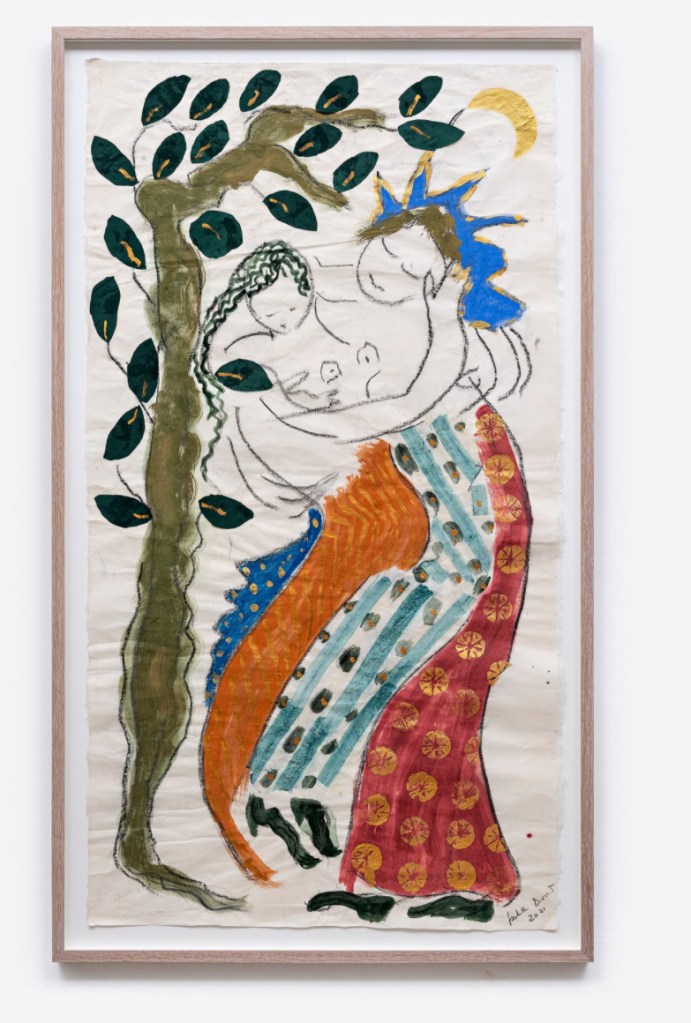
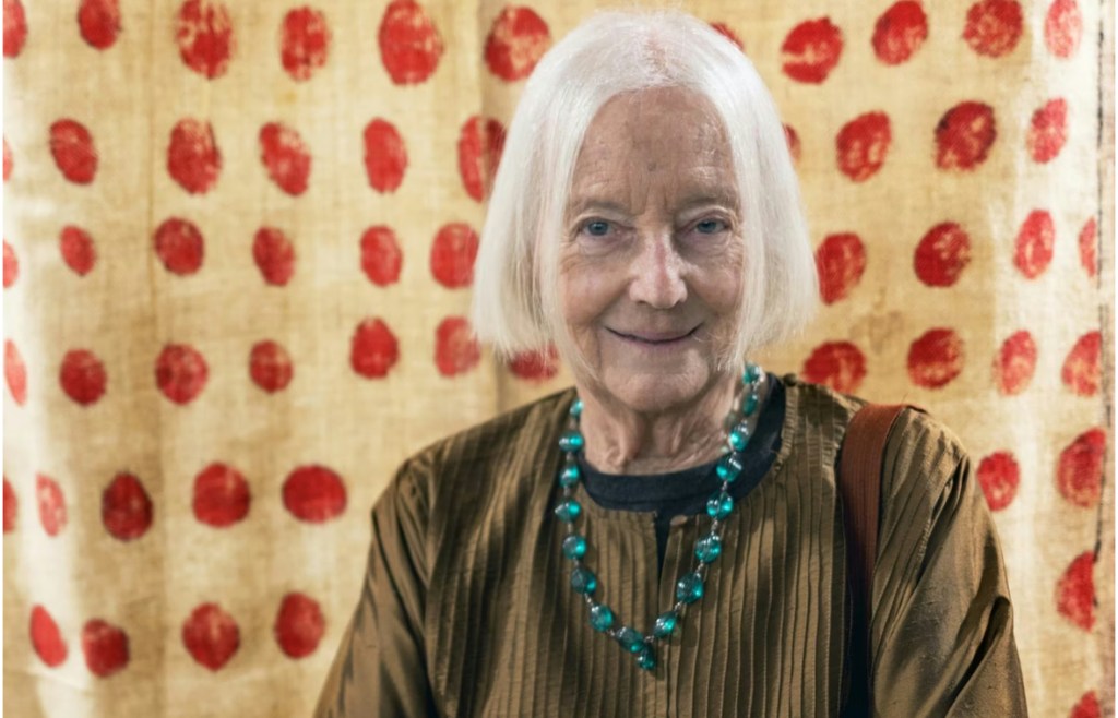
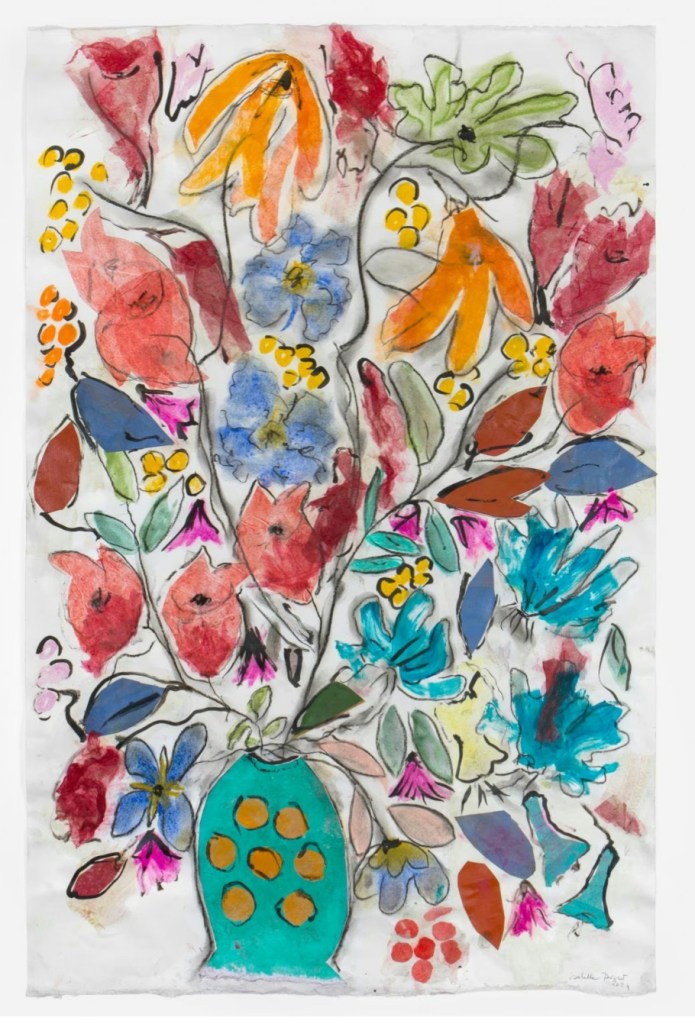
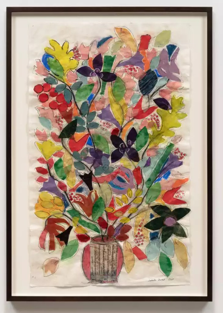
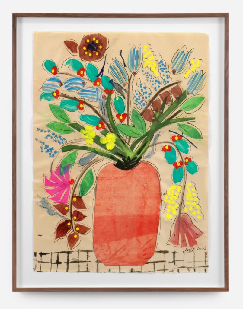
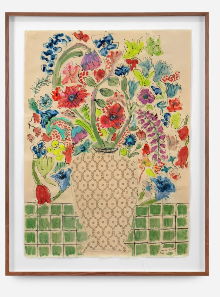
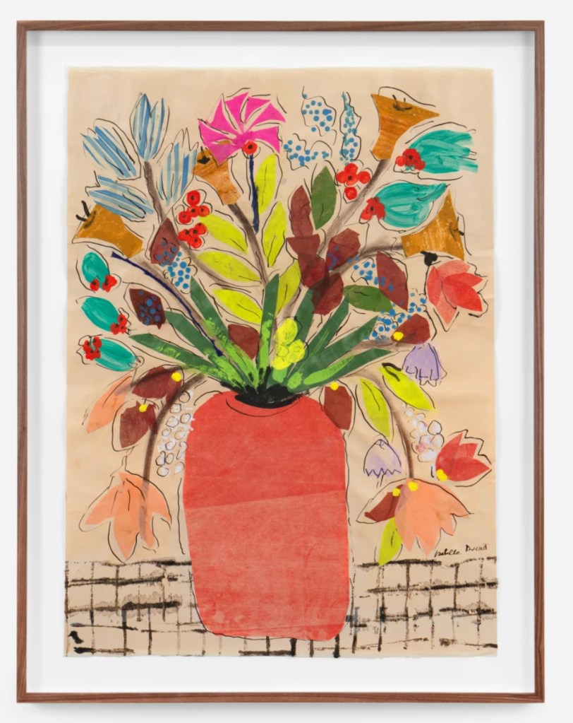
Inspirational Artist of the week… Isabella Ducrot
Isabella Ducrot (b. 1931, Naples, Italy) is an artist and writer with a career spanning four decades. Ducrot’s oeuvre is deeply rooted in an extraordinary and enduring interest in fabrics, that is central to both her pictorial works and writings. Sourced during extensive travels over the course of her life, Ducrot has amassed an exquisite collection of fabric that spans centuries and bear origins from across Asia and Eastern Europe – including Russia, Turkey, China, India and Tibet. She considers these fabrics as an art form in and of themselves, to which she has dedicated herself to many years of focused study and views essential to her education. Employing diverse media – including pencil, pastel, ink and watercolor, which she applies to rare papers – her works compress an array of cultural references, ranging from philosophy to folklore and textile weaving. At both intimate and expansive scales, her work reflects a fascination with repetition, form, and color, informed by the rare textiles in her collection. Ducrot’s work was the subject of a recent solo exhibition, Profusione at le Consortium Museum, Dijon and her installation, titled Big Aura was featured at the Dior Haute Couture SS 2024 runway show at the Musee Rodin, Paris. Ducrot has presented solo exhibitions at Petzel Gallery, New York, Gisela Capitain, Cologne, Sadie Coles, London and Standard (Oslo), Oslo. Ducrot lives and works in Rome.


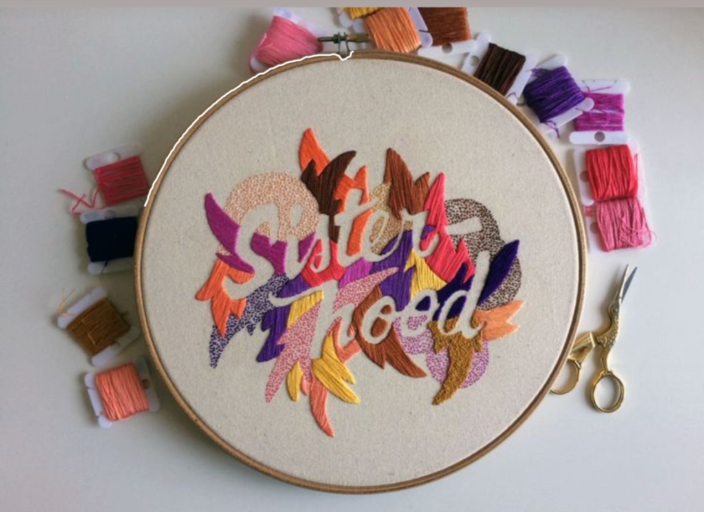
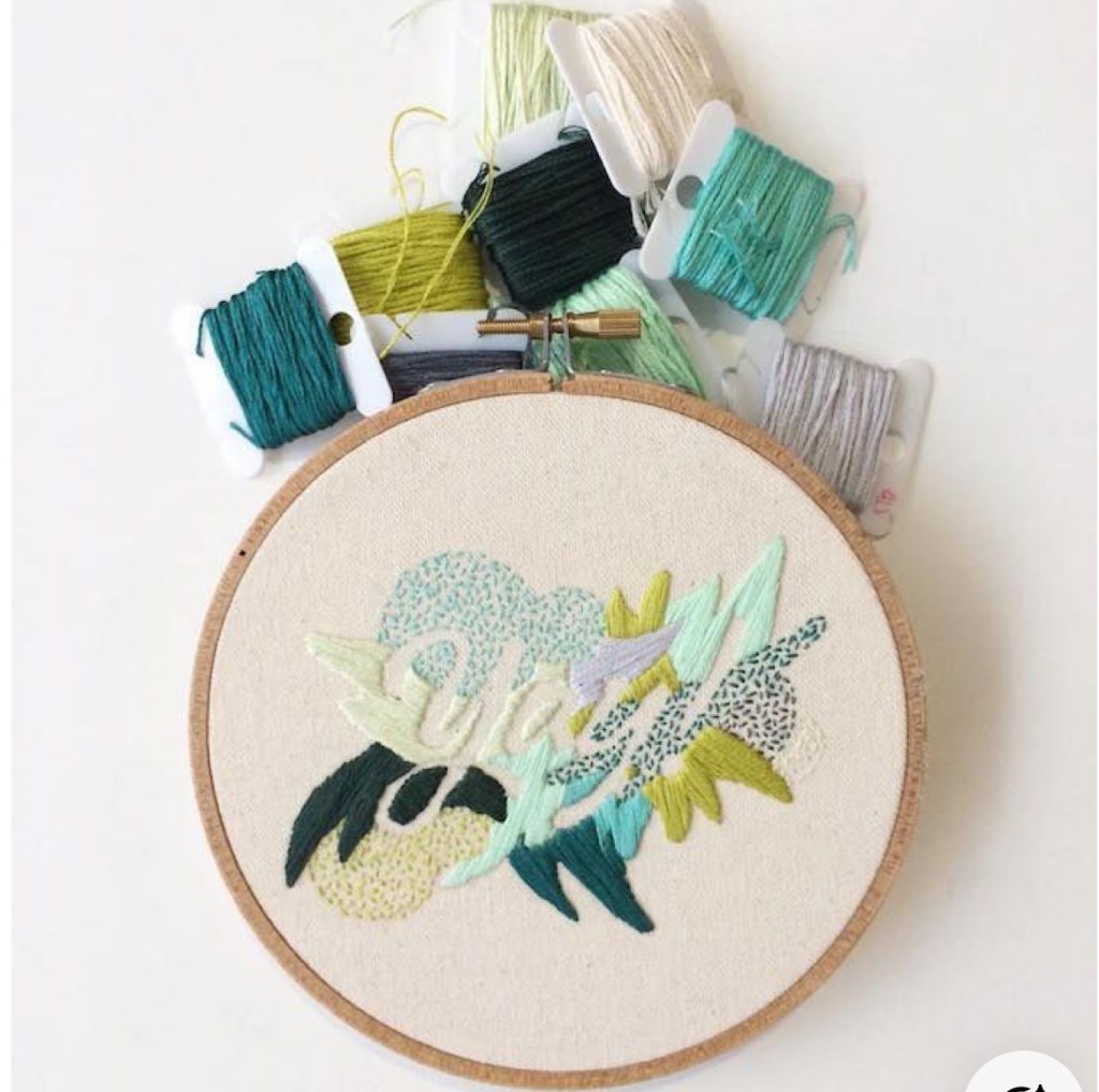
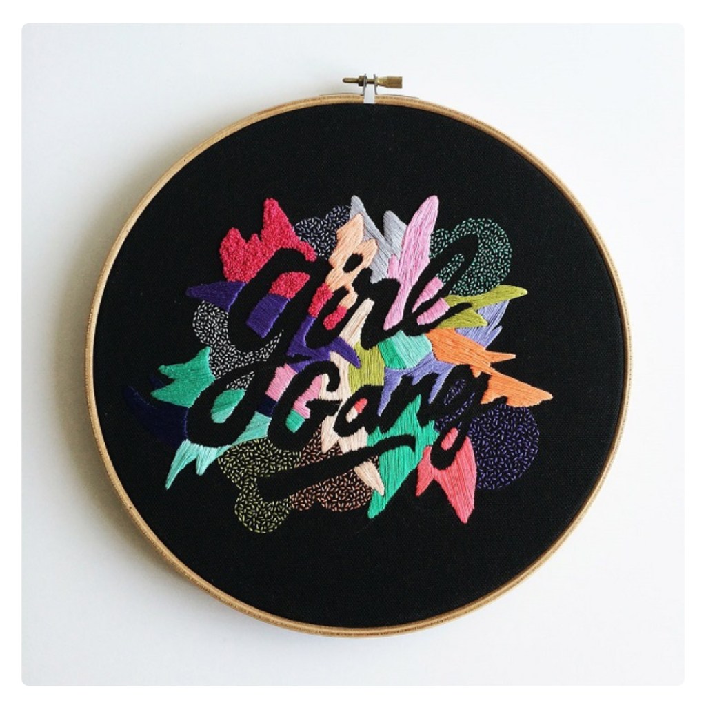
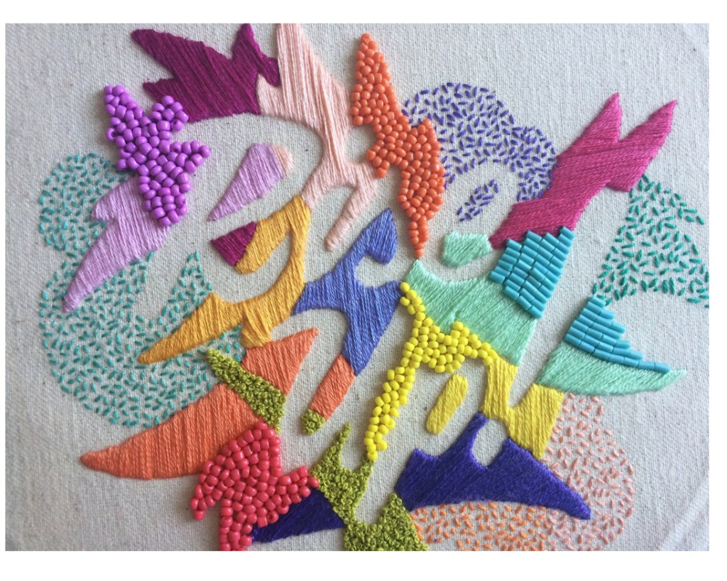
Handlettering artist of the week: Valeria Molinari
Valeria Molinari (she/they) is a multidisciplinary creative from Venezuela, with a diverse practice that includes textile work, video installation, editorial illustration, art direction and community organizing. Experimenting with different mediums is one of her favourite things in the world. For the past roughly ten years, a lot of her work has existed in the cross between art and activism, dealing with the language surrounding feminism. Using fibers as her base medium, she likes to incorporate calligraphy and hand lettering to display her messages. Her practice involves self-examination and research, trying to remind the viewer about the power of words, of concepts, phrases, and lines that have been unquestioned by people for generations, helping to perpetuate thoughts and behaviors around gender, class, race, and sexuality.